The Graphic Designer and Her Presence


It’s Jacqueline Casey’s world, we’re just living in (a reflection of) it.

In the early 1990s, before ever envisioning a career in design, I spent months facing a framed copy of Jacqueline Casey’s 1985 poster Russia, USA Peace. It hung opposite my desk in the Massachusetts College of Art and Design Development office. Then I knew nothing about design’s history or Casey’s reputation. But the poster seemed to me ingenious and perfect—everything design was supposed to be.

The print came to the office via an exhibition of design alums I helped organize. At the opening reception, I chatted briefly with Jacqueline Casey. The show was my first exposure to her work and I expressed my appreciation to the frail, soft spoken woman. More than any other piece, or even her photo, when I look at Russia, USA Peace, I think of that short exchange of pleasantries. After all, she was in it, as was everyone on our planet.

The poster features a monochrome photo of Earth, shown in full in the upper right corner. Printed in a varnish, it floats in a black void that fills the poster’s frame. At the base of the poster runs the letters RUSSIA, the R and concluding A extending off the trim edges. The characters alternate in a solid, vivid red and reversed out white, which form USA.

Casey created the work for the exhibition Images for Survival organized by the Japanese Shoshin Society. The collection marked the 40th anniversary of the atom bombing of Hiroshima. At the time, a nuclear conflict between the two superpowers was the direst threat to humanity. Russia was then, technically, the USSR. Now, the poster seems prescient and timeless—both in appearance and message.

In all of Casey’s oeuvre, this work may be most emblematic of her method. She was the foremost U.S. practitioner of the International Style and deserves inclusion among its exemplars anywhere. While Müller-Brockmann is the style’s most renowned and doctrinaire practitioner, it was Casey that fully demonstrated its potential as an accessible design methodology. Müller-Brockmann may have generated the most music posters in the manner but it took Casey to make that style sing.

Casey represented an advance for the International Style separate from the “New Wave” represented by Wolfgang Weingart. (And it took another supremely talented American woman designer—April Greiman—to make that approach resound.) New Wave sought to bring down to Earth an airless typography (“do we live on the Moon?”). It didn’t make it breathe so much as make it hyperventilate. 

In her process and product, Casey bridged the Swiss and American Modern strains: a fusion of the best Müller-Brockmann (discipline and structure) and Paul Rand (personability and formal imagination) could offer. She was the fulfillment of Modern intent, methodical and human.

High Modernist design overall developed from a celebration of mechanization and systemization. Its foremost performers operated sleek, clock-work devices of representation. Casey became the ghost in that machine.

A comparison of Der Film and Russia, USA Peace is instructive. Both are signature works of the respective designers. The core aspect of each is a depiction of an effect of light: Casey using varnish, Müller-Brockmann an overlap that implies light projected through a transparency.

In this spot varnish, Casey engages the materiality of design, subtly. Müller-Brockmann is all about the ink that resides on the sheet’s surface. Material effects and manipulation: stock, die cuts, emboss, seem almost vulgar in his context. Casey’s usage is rare for her and typically restrained.

Staying true to the International Style’s formal fundaments, Casey infused it with an open, flexible sensibility. Müller-Brockmann’s design was an austere intellectual exercise, a distillation to craft a formal representation of a message’s “essence.” He pared to the pure. His favorite of his works was the blank verso of the printed sheet—this page ideally left blank.

Müller-Brockmann was ultimately unable to transcend language and its subjective confines. So, ironically, words became the primary, often sole, constituent of his works. For Müller-Brockmann, language was text, another formal element to arrange, along with image—ideally, usually, geometry—and color. Its role was limited to being positioned, scaled and read. That reading was singular and apparent.

With posters largely consigned to phenomena that could be reduced to names (activity, performer, venue) and dates, he self-selected the ideal forum for his essentialist art. The greatest challenge was overcoming the initial public reaction to his graphic austerity. Once normalized, the field was clear.

But it was Jacqueline Casey that fulfilled Müller-Brockmann’s promise, to divine and impart essential messages. She was able to summarize complex and arcane subjects using a limited but endlessly adaptable palette of effects. Overall, she orchestrated a wider range of topics, imagery, color schemes, graphic elements and compositions. Casey was a maximalist of the minutest.

Her 1971 poster for the exhibition Goya: The Disasters of War is illustrative of her ability to realize a concise, evocative message. She condenses Goya’s paintings to an expressive, active spatter. It’s simple and readily recognizable, but also ambiguous, suggesting paint and blood equally. This is consistent with the many shapes that adorn Casey’s posters, forms that often toggle between representation and abstraction. The “JC” of the poster for an exhibition of her work is a deliberate, telling manifestation of this treatment.

Most importantly, Casey utilized language as a resonant, variable communication medium, beyond simply being text. Language’s manifold character wasn’t to be transcended but exploited. Müller-Brockmann’s design denied language’s nature, Casey’s embraced it. She would split words apart as if they were atoms, to reveal their component elements and spin off additional illumination. For instance, in addition to the nested RUSSIA/USA display, OIL is accented within POLLUTION for another poster.

Variety in typeface was naturally found in heads and titles, though Helvetica still dominated. These texts could perform, reinforcing and representing the poster’s topic. At times, her typography approached concrete poetry in forming patterns and exotic arrays. Mediums of Language is a natural showcase of this impulse, where the occasional tool of repetition and stacking signals language’s structuring and multiplicity. Type becomes dimensional, a framework, multiplies, breaks apart.

Casey regularly has more body copy in her posters than found in Müller-Brockmann’s. This is always set in a regular weight of Helvetica—exclusively set in ragged columns hung from their heads. Depending upon the overall layout, the columns may be horizontally spaced unevenly. Or, in Intimate Architecture, rotated 90 degrees to echo and extend the shape of the pleated dress hem.

On the boundary of text and pure form are characters constructed from basic shapes, such as the ‘SIX’ of Six Artists. Characters are, of course, forms in their own right, though more charged and defined than the primary shapes—circle, square, triangle—that populate Casey’s posters.

Casey employed a wide range of imagery as a regular component of her posters. She was willing to employ representation while maintaining a connection with abstraction. As previously noted, her abstractions frequently straddle the borderline with representation (the “cups” of Coffee Hour). At the same time, her abstract forms play different roles across works depending upon context: here symbolic, there pure geometry, elsewhere metaphoric.

Casey was also working with subject matter that while more diverse than that addressed by Swiss Internationalists, was still limited to focuses conducive to the minimalist approach. MIT wasn’t showcasing the broader hurly-burly of culture. The preponderance was art exhibitions, music performances and technology-related matters, where charts and graphs resided naturally. Though limited in topics, Casey wrung maximum meaning out of her reduced subjects and process.

Her achievement shouldn’t be cast only in contrast to Josef Müller-Brockmann and the International Style. Her work deserves regard within the entirety of design activity, historically and conceptually.

Though diffuse and amended, Modernist principles still permeate most of design practice. Many critical statements are often posed in relation or opposition to Modernism. Modern design still lives as design’s default position.

In this context, Casey’s work serves as an executive summary of our discipline, an ideal fig.1 textbook illustration of design’s most effective product. It’s design not at its most minimal but its most succinct.

To view a collection of Jacqueline Casey’s posters, visit the Rochester Institute of Technology Graphic Design Online archive.

BB King

If Barney Bubbles was punctuation, he’d be an interrobang. He seemed incapable of the straightforward, singular expression. Everything divulged layers. His work and practice were a gestalt of contradictions and oppositions. Unpacked, it opened like a graphic Big Bang. Even a personal scribble from Bubbles exhibits minutiae that provoke a close reading. Why would it be any different from the rest of his oeuvre?

In his forward for Paul Gorman’s Reasons to Be Cheerful, designer Malcolm Garrett describes a message left for him by Bubbles, which included a rare self-portrait. “I SEE A VISION,” it read, “I SEE A ‘MODERN’ WORLD.” Crossing at chest level—ducking under the upraised left arm, floating over the extended right—the text precedes then trails after the sketchy figure. Even for a handwritten note, there’s typographic play: “WORLD” bends slightly, distinct from the rest of the text, the W hovering sideways above the O. “I SEE” repeats. Is it a stutter? Change of mind mid-thought?

The Bubbles caricature is moving away from the viewer, arms spread wide, fingers splayed. He might be maintaining balance as he confidently strides, left foot forward, right angled back, across an invisible tightrope or baseline. He could also be closing in to embrace someone off stage. Or be strutting. Or dancing.

There’s his signature schnoz, punctuated with a triangle and circle to form (according to Garrett) “Bauhaus nostrils.” Bubbles may not be seeing a “modern” world but smelling it, and liking the aroma. His mouth is described with pointed, puckered lips that betray no particular emotion or action. He could be silent, speaking, or singing.

The character is dressed in a geometric shirt or sweater, adorned with Charlie Brown-like zig zags at the elbows. Double-lined angles meet in the center of his back. Below, a curve of buttock is described to suggest snug-fitting trousers. Though likely dashed off, he still captures the detail of fabric bunched behind the bent right kneecap.

Bubbles deftly crafted an irreverent and expressive image of himself. Certain details stand out for their incongruency, complicating the reading. Springing from the top of his head, there’s what appears to be an unruly tuft of hair. He neglects to differentiate a shoe for the figure’s right foot as he does for the left.

With Bubbles, the game is always afoot, so intention and accident vie for cause. Usually, defects are revealed as effects. Bubbles’ work wasn’t so much designed as plotted, like a novel. The larger the seeming flaw—the “misprinting” of the This Years Model sleeve or the built in the scuff marks on Get Happy!!—the more purposeful he was.

Constantly manipulating aspects of identity, his penned persona is leading a double life. That spiky skull sprout isn’t just a coif, it’s a gimcrack crown. And that undivided ankle shows him to be wearing a costume—that of a jester. Yet again, Barney Bubbles has purposefully blended high and low, this time with him in the starring role. He’s his subject and Lord. The Fool King, or King Fool.

I see a “design” world conjured and ruled by Bubbles, the jester sovereign. He needed to create so prolifically, compulsively, in order to people that world. Its inhabitants were anthropomorphized combs, matches, handprints, paint splatters, typography, geometry, studio detritus.

He was a rare designer whose entire output—every ad, every sigil, every sleeve, every sticker—deserves delectation and preservation. Gorman’s monograph is a worthy document but doesn’t map the entirety of Bubbles’ domain.

He relentlessly churned out design artifacts: album packages, single bags, ads, buttons, stickers, posters, programs, and occasional books. Alongside these he crafted inventive videos, furniture, paintings, collages, sculpture. It was more than being prolific out of necessity, pushed by the breakneck pace of his primary clients. Its politics were a tad on the anarchistic side, though virulently antifascist.

Some designs were part of a wider system. A single sleeve might continue the layout aspects of the album it was drawn from—e.g. the single bag for “(I Don’t Want to Go to) Chelsea” and This Years Model—but this was an exception in Bubbles’ work. He seemed to regard it as slothful to extend an identity into other artifacts.

And within his album packages, there regularly were inner sleeves, bespoke labels (which could vary in design from one side to the other), postcards, posters, stickers. Many albums sported unique logos, or had the many variations for Stiff and F Beat. Bubbles also had his hand in illustrations and lettering—frequently wielding brush or stamp kit to create text. He should have been paid by the piece.

Bubbles production of countless supplementary, extraneous material was a hallmark of his profligacy. Within them, he didn’t simply rehash ideas, he developed themes across projects and media. Some sleeves contained more than one.

There was uncanny portrait Barney (Cycledelic, This Years Model, all Nick Lowe albums, The Future Now), painterly Barney (which includes most early works, Seconds of Pleasure, Imperial Bedroom, Compass Point), domestic kitsch Barney (Armed Forces front cover, Mad About the Wrong Boy), surreal saga Barney (25 Years On, Be Stiff EP, Frogs, Sprouts, Clogs and Krauts, Speak and Spell), quoting Barney (Almost Blue, Life’s a Riot with Spy vs. Spy), music vernacular Barney (Get Happy!!, A Case of the Shakes, Music on Both Sides), meta Barney (This Years Model, Do It Yourself). Broadening out to his overall logo designs, one theme emerges, that might best be described as regalia.

In his last years, Bubbles’ design for music increasingly referred back to the pre-1960s era of small, independent record labels catering to jazz, blues, R&B, and early rock and roll. It was a time when myriad upstart companies opened all over the U.S. that catered to local artists deemed problematic by the majors. (England’s smaller market was dominated more by their indigenous majors and so didn’t see the same flowering of labels until the punk/new wave era).

Bubbles’ designs mimicked the visual accents of these labels with often geometry-based graphics featuring demonstrative type in keeping with overall commercial packaging. Only occasionally did Bubbles pointedly quote a well-known indie source. Typographically mirroring the album Midnight Blue by Kenny Burrell (1963) on the famed independent jazz label Blue Note for Elvis Costello and the Attractions’ Almost Blue (1981) was Bubbles indulging in a double graphic pun. (A more slavish imitation was issued a few years later with Joe Jackson’s Body and Soul (1984) paying homage to 1957’s Sonny Rollins, Vol. 2.) Reid Miles’ expressive typography was a regular go-to template for numerous other sleeve designs.

Looking to the U.S. for popular music inspiration was an established sightline. Emerging from skiffle, British rock and roll owes its existence to American expressions. Even groups such as Fairport Convention, which drew from and electrified British folk songs, were inspired by the Byrds.

The dominant, declared evocation for British bands was blues and R&B. Groups like the Beatles and the Rolling Stones celebrated African-American artists (literally) ghettoized in the U.S. In their native country, these performers could only be found on small labels often named Regal, Imperial, Duke and King. Chess Records (originally called Aristocrat)—a major among the minors with a roster including Chuck Berry, Bo Diddley, Howlin’ Wolf and Muddy Waters—contained all of the nobility. (It was, of course, named after its founding brothers).

The U.S. embraced the symbolism of royalty to ennoble its musicians. Representational democracy is all that but being the President of Rock ‘n’ Roll doesn’t confer much glory. Maybe a Sinatra can carry “Chairman of the Board” and make it work. Senator of the Blues? Please. Elvis was the King. Aretha Franklin the Queen of Soul. And so on to Prince.

In a small irony, when Stiff Records released Mil Gracias A Todos Nuestros Amigos by Tex-Mex master Joe “King” Carrasco and the Crowns (1980), it didn’t come in a Bubbles sleeve, but was outsourced to Chris “C-More-Tone” Morton.

As Bubbles overall turned to referencing historic music graphics, regalia surfaced as a theme in his logo work. Alongside toggling between a couple of typography-based logos for F Beat, Bubbles established a three-pointed crown as the sole object-based mark. Perversely, he didn’t use it for the aptly-named Imperial Bedroom (1982) (or IbMePdErRoIoAmL, as Bubbles would set it), his last produced sleeve design for Costello. This was likely due to the crown’s appearance as logo on Trust (1980), two albums previously. By the time Costello got to King of America, Bubbles had abdicated from life.

Bubbles introduced a new theme with Get Happy!!—inhabiting album design’s past. Elvis Costello’s 1980 release marked his definitive break from a “brittle” new wave sound to adopting an overt soul and R&B template. Bubbles echoed this in his throwback design which fused day-glo new wave colors with a high contrast Reid Miles type vibe. Bubbles physically reinforces the retro move with partial lamination and the faux scuff marks (on the F Beat version).

(Another dated reference is my suspicion that the sleeve may be a sham 3D image. According to Tom Pogson, his cover painting for Armed Forces was intended to be 3D. The idea may have slipped one release. The possibility is raised by the curious hues of the intersecting parallelograms on front and back. Also, the mysterious “bug” placed in the top corners front and back of the sleeve has a prominent “3” in its center, overlapping three sets of hypnotic concentric circles. The shape at the base of the “3” resembles a cap “D” with a pointed tail. A test viewing with 3D glasses was unsatisfying.)

Bubbles was as versed and discerning about the history of album graphics as he was in art. In addition to Reid Miles, Bubbles channeled record design pioneer Alex Steinweiss. Mostly, he evinced the music graphics “vernacular” (scare quotes used as they were performed by trained but usually uncredited professionals) prior to the 1960s, when his deliberate anonymity was the professional standard.  

This theme didn’t dominate and was applied to other releases that invoked rock and country roots music. It generated a studied timelessness in Bubbles’ sleeve work, different in nature with his other pastiche motifs. Evoking fine art and album graphics dislocated Bubbles’ work from its specific date of manufacture.

The generalized reference to past album graphic styles replaced the overt quoting of high art sources. This is most evident in the transition from Armed Forces (actually, an amalgam of all of Bubbles’ themes) to Get Happy!!

Overall, with the entirety of his work, Bubbles was composing his own undeclared visual Lipstick Traces, drawing his own connections between music, art and design across history. The resulting diagram was like a spirographed circle. Bubbles wasn’t at the center, he was throughout.

That this theme came late and last in Bubbles’ career gives it a special poignancy, though there’s no evidence it held any for him. As noted, it was likely a pragmatic conceptual move, reinforcing and resonating with what was placed in the grooves. It was self-referential but reflexivity wasn’t new for Bubbles. It was upon returning to sleeve design at Stiff that a self-consciousness entered his work. The process of design and its artificiality became a constant, overarching subject.

His self-consciousness also manifested in questioning his relevance as a sleeve designer. As early as 1981, in his lone printed interview, he lamented being “staid and boring.” “I’ve got to get out,” he said, “It’s time for me to go.” Two years after the publication of that interview, Bubbles went.

I see a vision of a “post-modern” world where Barney Bubbles stuck it out longer. Maybe he’d still be with us even now, 76 years old, frail or hale. Following two designers he inspired, Peter Saville and Malcolm Garrett, he would have moved beyond full time sleeve design, and into other media.

But, like Saville with New Order, Bubbles would continue designing for musicians with who he had a special relationship. Hawkwind, naturally. He and Elvis Costello would get past the Punch the Clock rejection and continue their fruitful collaboration. Nick Lowe and Billy Bragg would also remain patrons. For them, Bubbles would even take on CD packaging, though he was indifferent to the format.

As his contemporaries Hipgnosis did, Bubbles would concentrate on video, overcoming his trepidation with the inability to manually edit and manipulate the medium. MTV and adventurous ad agencies provided him with a sufficient stream of clients seeking something surprising—and cost effective.

He was even able to branch out into documentaries and features, appreciated for his eccentric but affectionate take on British culture, politics, and domestic decor. It amused him to be shown on the BBC, because now it was where you see BB. He was still cagy about his name, dubbing his production company Fulcher Films.

He converted his Elephant Dollars film script (“a short film featuring rock’n’roll, but incorporating a love of trash movies, pulp sci-fi, bad true romance and the dumbest of humor. Its aesthetic is cheapness, surface flash and hipness”) into a series that gained respectable notices, particularly when aired on the American PBS network.

Vinyl came back, after a fashion. Bubbles returned to album art to joyfully launch into designing a round of commemorative box sets resplendent with new artwork and lavish companion books. There were no design credits.

Eye magazine still published Julia Thrift’s “In Search of Barney Bubbles” article in 1992. However, it came with a different slant and ending. The designer was agreeable to being interviewed about his “sordid past” but remained evasive and dismissive about his work. “King of the Bargain Bin!” he proclaimed himself.

Eventually, there was a documentary on Barney Bubbles, from a Fulcher Films protege. Rumor was that Bubbles actually directed it himself. Though photos were shown of the young Barney, the filmmakers substituted other, associated figures speaking Bubbles’ interview lines. These bogus Barneys were either silhouetted—sporting obviously fake noses—or friendly stand-ins with prominent proboscises, like Billy Bragg and Pete Townshend (to make up for the aborted Who Are You commission, the band hired Bubbles to package one of their myriad rarity collections). Each received a caption identifying them by a Bubbles pseudonym.

The biopic’s last scene featured Elvis Costello (identified on screen as “Declan McManus et al.”) casually handling a copy of My Aim Is True as he relates the story of Bubbles directing him through the cover photo shoot. Hanging on the wall behind Costello is the canvas of Snakecharmer & Reclining Octopus, the “Sal Forlenza” painting used as the cover of Imperial Bedroom.

Concluding the tale, Costello stops speaking for a moment to actually focus on the album cover. “Barney did all these letters individually, you know,” he then says, “the ones spelling out ‘Elvis is King.’ He may have spent more time on that than I spent on the music!” A beat. “That was Barney. He was King.”

The picture suddenly jumps, as if the film has leapt from its sprocket holes. In faulty magic marker, a scrawled word is then jerkily inserted into the frame: Fin.

Note: This is the fourth and concluding part of my study “Barney Bubbles: Offset Identities.” The previous episodes can be found in the “Writing” section. All the essays draw from Paul Gorman’s book Reasons To Be Cheerful: The Life and Work of Barney Bubbles (Adelita, 2010) for details and quotes about Bubbles’ life and work.

Bubbles’ pop

“Most of you won’t like this, and I don’t blame you at all. It’s not meant for you.”
—Lou Reed, original liner notes to Metal Machine Music (The Amine β Ring) (RCA, 1975)

♭♭

For Barney Bubbles, ersatz is as real as fake gets.

Due to his myriad puzzles and conundrums, it’s tempting to look for a skeleton key to Bubbles among his diverse productions. Is there a deciphering work? There are masterpieces such as Armed Forces that showcase most aspects of his design imagination. And for that sleeve, he even placed a self-portrait inside center.

The written record is thin where he speaks directly about his work. And when questioned, he manages to be simultaneously forthcoming and evasive. Most artists profess to speak through their work and Bubbles labored to leave us little else.

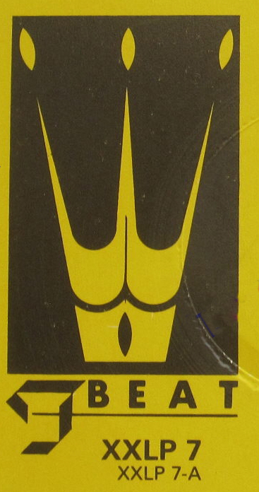
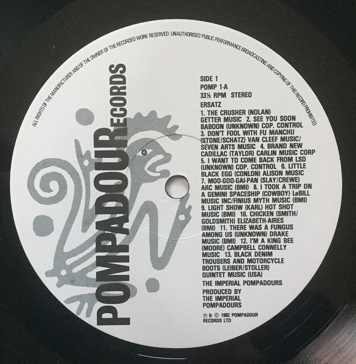
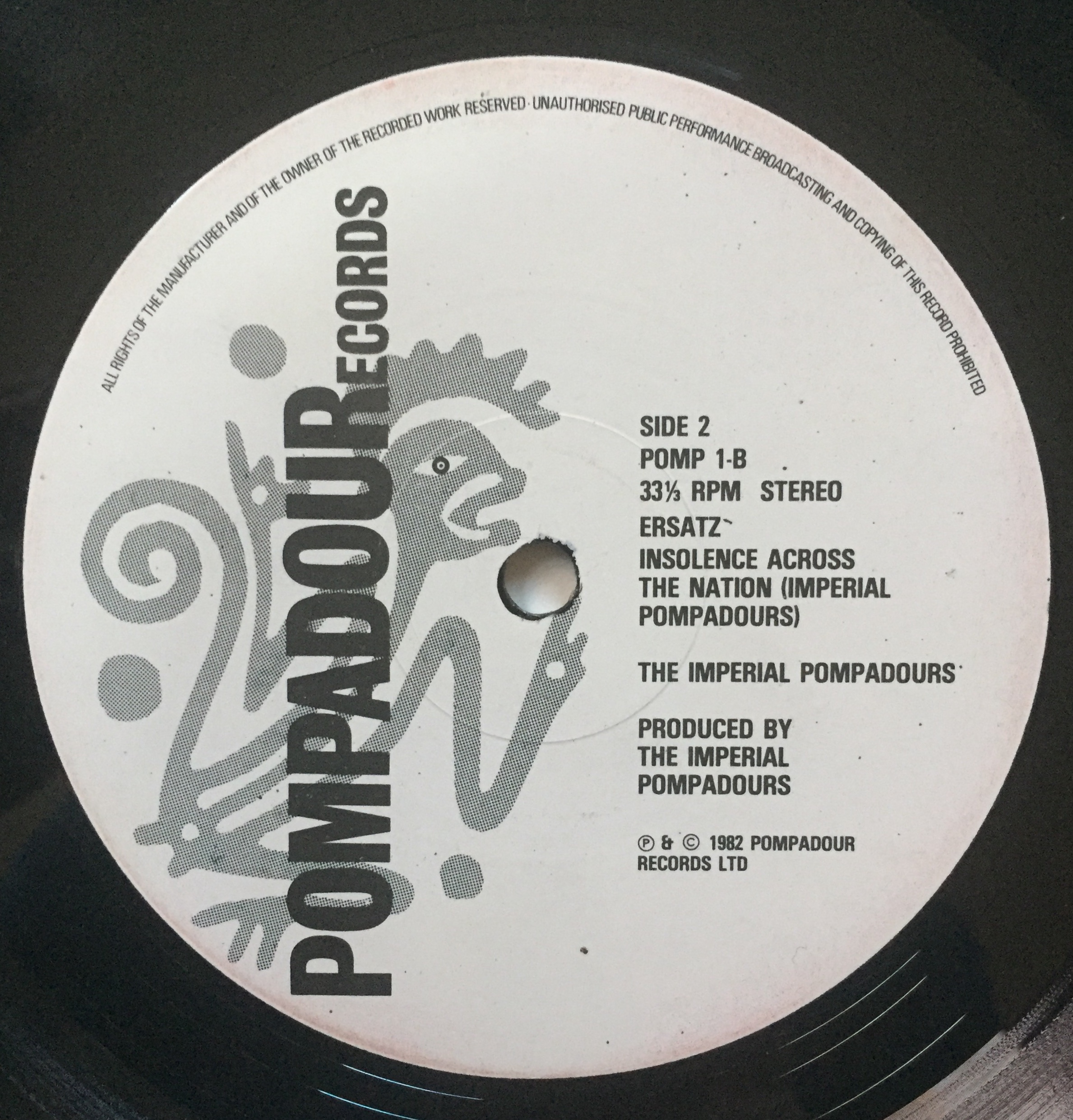
We do have a vinyl record that’s thick with meaning. The best candidate for the definitive Barney Bubbles work would seem to be his own and lone album Ersatz, released in 1982 under the moniker The Imperial Pompadours. Issued on an F-Beat one-offshoot imprint also called Pompadour Records, Ersatz inverted a concession made to select performers.

Labels frequently pander to their superstars by allowing them to create their own cover designs, regardless of their objective skill at design or illustration. (You tell Bob Dylan how ghastly that painting is, Mr. A&R Man.) Flipping the script enters the realm of the commercial unnatural for a major label.

Of course, such eccentricities were a regular feature of Bubbles’ chief champion and sponsor, Jake Riviera. Issuing an album by the label’s primary sleeve designer, even pseudonymously, is a prototypical perverse move. For instance, in 1980, Stiff Records issued the one-off joke album The Wit and Wisdom of Ronald Reagan. A shadow release attributed to Magic Records (“If it’s a success it must be Magic!”), the LP sported grooved—but silent—tracks.

Bubbles’ record should be filed with the 1982 promotion-only F-Beat LP, The Art of Roger Bechirian, Vol. 1. That album was a compendium of songs shepherded to disc by the ubiquitous engineer/producer (there was no volume two). It also featured an Alex Steinweiss homage sleeve design by Bubbles.

In his introduction to Paul Gorman’s Reasons to be Cheerful, Billy Bragg says how Barney Bubbles seemed like another member of the band. However, as simpatico and necessary as Bubbles may have been to those musicians, he was never regularly afforded such credit. Still, non-instrumentalists occasionally received equal billing alongside players. Lyricist Bernie Taupin got props from Elton John and Procol Harum’s Keith Reid was listed as band member.

Bubbles’ circumstance has similarity with another non-performing figure, Peter Sinfield. For his “words and illumination”—lyrics and stage lighting—Sinfield was accorded full member status beginning on King Crimson’s 1969 premier album In the Court of the Crimson King (which, upon its release, music critic Robert Christgau dubbed “ersatz shit.”)

As that group dissolved and reconfigured over their first four LPs, his role expanded to co-producer and noodling with a synthesizer off stage. When Sinfield was ultimately on the outs, he released his one and only album Still in 1973, on Emerson, Lake and Palmer’s Manticore label. Lake was another original member of King Crimson, and the record had contributions from other former and current personnel.

Bubbles’ closest and longest relationship with a band and its offshoots was with space-rockers Hawkwind. As influential as he was, the group never included Bubbles in their ranks. He is only one of six names listed on the sleeve of X in Search of Space under “optics/semantics,” which echoes Sinfield’s acknowledgement. Though arguably more distant from the action than Sinfield, Bubbles’ band buds supported his own venture into recording.

♭♭

Ersatz is a concept album, though not in the usual rock music sense. There isn’t an ostensible narrative running through and connecting the separate songs. Instead, Ersatz manifests themes of eccentricity, obsession and substitution graphically and sonically. Layered on top is a fixation on World War II, an experience that though not lived, permeated the consciousness of Britons of Bubbles’ (born in 1942) generation.

“Ersatz” is a German term meaning “substitute.” Inherent in the word is the suggestion of wartime goods. In the face of deprivation or scarcity, alternatives were fashioned. Coffee is brewed out of roasted acorns, tea from catnip. The connotation is of inferiority—bad goods.

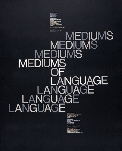
Apropos for a sleeve designer, Ersatz is an album primarily of “covers,” songs first performed by others. In a way, the album is, in its construction, a précis of Bubbles’ music-related career. With 13 tracks, the first side echoes the punk/post-punk style, which specialized in large groups of snappy, short songs.

Recent precedent existed from 1978 with Wire’s 21-track debut Pink Flag or the 1980 Bubbles-designed Get Happy!! which sported 20 total tracks, ten to a side. The Ersatz verso presents a single, side-spanning track—reminiscent of a extended Hawkwind space epic.

The album’s first side of cover tunes fulfills the replacement aspect of the title, declaring its own product to be a poor alternative. The songs are misfits to begin with, culled from the fringes of rock and roll’s early days. They’re affectionate piss-takes on novelties that were fairly alimentary to begin with.

Provenance isn’t a concern: three of the tracks are credited to “(Unknown).” The most notable of the songs are still obscurities, known for being re-recorded by prominent bands. “Brand New Cadillac,” appeared three years earlier on The Clash’s third LP London Calling. In 1981, The Cars demo-ed a version of The Nightcrawlers’ 1967 minor U.S. hit “Little Black Egg.”

Among other topics, tunes extol standard rock and roll subjects like Chinese food (“Moo Goo Gai Pan”) and detectives (“Fu Manchu”), space probes (“I Took a Trip on a Gemini Spacecraft”), psychedelic drugs (“I Want to Come Back from the World of LSD”), and…fungus (“There’s a Fungus Among Us”). Many of the originating bands hail from the States, home of millions of garages and attendant rock aspirants. Though numbered as discreet tracks, the songs blend and bleed into each other.

Bubbles wasn’t coy about his intentions with the record. According to Paul Gorman, he declared to a friend that the music was “inspired rubbish, loud and in extremely bad taste.” There’s plenty of operative bands that flaunt that attitude, but anyone hoping for an anglo-Cramps is setting their expectations far too high. Bubbles scribbled out some rough outlines—a full-fledged framework would be too confining—and let his collaborators fill them in. Lurching outside the sketchy borders was encouraged. Anyone in the studio at the time was invited to bang along.

Though steeped in humor, Ersatz isn’t a novelty album, as it contains performed and/or assembled compositions. While the performances and “arrangements” fall decidedly on the anarchistic end of the scale, it isn’t due to a lack of ability on the performers’ part. Bubbles deliberately mixed sawdust into his musical bread.

The record was assembled from sessions Bubbles had occasionally directed and participated in with sympathetic musicians—primarily Inner City Unit, saxophonist Nik Turner’s post-Hawkwind band. The performers’ proficiency was deliberately hampered by Bubbles’ method. Musicians were given lyric sheets and a single listen to a tape of the songs they were to play.

Bubbles also performed for the record and was a competent musician in his own right. Recalling their mutual Twickenham College of Technology days, former Small Faces keyboardist Ian McLagan said Bubbles “was a huge fan of Big Bill Broonzy and could play pretty good gut-string guitar in that folk blues style.”

The first side of Ersatz features songs with basic guitar/bass/drums rock accompaniment on each track with coloring provided by sax, piano, and organ. Performances are sloppy, by turns hung loose or studiously exaggerated. Every instrument will occasionally stray from regular order, becoming assertive or wandering off on its own. Drums follow a steady rock or tribal beat. The bass keeps to its lane, usually in sync. Vocals are spoken, shouted or comically-voiced.

Sometimes the vocals and instruments will be adorned with echo, evoking 50’s era rock and horror movies. Inserted among the clamor are ersatz instruments: shattering glass, power tools, and bashing on a tractor-trailer. Crude sampling also plays a role, with fragments of Wagner spliced into the raucous second side.

Though Bubbles plangently proclaimed a trashy aesthetic, some other purpose seems at work with the willful amateurism and noise-mongering. An antecedent may be the Portsmouth Sinfonia, a British classical music ensemble that spanned the 1970s. It welcomed any comers, combining the trained (though on unfamiliar instruments) with rank amateurs. Though their performances were cause for hilarity, the intent wasn’t humor or to mock the music. Participants were directed to perform to the best of their abilities.

Founded by experimental composer Gavin Bryars, the orchestra was a high concept take on music and mastery. Fittingly, the famously untrained Brian Eno joined the ensemble on clarinet, produced their first two albums, and featured them on his Taking Tiger Mountain (By Strategy) track “Put a Straw Under Baby.” Along with his avowed autodidaction in music, Eno often imposed physical and conceptual constraints on studio musicians that interrupted their prowess. His Oblique Strategies were employed in service of fresh attitudes toward music, to foster novelty and sass.

Bubbles’ concept was lower but conveys a deconstructive reverence for the genre. He designed for and identified with the punk and new wavers. Overall, Bubbles had empathy with the misfits, his attitude being (according to Jake Riviera, speaking of Barney’s work for Johnny Moped), “Bring me your dented and out of shape.” Moped and his ilk represented a return to rock and roll’s rough and ready Teddy pre-Beatles roots. Fervor and fun were critical components; maestros could fuck off. It was deadly serious (“We mean it maaaan!”) and flippant (“And we don’t care!”)—all in the same band.

It could be that Bubbles decided to take this sensibility to its illogical conclusions. He’s showing the youngsters how it’s done—or just getting in on the fun. Where early rock and roll was rudimentary by nascence, stripping songs down to their bones was a widespread new wave stratagem.

A frequent aspect of punk and post-punk covers of classics hits was toying with tempos. Rhythms were regularly sped up to a breakneck pace, or slowed to a plod, or tooled to a robotic pulse. In increasing melodicism, there’s Devo’s version of The Rolling Stones’ “(I Can’t Get No) Satisfaction,” (Bubbles designed the Be Stiff EP containing their original recording of the song), Magazine’s frosty Sly Stone “Thank You (Fallentin Me Be Mice Elf Agin),” and the Eno-directed Talking Heads slow burn version of Al Green’s “Take Me to the River.” The songs were veneration and negation in stereo, revealing the artifice of music as pop product and prayer.

Bubbles slightly extended the axis of anti-mastery that punk reanimated, nearer to the desired absurdity. To elude any semblance of commercial viability, he would have to drop below new, lessened standards. In 1979, David Cunningham’s DIY project The Flying Lizards had scored hits with their tinker-toy takes on “Summertime Blues” and “Money (That’s What I Want).” Ersatz resembles a rough, joking demo of either, or the product of a poor mix.

In looking for antecedents to Bubbles’ endeavor, a possible influence—or at least, confluence—may be with an American group with lower-fi, hippier, and deeper roots. That connection combines Ersatz’s two sides and engages the records’ covers.

Side two of Bubbles’ record is comprised entirely of the audio collage “Insolence Across the Nation,” and credited to Imperial Pompadours. Like its first side songs, “Insolence” is sparse; at its busiest it will have competing stereo separated voices over music and sound effects. The effort is less “Revolution 9” than a recording of an absurdist drama.

Bubbles friend and Ersatz performer Nik Turner explained to Paul Gorman that “Barney said he wanted to do something about the life of Hitler…I selected quotations from Mein Kampf, Mad King Ludwig and Wagner and also from the women in all their lives, and then recorded random visitors to my flat reciting them.”

With its Wagnerian bluster and Fuehrer proclamations, “Insolence” abandons all subtlety, abjuring metaphor for blunt force audio trauma. To quote occasional client Dave Edmonds, it’s as subtle as a flying mallet. The sleeve listing for the track indicates it was “recorded LIVE at Krankschäft Kabaret.” Krankschäft was a name subsequently used by a backing band for sometimes Hawkwind singer and lyricist—and Ersatz vocalist—Robert Calvert.

The side fades in on a distant jazzy saxophone-led instrumental that dips under narration. The first voice suggests a fairy or folk tale is about the start. The Mein Kampf quotations kick in around the 10-minute mark, arriving with a jolt and growing increasingly vile. Speakers frequently adopt pompous or cartoonish villainous tones, often undercut by sniggering and snide responses. After a crescendo, the Wagner slowly fades out as the track began.

Invoking Nazi Germany in a rock and roll context was neither unique or original with Ersatz. Nor was presenting fractured takes on pop songs. San Francisco-based avant-gardists The Residents went there years earlier with their 1976 second LP The Third Reich and Roll. That LP mashed together skewed versions of singles and commercials over two side-long pastiches called “Swastikas on Parade” and “Hitler was a Vegetarian.”

Third Reich is entirely comprised of merged mutant versions of 60’s and 70’s popular music (rock, funk, soul, folk) ranging from Count Five’s “Psychotic Reaction” to America’s “Horse with No Name.” While the former is more in line with Bubbles’ obscure tastes, the majority of the 29 songs are classic Top 40 hits, though frequently unrecognizable. Songs can overlap completely, or have components interjected into others. Where Bubbles listed his individual tracks, on its release The Residents left listeners to discern what ingredients made up their sonic stew.

Ersatz and Third Reich and Roll are twinned transpositions of each other on the Nazi aspect. Bubbles loudly places his Hitler content only in the tracks. His sleeve gives no indication of what’s to come. Meanwhile, The Residents’ grooves are devoid of any such references. But the album title and cover imagery prominently invoke the Nazi past. Swastikas abound on the cover, which features a Hitlerized Dick (American Bandstand) Clark.

Commercialization is a career-long subject for The Residents and pop music is a target rich environment for satire. But invoking Nazis blows away any nuance, resulting in camp. Bubbles is as unfocused conceptually with an offering that aspires to be “something about the life of Hitler.” “Insolence” easily clears that low hurdle. It’s an open question if it’s something more.

These were the early Margaret Thatcher years, which galvanized many musical protests. The right wing prime minister’s nationalist, capitalist triumphalism outraged progressives of all stripes. Comparisons to Nazism and fascist states flowed freely. She was supported enough to serve eleven years as PM, and widely reviled. Either side could be tarred as impertinent in their stance.

The parallels between the two albums suggest an awareness. Bubbles traveled to San Francisco in 1978, but there’s no record he had any exposure there—or subsequently—to the Residents. But their arch humor seems just his style.

Bubbles could also be tweaking the fashion choices of certain musicians of the day. Some punk and post-punk acts flirted with Nazi symbols and imagery in ways that weren’t apparently ironic or condemnatory. And the Sex Pistols infamously offered “Belsen Was a Gas” (performed last at their final show—in San Francisco). Naïveté and cheap outrage were criticisms leveled at musicians wrapping themselves in Nazi iconography. Bubbles could be making a blunt retort and providing a schooling in the actuality.

While acoustically disconcerting and in subject matter, “Insolence” is only half the record. Graphically, Bubbles emphasizes the album’s wider sensibility of evoking the past. The sleeve design has a rough equivalence to the music. Both are unstable and convention-challenging.

♭♭

On the surface, the music and design of Ersatz are opposed—another Bubbles contradiction. The design of Ersatz is a characteristically self-effacing gesture for Barney Bubbles. Neither his name or his voice is on it. The package is simple, direct, restrained: a conventionally professional product. Variances are conceptual and considered.

An unruly, David Carson-like expression would be a reasonable expectation for the formal representation of the rowdy Ersatz content. Capability or appreciation for such a manifestation isn’t an issue. Bubbles’ portfolio amply demonstrates he could successfully adopt an anarchic, immediate styling if desired. The entire folding outer wrapper of Armed Forces is a study of coordinated commotion.

A major difference is that Bubbles is solely responsible for the graphic performance. In the design studio, he was an off-the-cuff genius. He excelled under the tightest deadlines and budgets, reduced means, and in crappy quarters. Barney made great design literally out of garbage. On their own, the sound studio games, if transferred wouldn’t bring the same crude result. Graphic dissonance in the Ersatz sleeve had to be subtler.

What aren’t distinct, planned Bubbles quirks are ambiguous, attributable to pragmatic economic decisions or stylistic twists. For instance, though a full-fledged 33 RPM album, Bubbles housed the disc in a flat sleeve meant for 12-inch singles. This confuses expectation of what the nature of the record is.

In keeping with its throwback rock and roll, the package design is back to basics. Absent are extravagances such as die cutting for X in Search of Space or Armed Forces, photography, or even color. The only printing ink employed is black, with selective screening to produce a grey tone. Just as might be seen on albums pre-Sgt. Pepper era LPs, the front cover featuring an image and the reverse consisting entirely of text: the track titles and credits.

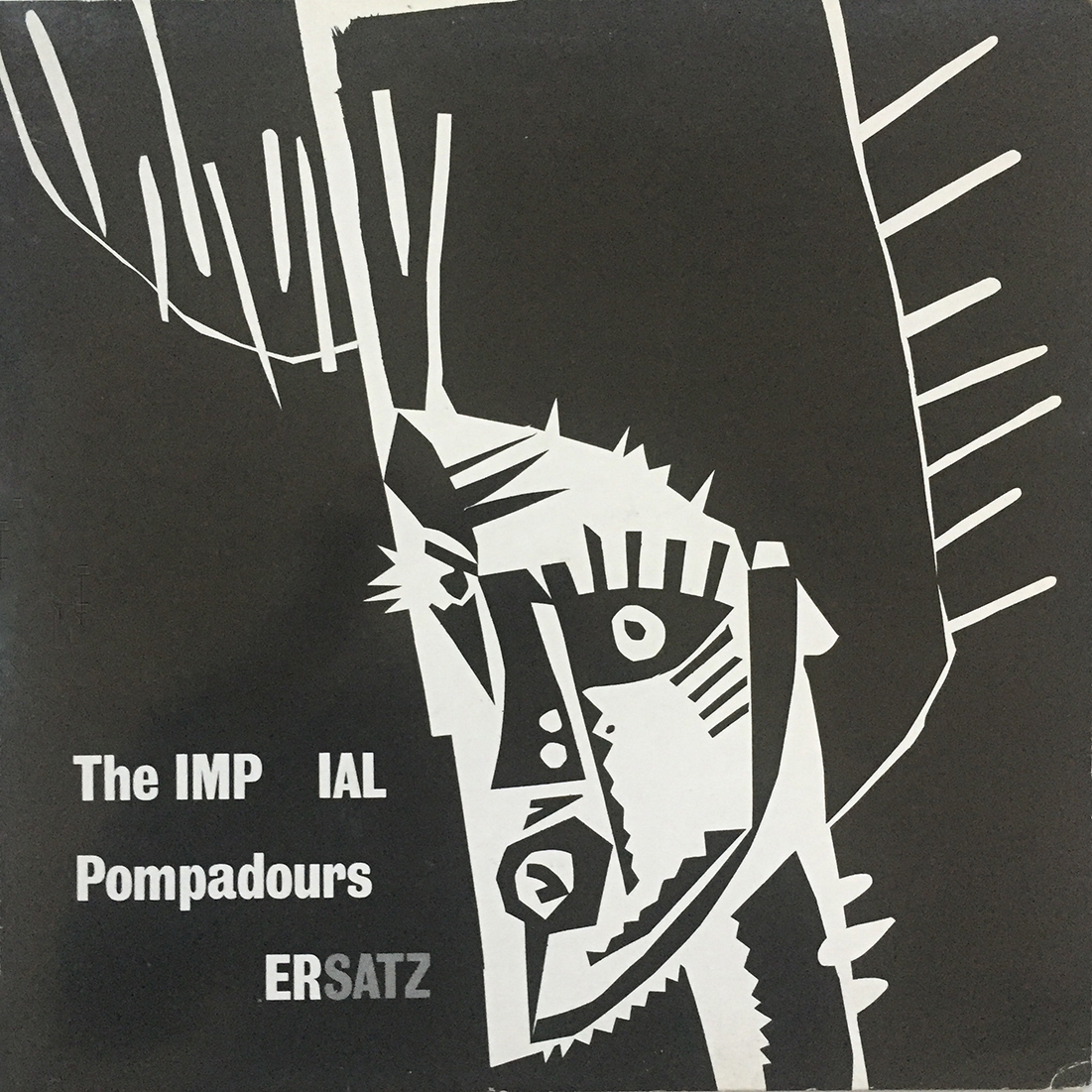
Characteristically, Barney puts his portrait on other people’s records, not his. According to Paul Gorman, the cover illustration is a freakish “Elvis Presley in the woodcut style of Flemish expressionist artist Frans Masereel.” The brushed ink and cut-paper King sports an enormously elevated coif that bleeds off the top of the sleeve. The pompadour reinforces the throwback aspect, amplifying a 1950’s era hairstyle.

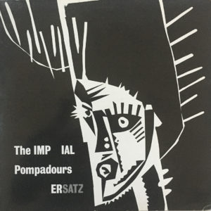
Bubbles turned to this particular manner of illustration for a number of albums during this time, notably for a portrait of Billy Bragg and the cover for his Brewing Up with Billy Bragg and for Inner City Unit’s Punkadelic. A full-color example can be found with the flautist figure on Imperial Bedroom.

The album title is placed contra-commercially in the lower left-hand corner, as if spoken by the Elvis figure. Its frisky setting is a frequent flourish from Bubbles’ benign typographic trick bag. The “ER” is dropped out of “IMPERIAL” to complete “ERSATZ.” It also forms by subtraction “The IMP”—a little devil. (Jake Riviera and Elvis Costello’s post-F-Beat label was named Demon Records.) All text is reversed out, save for “SATZ,” which is screened to grey. “IMPERIAL” and “ERSATZ” are capitalized—is Bubbles announcing he’s (the) Mock King?
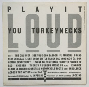
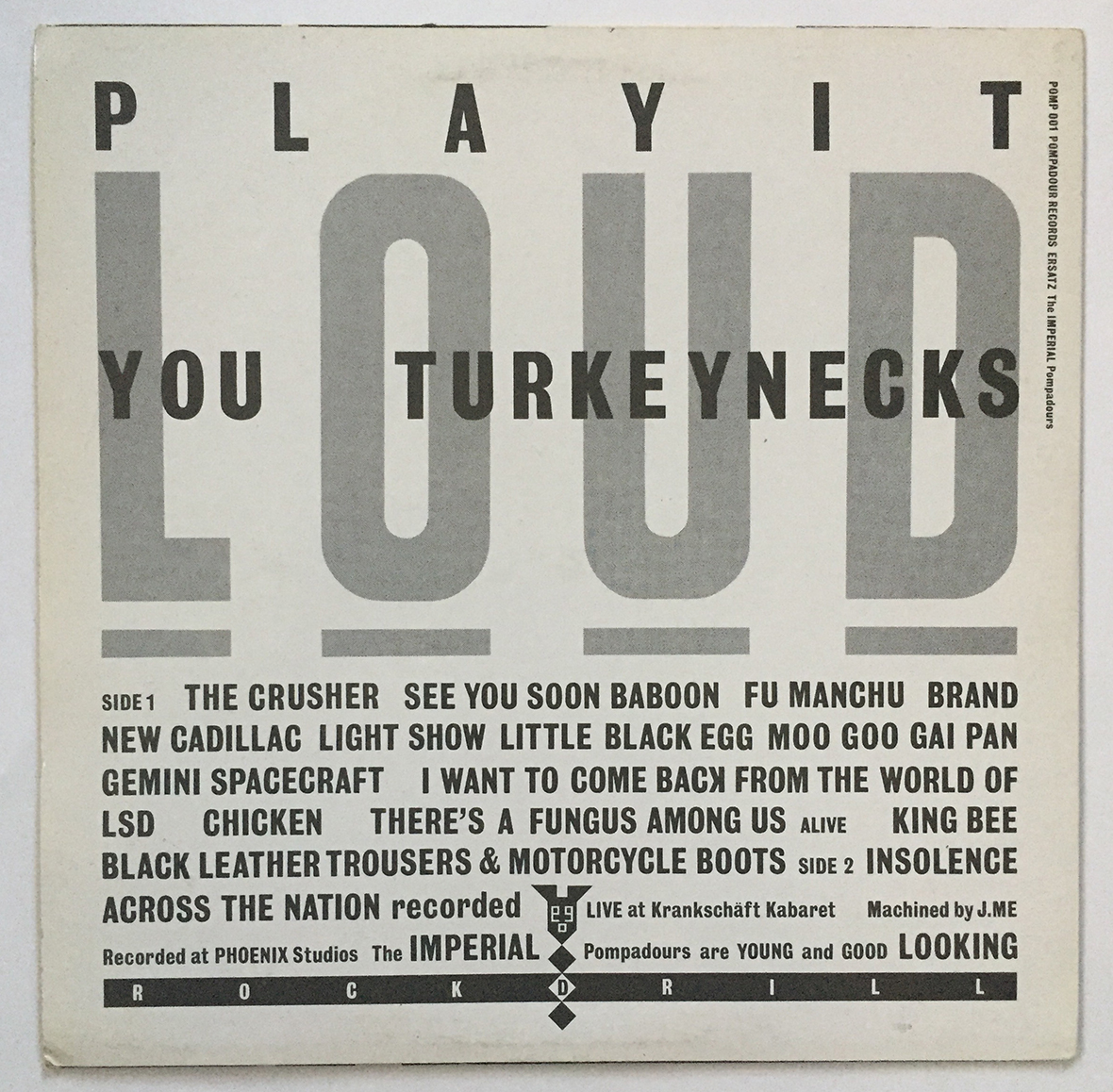
PLAY IT LOUD YOU TURKEYNECKS” dominates the back cover in large caps, filling roughly 2/3 of the vertical space (the cover figure definitely fits the description in its neck). The words are lifted from the album’s kick off track, “The Crusher.” “LOUD” is the sole text screened grey and placed behind the black text. Each letter earns its own underline to doubly emphasize the command. Minimal legal text (catalog number, label, artist name and album title) run down the upper right edge of this text.

All the text set on the back-cover text is force justified and styled contemporarily, rendered more expressively than the practical layouts of the 50’s and 60’s. That expressiveness manifests solely in arbitrary changes in scale and capitalization. It’s a rough equivalence with the variable volume of elements in the music. The track listing runs the all caps titles together in a force-justified block. The face is a Grotesque, similar is style to that found on the reverse of early Beatles albums (though not exclusively theirs).

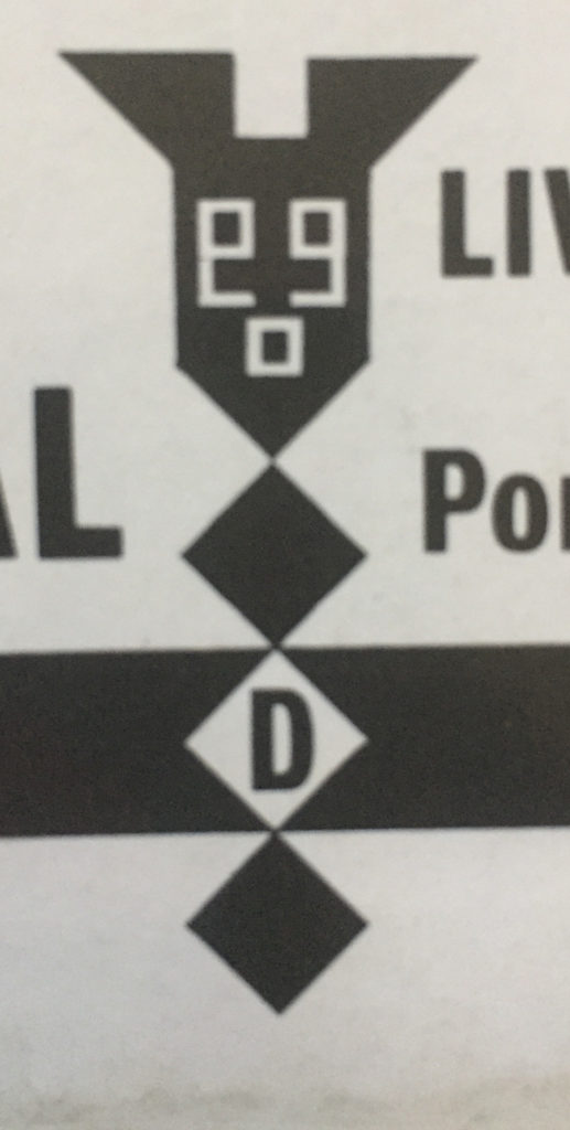
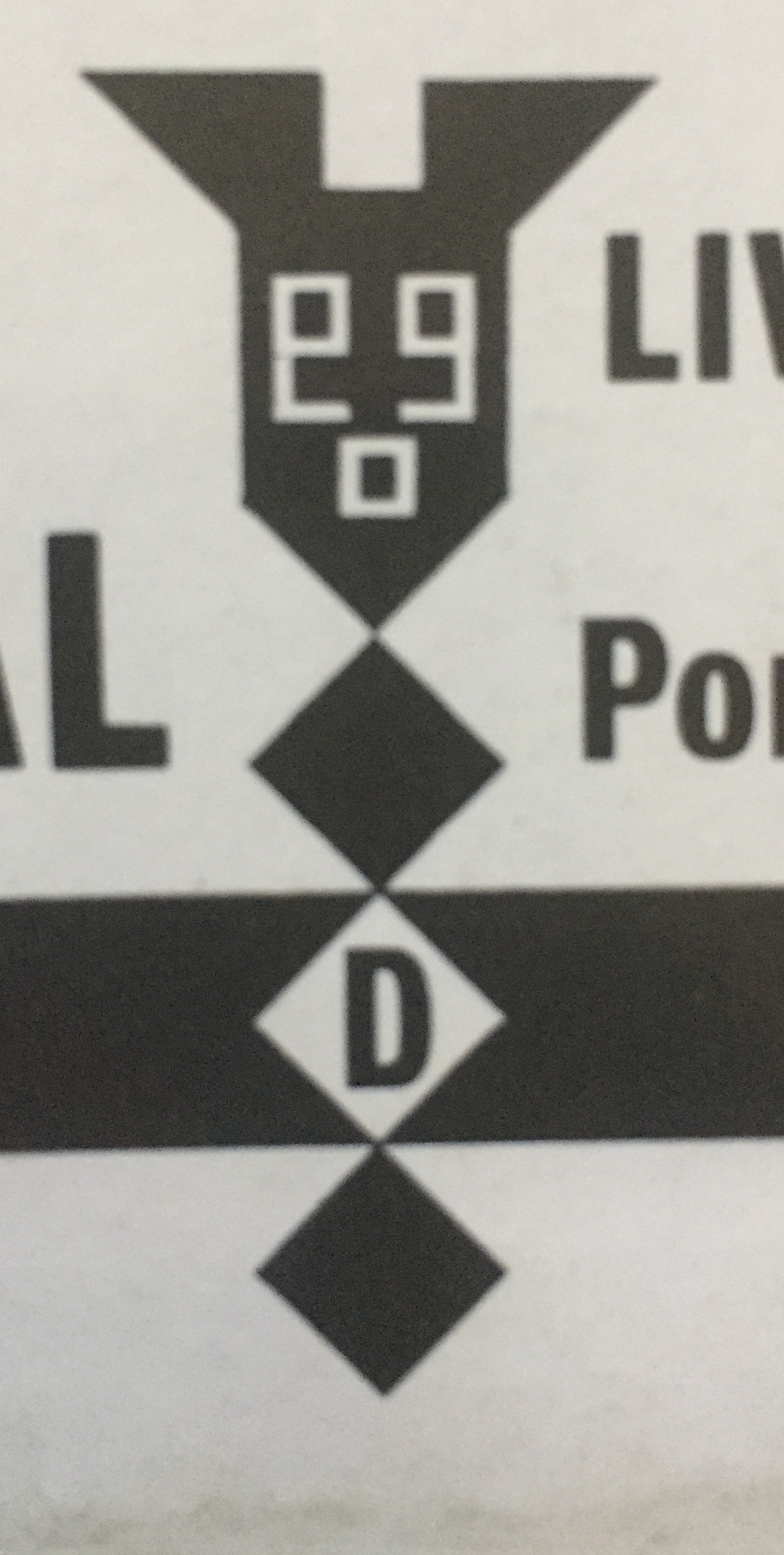
The lone graphic is one of Bubbles’ custom sigils—a stylized screw penetrating a thick black horizontal rule emblazoned with “ROCKDRILL”. The “D” of this word is on the screw’s point. This graphic appears anthropomorphized (as with “Timmy the Talking Toolbox” on the cover of Ian Dury’s Do It Yourself) with a “face”: opposed mirror-image open single quotes over a square/period “mouth.” The trio can also read as “ego.”

It’s in the track listing that Bubbles visually echoes the music’s instability. He does this primarily by blundering around with titles across the sleeve and record label. The names of songs vary between sleeve and label, sometimes abridged, sometimes not, to no discernable reason. It may just be in service of typefitting, always a challenge with justified settings.

“Fu Manchu” on the cover is “Don’t Fool with Fu Manchu” on the label, “I Want to Come Back from the World of LSD” is abbreviated to “I Want to Come Back from LSD.” Other titles differ in tense: on the sleeve “There’s a Fungus Among Us,” on the label the fungus has moved on. And some are combos: “Gemini Spacecraft” expands to “I Took a Trip on a Gemini Spaceship.” (And rhymes!)

Apart from the dropped title text, Bubbles indulges in minimal type trickery, mostly in point sizes and capitalization. He does horizontally flip the “K” concluding “BACꓘ” in “I Want to Come Back from LSD.” While often fanciful, Bubbles’ typography was always judiciously deployed, never overpowering layouts.

As with the music, why be a stickler with text? Scratch out a clumsy guitar solo; scribble down titles on scrap paper. On the radio or in concert, they don’t always announce the song titles, or they mess them up—who cares? What matters is how they sound, bro. Which is better after a few brews, honestly. These guys might consider rehearsing sometimes before hitting the stage. So “Light Show” (a wink about his alias and early career?) and that LSD song are flipped on the cover—it’s straightened out on the label. Are you hear to rock or proofread?

The package comes with a plain inner sleeve but includes a bespoke record label extending the cover theme. Labels have black text on a solid white background. The face used throughout is an all caps bold condensed Univers, a regular BB choice for this usage. It’s also used for a simple wordmark that features one of his shared character type treatments that forms “POMPADOURECORDS.”

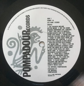
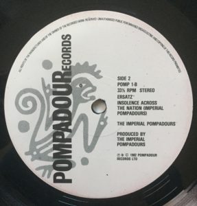
Screened to grey behind this vertically-reading text is another illustrated figure, which may be meant as the Pompadours Records logo as it’s repeated. This line drawn creature—monkey? (one song is “See You Soon Baboon”) Lizard? It boasts a curled tail—wears another wacky ‘do. The simianewt is open-mouthed as if singing or shouting, arms raised with pointed index fingers as if dancing or proclaiming. It looks askance at us with a solid black pupil.

In what may be a nod to his musical co-conspirators, the package has similitude with Inner City Unit’s first LP, Passout (RI¿¿LE Records, 1980). Rather than devise a grandiose or unique cover, it fits in with his overall direction in sleeve design at the time. He didn’t place himself above or apart from his clients.

♭♭

Bubbles’ training was Modernist and he was an articulate student of design history. The total designer spread his sensibility into all creative forms. With Ersatz, Bubbles could now claim music with art, design, furniture, and video. A record was inevitable.

Across all his work, in all media, is the elevation of the mundane, a collapsing of low and high cultures, historical forms re-imagined and re-contextualized, the integration of found materials, humor, adventure…and games. He worked fast, made do, and reveled in and revealed with it. Accident was embraced and incorporated. Tangents followed. Answers and identity withheld.

Ersatz isn’t the key or the masterpiece but a synopsis of Bubbles’ design, the order and the anarchy. In the end, listening to Ersatz isn’t as satisfying or elevating as experiencing his other media, especially the design. After many listenings, it’s growing on me (which may be more a testament to the songs than the performances), slowly revealing not secrets but the consistent question of his work.

Is this a real record? Isn’t it just a one-off vanity project, a goof, for patrons that specialized in these kinds of things? Real in art usually means more. Is that a real measure of something’s truth? That you’re able to repeat yourself? (What about say something once, why say it again?)

We’ll never know if there was an intended follow up. Are there more songs in the can? It’s not like your typical band’s first release, and Ersatz just contains all the best songs from their stage repertoire.

Everything about the record says one and done. Ersatz may exist just to exist. To be a real record, it had to have sounds on it, so Barney made some, having the most fun he could. It’s the purest expression of his work as there was zero pressure to make a hit. Don’t care for it? Hey, the record’s title announces there’s better elsewhere.

Barney Bubbles’ work always seems to prompt the question: Is he (for) real? The fucked-up quality of this record begs cult status—a feature for him, not a bug. The anonymity and pseudonyms (does he really exist?) undermines his career. The graphic games, puzzles, secret meanings, variations—all commercial poison.

Bubbles never resolves the essential conflict of making a living doing something you love. There’s a real romanticism to this willful contrariness and obscurity, in the work and the person. He just can’t help himself. Bubbles should have been famous and may get there yet. But alive, he was having none of it.

Ersatz is real, it just isn’t right. Ersatz is both. So, if you’re in the market for Barney Bubbles, dis-order now! Ask for him by names. Accept all substitutes.

♭♭

“No one I know, including myself, has listened to it all the way through. It is not meant to be.”
—Lou Reed, original liner notes to Metal Machine Music (The Amine β Ring) (RCA, 1975)

♭♭

Note: This is the third part of my ongoing study “Barney Bubbles: Offset Identities.” The previous two can be found in the “Writing” section. These essays draw from Paul Gorman’s book Reasons To Be Cheerful: The Life and Work of Barney Bubbles (Adelita, 2010) for details and quotes about Bubbles’ life and work.

Character References: On Emigre type specimens

esamplers

Earlier this year, Gingko Press published Emigre Fonts: Type Specimens 1986-2016, a comprehensive collection of Emigre’s distinctive print samplers. A couple years previous, I went through my personal collection of their specimens dating back to the early 1990s and wrote this appreciation for a project that wasn’t realized. However, on the (late) occasion of Emigre’s book, here’s the essay.

When Rudy VanderLans announced that issue 69 would be the final publication of Emigre magazine, he emphasized—via a “reminder” from partner Zuzana Licko—that it wasn’t the end of the company. Considering the magazine’s primary role in determining Emigre’s identity, and that the journal was its namesake, the notice was necessitous. The foundry that had become the core business would continue developing and vending type.

In addition and importantly, the specimens that promoted their typographic works would continue to be produced. VanderLans had separately declared a commitment to continue these print pieces. The pledge placed Emigre in a distinct minority. We’re in a time that has seen a marked decrease—if not total abandonment—of foundries issuing physical type catalogs. Whether it was a decision based in pragmatic marketing or a nostalgic nod to the unended print, VanderLans’ avowal was welcome among aficionados of everything Emigre. The magazine was an acceptable but tough loss. Having to also bid farewell to the catalogs could have been devastating.

While Emigre magazine was a fundament in its firmament of products, it was always only one aspect of a constellation of printed works that grew up around it and the foundry. By VanderLans’ estimate, the company has generated close to 200 printed artifacts, comprising catalogs, specimens, posters, brochures, postcards, pamphlets, and other printed ephemera published since 1984. All converged in the magazine and spun off from it.

Foremost amongst those ancillary works were the specimens that introduced individual or a selection of faces, and the annual inventory of the Emigre library. In the magazine’s heyday, the boundaries between it and the specimens blurred. For many designers and some critics, Emigre magazine was little more than a glorified type catalog. Curiously, and revealingly, the distinctive critical content is downplayed, if not dismissed. The pioneering type design and marketing originalities are highlighted. Zuzana Licko’s typographic innovations have been evidently easier for the design field to assimilate than the ideas set in her landmark faces.

The appraisal of Emigre magazine as elaborate sales brochure denigrates both the journal and the full-fledged specimens. Emigre absolutely made, and continues to make, glorified type catalogs—but they are the catalogs.

Emigre’s type specimens are the intersection of its two signal accomplishments, the magazine and type design. They are also the most representative artifacts of the partnership of Licko and VanderLans. The reputations of their other products understandably overshadow the catalogs. While the magazine and type have received considerable attention and documentation—most recently in the Emigre no. 70 anthology—the specimens go largely unnoted.

Both for their connection to and fusion of Emigre’s more celebrated work, and as artifacts in their own right, the type specimens are worthy of separate attention. All the aspects of Emigre’s contributions to contemporary design are present in form and content. If, as Rudy VanderLans regarded them, issues of the magazine are considered graphic “albums,” the specimens are the “EP’s” and “singles.”

Emigre’s specimens are notable for the negotiation of practical considerations and creative idealism—the essence of all graphic design. They demonstrate an adept dovetailing of these concerns, crafting a format that stimulates desire then provides an efficient vehicle for satisfying it. A balance is struck between providing an enthusing context for the type while not overwhelming it. Though far from “neutral,” the framework is evocative and clear.

This framework has become more involved than embellishing the traditional catalog display. A rethinking of purpose and presentation is evident across the history of the pieces. Emigre’s specimens advance upon earlier examples of the form that utilized it to advance a wider conceptual agenda on how typography is defined and practiced.

A precursor is William Addison Dwiggins’ specimens for his new type designs. His were more realized, progressive publications centered on type display. A simple necessity was embraced as opportunities to explicitly express his typographic philosophy.

emblemselektra

Dwiggins’ “Emblems and Elektra” specimen eschewed the rote alphabetic exercise to put forth a manifesto. “How is one to evaluate and assess a type face in terms of esthetic design? Why do the pace-makers in the art of printing rave over a specific face of type? What do they see in it? Why is it so superlatively pleasant in their eyes? Good design is always practical design. And what we see in a good type design is, partly, its excellent practical fitness to perform its work.”

Of course, that final statement is purely subjective. But as is often the case, the distinction of the type design supplies affirmation for his rhetorical position. Plus, you get a measured dose of Dwiggins’ delightfully idiosyncratic abstract illustrations.

Along with spurring a surge in digital type design, Emigre’s catalogs sparked a spate of inventive promos from a variety of short-lived and established foundries. Simply having the specimens was a practical necessity that isn’t attributable to Emigre. But the venturesome contexts adopted by many of the other foundries owe a debt to Emigre’s examples.

othersamplers

Often, the specimens were the most—sometimes only—interesting aspect of these other type designers’ efforts. As abstract works, separated from their sales imperative, they were engaging artifacts, parading wild, unfettered graphic novelties riffing off the theme of character sets. As proffers of usable type, they were far less viable. Simply put, I’d rarely imagine ever using faces from these specimens. But as elements in an “artist’s book” of Roman characters, they were engaging marks.

hoeflersamplers

That the faces were disposable didn’t lessen the charm of the specimens, which could get baroque in concept and hyperactive in the number and variations on a theme. Another intriguing exponent of the surge in specimens was that they provided scarce examples of graphic design by individuals known foremost as type designers. Jonathan Hoefler’s Muse publication lasted the one issue but was succeeded by a few catalogs that shared the same delightful classicist sensibility. Much as I admire his typefaces, I’d put money down for more Hoefler print objects.

The earliest Emigre specimen I own, “Signs of Type,” is similarly unique for its rare “Design: Zuzana Licko” credit. Absent the notice, the piece might easily be attributed to her partner in its presentation of her low-rez faces illustrated with bit-mapped scans. With all respect to Rudy’s work, I’d fantasize at times that on a lark, Zuzana might take on the layout of one my articles and afford me a singular design triumph.

The overall design sensibility of Emigre specimens naturally moved in parallel with the flagship magazine. Roughly, specimen history can be divided into the pre- and post-4-color eras. Pre-color, the specimens proffer VanderLans’ distinct formal sensibility but are straightforward in text and concept. The phrases set in the faces are descriptive of the type’s features and formal rationales. Or, as with Dwiggins, propound terse typographic manifestos: e.g. “Typefaces are not intrinsically legible; rather it is the reader’s familiarity with typefaces that accounts for their legibility. Studies have shown that readers read best what they read most.”

With the advent of full color publication—the time leading up to and after the end of Emigre magazine—the specimens bloom as deeper, broader artifacts in their own right. A preservation principle seems at work. The energy of the magazine couldn’t be destroyed, only channeled and adapted into another form. One of these alternate outlets was VanderLans’ book projects— Supermarket, the Palm Desert/Cucamonga/Joshua Tree music trilogy. And the specimens also received an additional infusion of vitality.

Specimens became small journals in their own right, offering broader speculations and investigations of type design. Short accounts of a face’s origins and the designer’s intentions regularly appear and expand. Experts such as John Downer provide extended essays on topics related to typographic revivals.

The text examples become extended haikus or proffer full-on stories. Writer David Barringer was commissioned to bring his fluent prose to the two volume “Little Book of Love Letters.” Other republished texts feature early-20th century writers on subjects like the geography of the U.S. southwest (a VanderLans obsession).

Other specimens give the type designers the opportunity to frame their creations in artist-book quality promotions. The late Frank Heine crafted two amazing booklets for his Tribute and Dalliance faces. Mark Andresen wrote and illustrated a VouDou tale for his NotCaslon booklet. Mr. Keedy generates a visual/textual polemic for Keedy. Elliott Earls does Elliott Earls. VanderLans himself imagines eccentric and elaborate historical markers for the Historia specimen.

The ultimate and ongoing charm of the pieces transcends their status as product catalogs. However attractively designed any specimen may be, it is as disposable as any graphic design artifact, if not more so. That the specimens’ primary type product is essentially unchanging presents a significant design challenge. Change is mostly through accretion: the addition of new faces to the library.

In broader terms, a common charge against graphic design as a discipline is the unapologetic disposability of its product. The overwhelming majority of graphically designed artifacts are properly characterized as ephemera. What then the products for a graphic design audience? Is the factor doubled? VanderLans’ fancy flights confront these realities and serve a very pragmatic purpose: how to make the same collection of forms fresh.

The particular genius of these works is their beautiful functionality: an equal balance of abstract aesthetic qualities and clarity of use. The feature in the specimens that best expresses this balance was the now discontinued order form. Their layouts were also divided across the introduction of process color. Within these diversities, they’ve remained fairly consistent: an incidence of an inability to improve upon perfection.

The forms are the most succinct expression of VanderLans’ design approach (his “inner classicist” in Rick Poynor’s description)—an articulate and resonantly apparent structure. As formal compositions, the order forms residing somewhere between El Lissitzky’s “prouns” and Sol LeWitt. Pre-process, the layouts were all right-angular, sectioned by thick rules that strategically extended beyond the form’s basic framework. With the introduction of color, circles came into play, accenting in hues and shapes. Actually writing on the forms didn’t ruin the effect. Rather, it became a lively, improvised vernacular accentuation.

Often, the underlying structure of VanderLans’ layouts are visible and made decorative graphic elements in its own right. (See Emigre #40, The Info Perplex issue for his most elaborate expression). This strategy has tangential relation to designs that display a visible grid, as can be seen in a number of classic Josef Müller-Brockmann posters. VanderLans’ structures, however, are more flexible and colorful. Their agile geometries are efficient to their task of segmenting and structuring space.

If enthusing over an order form as a counterpart to signature works by renowned artists isn’t grandiose enough, I’ll take a step further. As previously mentioned, many of the booklets stand among the finest artist books of any era. The Hypnopædia specimen, for one, is a marvel of pattern and color that rivals many painters’ output—not to mention its status as a triggering expression in the “rational/decriminalized ornamentation” movement now in full flower.

More than this, these specimens provide one of the best examples of graphic design demonstrating content in its own right. It’s a near universal tenet that graphic design is an applied activity, possessing no substance upon its own. But when considering these catalogs, they can be “read” the same way that abstract painting are. A color field painting by Mark Rothko is “about” color, physically about paint. These specimens are about character forms, physically about type. The specimens transcend the mundanity of words to express ideas of the representation of language. We can contemplate the letter as we might upon the hue of blue.

It is a charge, a challenge, I regularly place upon my students, and ultimately upon all graphic designers. Is this discipline of graphic design worthy of contemplation on its own terms? Might you pick up any graphic design artifact and enjoy it for the pure joy of its unique status that straddles and fuses form and function? Can you pick up and delight in a type specimen as you would a painter’s (or sculptor, or photographer, or what have you) monograph? Not seeking professional “inspiration” but sensual indulgence?

Graphic design artifacts are like nothing that came before them. Their motives and intentions are unlike any creative form now or since. And this stature is best represented in forms like type specimens. They speak volumes of potential, in the works they will conjure into being, and what they suggest for how we regard our past and current print culture.

A thorough documentation of the Emigre’s specimens is a valuable undertaking. Like the entire Emigre enterprise, the boundary was sometimes crossed to encompass booklets for its nascent music label, and some non-paginated pieces (though excluding posters). I’ve focused on the type aspect of these pieces, though most may be rightly considered catalogs for the entire Emigre product line. Whatever you want to call them, enjoy.