BB King

If Barney Bubbles was punctuation, he’d be an interrobang. He seemed incapable of the straightforward, singular expression. Everything divulged layers. His work and practice were a gestalt of contradictions and oppositions. Unpacked, it opened like a graphic Big Bang. Even a personal scribble from Bubbles exhibits minutiae that provoke a close reading. Why would it be any different from the rest of his oeuvre?

In his forward for Paul Gorman’s Reasons to Be Cheerful, designer Malcolm Garrett describes a message left for him by Bubbles, which included a rare self-portrait. “I SEE A VISION,” it read, “I SEE A ‘MODERN’ WORLD.” Crossing at chest level—ducking under the upraised left arm, floating over the extended right—the text precedes then trails after the sketchy figure. Even for a handwritten note, there’s typographic play: “WORLD” bends slightly, distinct from the rest of the text, the W hovering sideways above the O. “I SEE” repeats. Is it a stutter? Change of mind mid-thought?

The Bubbles caricature is moving away from the viewer, arms spread wide, fingers splayed. He might be maintaining balance as he confidently strides, left foot forward, right angled back, across an invisible tightrope or baseline. He could also be closing in to embrace someone off stage. Or be strutting. Or dancing.

There’s his signature schnoz, punctuated with a triangle and circle to form (according to Garrett) “Bauhaus nostrils.” Bubbles may not be seeing a “modern” world but smelling it, and liking the aroma. His mouth is described with pointed, puckered lips that betray no particular emotion or action. He could be silent, speaking, or singing.

The character is dressed in a geometric shirt or sweater, adorned with Charlie Brown-like zig zags at the elbows. Double-lined angles meet in the center of his back. Below, a curve of buttock is described to suggest snug-fitting trousers. Though likely dashed off, he still captures the detail of fabric bunched behind the bent right kneecap.

Bubbles deftly crafted an irreverent and expressive image of himself. Certain details stand out for their incongruency, complicating the reading. Springing from the top of his head, there’s what appears to be an unruly tuft of hair. He neglects to differentiate a shoe for the figure’s right foot as he does for the left.

With Bubbles, the game is always afoot, so intention and accident vie for cause. Usually, defects are revealed as effects. Bubbles’ work wasn’t so much designed as plotted, like a novel. The larger the seeming flaw—the “misprinting” of the This Years Model sleeve or the built in the scuff marks on Get Happy!!—the more purposeful he was.

Constantly manipulating aspects of identity, his penned persona is leading a double life. That spiky skull sprout isn’t just a coif, it’s a gimcrack crown. And that undivided ankle shows him to be wearing a costume—that of a jester. Yet again, Barney Bubbles has purposefully blended high and low, this time with him in the starring role. He’s his subject and Lord. The Fool King, or King Fool.

I see a “design” world conjured and ruled by Bubbles, the jester sovereign. He needed to create so prolifically, compulsively, in order to people that world. Its inhabitants were anthropomorphized combs, matches, handprints, paint splatters, typography, geometry, studio detritus.

He was a rare designer whose entire output—every ad, every sigil, every sleeve, every sticker—deserves delectation and preservation. Gorman’s monograph is a worthy document but doesn’t map the entirety of Bubbles’ domain.

He relentlessly churned out design artifacts: album packages, single bags, ads, buttons, stickers, posters, programs, and occasional books. Alongside these he crafted inventive videos, furniture, paintings, collages, sculpture. It was more than being prolific out of necessity, pushed by the breakneck pace of his primary clients. Its politics were a tad on the anarchistic side, though virulently antifascist.

Some designs were part of a wider system. A single sleeve might continue the layout aspects of the album it was drawn from—e.g. the single bag for “(I Don’t Want to Go to) Chelsea” and This Years Model—but this was an exception in Bubbles’ work. He seemed to regard it as slothful to extend an identity into other artifacts.

And within his album packages, there regularly were inner sleeves, bespoke labels (which could vary in design from one side to the other), postcards, posters, stickers. Many albums sported unique logos, or had the many variations for Stiff and F Beat. Bubbles also had his hand in illustrations and lettering—frequently wielding brush or stamp kit to create text. He should have been paid by the piece.

Bubbles production of countless supplementary, extraneous material was a hallmark of his profligacy. Within them, he didn’t simply rehash ideas, he developed themes across projects and media. Some sleeves contained more than one.

There was uncanny portrait Barney (Cycledelic, This Years Model, all Nick Lowe albums, The Future Now), painterly Barney (which includes most early works, Seconds of Pleasure, Imperial Bedroom, Compass Point), domestic kitsch Barney (Armed Forces front cover, Mad About the Wrong Boy), surreal saga Barney (25 Years On, Be Stiff EP, Frogs, Sprouts, Clogs and Krauts, Speak and Spell), quoting Barney (Almost Blue, Life’s a Riot with Spy vs. Spy), music vernacular Barney (Get Happy!!, A Case of the Shakes, Music on Both Sides), meta Barney (This Years Model, Do It Yourself). Broadening out to his overall logo designs, one theme emerges, that might best be described as regalia.

In his last years, Bubbles’ design for music increasingly referred back to the pre-1960s era of small, independent record labels catering to jazz, blues, R&B, and early rock and roll. It was a time when myriad upstart companies opened all over the U.S. that catered to local artists deemed problematic by the majors. (England’s smaller market was dominated more by their indigenous majors and so didn’t see the same flowering of labels until the punk/new wave era).

Bubbles’ designs mimicked the visual accents of these labels with often geometry-based graphics featuring demonstrative type in keeping with overall commercial packaging. Only occasionally did Bubbles pointedly quote a well-known indie source. Typographically mirroring the album Midnight Blue by Kenny Burrell (1963) on the famed independent jazz label Blue Note for Elvis Costello and the Attractions’ Almost Blue (1981) was Bubbles indulging in a double graphic pun. (A more slavish imitation was issued a few years later with Joe Jackson’s Body and Soul (1984) paying homage to 1957’s Sonny Rollins, Vol. 2.) Reid Miles’ expressive typography was a regular go-to template for numerous other sleeve designs.

Looking to the U.S. for popular music inspiration was an established sightline. Emerging from skiffle, British rock and roll owes its existence to American expressions. Even groups such as Fairport Convention, which drew from and electrified British folk songs, were inspired by the Byrds.

The dominant, declared evocation for British bands was blues and R&B. Groups like the Beatles and the Rolling Stones celebrated African-American artists (literally) ghettoized in the U.S. In their native country, these performers could only be found on small labels often named Regal, Imperial, Duke and King. Chess Records (originally called Aristocrat)—a major among the minors with a roster including Chuck Berry, Bo Diddley, Howlin’ Wolf and Muddy Waters—contained all of the nobility. (It was, of course, named after its founding brothers).

The U.S. embraced the symbolism of royalty to ennoble its musicians. Representational democracy is all that but being the President of Rock ‘n’ Roll doesn’t confer much glory. Maybe a Sinatra can carry “Chairman of the Board” and make it work. Senator of the Blues? Please. Elvis was the King. Aretha Franklin the Queen of Soul. And so on to Prince.

In a small irony, when Stiff Records released Mil Gracias A Todos Nuestros Amigos by Tex-Mex master Joe “King” Carrasco and the Crowns (1980), it didn’t come in a Bubbles sleeve, but was outsourced to Chris “C-More-Tone” Morton.

As Bubbles overall turned to referencing historic music graphics, regalia surfaced as a theme in his logo work. Alongside toggling between a couple of typography-based logos for F Beat, Bubbles established a three-pointed crown as the sole object-based mark. Perversely, he didn’t use it for the aptly-named Imperial Bedroom (1982) (or IbMePdErRoIoAmL, as Bubbles would set it), his last produced sleeve design for Costello. This was likely due to the crown’s appearance as logo on Trust (1980), two albums previously. By the time Costello got to King of America, Bubbles had abdicated from life.

Bubbles introduced a new theme with Get Happy!!—inhabiting album design’s past. Elvis Costello’s 1980 release marked his definitive break from a “brittle” new wave sound to adopting an overt soul and R&B template. Bubbles echoed this in his throwback design which fused day-glo new wave colors with a high contrast Reid Miles type vibe. Bubbles physically reinforces the retro move with partial lamination and the faux scuff marks (on the F Beat version).

(Another dated reference is my suspicion that the sleeve may be a sham 3D image. According to Tom Pogson, his cover painting for Armed Forces was intended to be 3D. The idea may have slipped one release. The possibility is raised by the curious hues of the intersecting parallelograms on front and back. Also, the mysterious “bug” placed in the top corners front and back of the sleeve has a prominent “3” in its center, overlapping three sets of hypnotic concentric circles. The shape at the base of the “3” resembles a cap “D” with a pointed tail. A test viewing with 3D glasses was unsatisfying.)

Bubbles was as versed and discerning about the history of album graphics as he was in art. In addition to Reid Miles, Bubbles channeled record design pioneer Alex Steinweiss. Mostly, he evinced the music graphics “vernacular” (scare quotes used as they were performed by trained but usually uncredited professionals) prior to the 1960s, when his deliberate anonymity was the professional standard.  

This theme didn’t dominate and was applied to other releases that invoked rock and country roots music. It generated a studied timelessness in Bubbles’ sleeve work, different in nature with his other pastiche motifs. Evoking fine art and album graphics dislocated Bubbles’ work from its specific date of manufacture.

The generalized reference to past album graphic styles replaced the overt quoting of high art sources. This is most evident in the transition from Armed Forces (actually, an amalgam of all of Bubbles’ themes) to Get Happy!!

Overall, with the entirety of his work, Bubbles was composing his own undeclared visual Lipstick Traces, drawing his own connections between music, art and design across history. The resulting diagram was like a spirographed circle. Bubbles wasn’t at the center, he was throughout.

That this theme came late and last in Bubbles’ career gives it a special poignancy, though there’s no evidence it held any for him. As noted, it was likely a pragmatic conceptual move, reinforcing and resonating with what was placed in the grooves. It was self-referential but reflexivity wasn’t new for Bubbles. It was upon returning to sleeve design at Stiff that a self-consciousness entered his work. The process of design and its artificiality became a constant, overarching subject.

His self-consciousness also manifested in questioning his relevance as a sleeve designer. As early as 1981, in his lone printed interview, he lamented being “staid and boring.” “I’ve got to get out,” he said, “It’s time for me to go.” Two years after the publication of that interview, Bubbles went.

I see a vision of a “post-modern” world where Barney Bubbles stuck it out longer. Maybe he’d still be with us even now, 76 years old, frail or hale. Following two designers he inspired, Peter Saville and Malcolm Garrett, he would have moved beyond full time sleeve design, and into other media.

But, like Saville with New Order, Bubbles would continue designing for musicians with who he had a special relationship. Hawkwind, naturally. He and Elvis Costello would get past the Punch the Clock rejection and continue their fruitful collaboration. Nick Lowe and Billy Bragg would also remain patrons. For them, Bubbles would even take on CD packaging, though he was indifferent to the format.

As his contemporaries Hipgnosis did, Bubbles would concentrate on video, overcoming his trepidation with the inability to manually edit and manipulate the medium. MTV and adventurous ad agencies provided him with a sufficient stream of clients seeking something surprising—and cost effective.

He was even able to branch out into documentaries and features, appreciated for his eccentric but affectionate take on British culture, politics, and domestic decor. It amused him to be shown on the BBC, because now it was where you see BB. He was still cagy about his name, dubbing his production company Fulcher Films.

He converted his Elephant Dollars film script (“a short film featuring rock’n’roll, but incorporating a love of trash movies, pulp sci-fi, bad true romance and the dumbest of humor. Its aesthetic is cheapness, surface flash and hipness”) into a series that gained respectable notices, particularly when aired on the American PBS network.

Vinyl came back, after a fashion. Bubbles returned to album art to joyfully launch into designing a round of commemorative box sets resplendent with new artwork and lavish companion books. There were no design credits.

Eye magazine still published Julia Thrift’s “In Search of Barney Bubbles” article in 1992. However, it came with a different slant and ending. The designer was agreeable to being interviewed about his “sordid past” but remained evasive and dismissive about his work. “King of the Bargain Bin!” he proclaimed himself.

Eventually, there was a documentary on Barney Bubbles, from a Fulcher Films protege. Rumor was that Bubbles actually directed it himself. Though photos were shown of the young Barney, the filmmakers substituted other, associated figures speaking Bubbles’ interview lines. These bogus Barneys were either silhouetted—sporting obviously fake noses—or friendly stand-ins with prominent proboscises, like Billy Bragg and Pete Townshend (to make up for the aborted Who Are You commission, the band hired Bubbles to package one of their myriad rarity collections). Each received a caption identifying them by a Bubbles pseudonym.

The biopic’s last scene featured Elvis Costello (identified on screen as “Declan McManus et al.”) casually handling a copy of My Aim Is True as he relates the story of Bubbles directing him through the cover photo shoot. Hanging on the wall behind Costello is the canvas of Snakecharmer & Reclining Octopus, the “Sal Forlenza” painting used as the cover of Imperial Bedroom.

Concluding the tale, Costello stops speaking for a moment to actually focus on the album cover. “Barney did all these letters individually, you know,” he then says, “the ones spelling out ‘Elvis is King.’ He may have spent more time on that than I spent on the music!” A beat. “That was Barney. He was King.”

The picture suddenly jumps, as if the film has leapt from its sprocket holes. In faulty magic marker, a scrawled word is then jerkily inserted into the frame: Fin.

Note: This is the fourth and concluding part of my study “Barney Bubbles: Offset Identities.” The previous episodes can be found in the “Writing” section. All the essays draw from Paul Gorman’s book Reasons To Be Cheerful: The Life and Work of Barney Bubbles (Adelita, 2010) for details and quotes about Bubbles’ life and work.

Bubbles’ pop

“Most of you won’t like this, and I don’t blame you at all. It’s not meant for you.”
—Lou Reed, original liner notes to Metal Machine Music (The Amine β Ring) (RCA, 1975)

♭♭

For Barney Bubbles, ersatz is as real as fake gets.

Due to his myriad puzzles and conundrums, it’s tempting to look for a skeleton key to Bubbles among his diverse productions. Is there a deciphering work? There are masterpieces such as Armed Forces that showcase most aspects of his design imagination. And for that sleeve, he even placed a self-portrait inside center.

The written record is thin where he speaks directly about his work. And when questioned, he manages to be simultaneously forthcoming and evasive. Most artists profess to speak through their work and Bubbles labored to leave us little else.

We do have a vinyl record that’s thick with meaning. The best candidate for the definitive Barney Bubbles work would seem to be his own and lone album Ersatz, released in 1982 under the moniker The Imperial Pompadours. Issued on an F-Beat one-offshoot imprint also called Pompadour Records, Ersatz inverted a concession made to select performers.

Labels frequently pander to their superstars by allowing them to create their own cover designs, regardless of their objective skill at design or illustration. (You tell Bob Dylan how ghastly that painting is, Mr. A&R Man.) Flipping the script enters the realm of the commercial unnatural for a major label.

Of course, such eccentricities were a regular feature of Bubbles’ chief champion and sponsor, Jake Riviera. Issuing an album by the label’s primary sleeve designer, even pseudonymously, is a prototypical perverse move. For instance, in 1980, Stiff Records issued the one-off joke album The Wit and Wisdom of Ronald Reagan. A shadow release attributed to Magic Records (“If it’s a success it must be Magic!”), the LP sported grooved—but silent—tracks.

Bubbles’ record should be filed with the 1982 promotion-only F-Beat LP, The Art of Roger Bechirian, Vol. 1. That album was a compendium of songs shepherded to disc by the ubiquitous engineer/producer (there was no volume two). It also featured an Alex Steinweiss homage sleeve design by Bubbles.

In his introduction to Paul Gorman’s Reasons to be Cheerful, Billy Bragg says how Barney Bubbles seemed like another member of the band. However, as simpatico and necessary as Bubbles may have been to those musicians, he was never regularly afforded such credit. Still, non-instrumentalists occasionally received equal billing alongside players. Lyricist Bernie Taupin got props from Elton John and Procol Harum’s Keith Reid was listed as band member.

Bubbles’ circumstance has similarity with another non-performing figure, Peter Sinfield. For his “words and illumination”—lyrics and stage lighting—Sinfield was accorded full member status beginning on King Crimson’s 1969 premier album In the Court of the Crimson King (which, upon its release, music critic Robert Christgau dubbed “ersatz shit.”)

As that group dissolved and reconfigured over their first four LPs, his role expanded to co-producer and noodling with a synthesizer off stage. When Sinfield was ultimately on the outs, he released his one and only album Still in 1973, on Emerson, Lake and Palmer’s Manticore label. Lake was another original member of King Crimson, and the record had contributions from other former and current personnel.

Bubbles’ closest and longest relationship with a band and its offshoots was with space-rockers Hawkwind. As influential as he was, the group never included Bubbles in their ranks. He is only one of six names listed on the sleeve of X in Search of Space under “optics/semantics,” which echoes Sinfield’s acknowledgement. Though arguably more distant from the action than Sinfield, Bubbles’ band buds supported his own venture into recording.

♭♭

Ersatz is a concept album, though not in the usual rock music sense. There isn’t an ostensible narrative running through and connecting the separate songs. Instead, Ersatz manifests themes of eccentricity, obsession and substitution graphically and sonically. Layered on top is a fixation on World War II, an experience that though not lived, permeated the consciousness of Britons of Bubbles’ (born in 1942) generation.

“Ersatz” is a German term meaning “substitute.” Inherent in the word is the suggestion of wartime goods. In the face of deprivation or scarcity, alternatives were fashioned. Coffee is brewed out of roasted acorns, tea from catnip. The connotation is of inferiority—bad goods.

Apropos for a sleeve designer, Ersatz is an album primarily of “covers,” songs first performed by others. In a way, the album is, in its construction, a précis of Bubbles’ music-related career. With 13 tracks, the first side echoes the punk/post-punk style, which specialized in large groups of snappy, short songs.

Recent precedent existed from 1978 with Wire’s 21-track debut Pink Flag or the 1980 Bubbles-designed Get Happy!! which sported 20 total tracks, ten to a side. The Ersatz verso presents a single, side-spanning track—reminiscent of a extended Hawkwind space epic.

The album’s first side of cover tunes fulfills the replacement aspect of the title, declaring its own product to be a poor alternative. The songs are misfits to begin with, culled from the fringes of rock and roll’s early days. They’re affectionate piss-takes on novelties that were fairly alimentary to begin with.

Provenance isn’t a concern: three of the tracks are credited to “(Unknown).” The most notable of the songs are still obscurities, known for being re-recorded by prominent bands. “Brand New Cadillac,” appeared three years earlier on The Clash’s third LP London Calling. In 1981, The Cars demo-ed a version of The Nightcrawlers’ 1967 minor U.S. hit “Little Black Egg.”

Among other topics, tunes extol standard rock and roll subjects like Chinese food (“Moo Goo Gai Pan”) and detectives (“Fu Manchu”), space probes (“I Took a Trip on a Gemini Spacecraft”), psychedelic drugs (“I Want to Come Back from the World of LSD”), and…fungus (“There’s a Fungus Among Us”). Many of the originating bands hail from the States, home of millions of garages and attendant rock aspirants. Though numbered as discreet tracks, the songs blend and bleed into each other.

Bubbles wasn’t coy about his intentions with the record. According to Paul Gorman, he declared to a friend that the music was “inspired rubbish, loud and in extremely bad taste.” There’s plenty of operative bands that flaunt that attitude, but anyone hoping for an anglo-Cramps is setting their expectations far too high. Bubbles scribbled out some rough outlines—a full-fledged framework would be too confining—and let his collaborators fill them in. Lurching outside the sketchy borders was encouraged. Anyone in the studio at the time was invited to bang along.

Though steeped in humor, Ersatz isn’t a novelty album, as it contains performed and/or assembled compositions. While the performances and “arrangements” fall decidedly on the anarchistic end of the scale, it isn’t due to a lack of ability on the performers’ part. Bubbles deliberately mixed sawdust into his musical bread.

The record was assembled from sessions Bubbles had occasionally directed and participated in with sympathetic musicians—primarily Inner City Unit, saxophonist Nik Turner’s post-Hawkwind band. The performers’ proficiency was deliberately hampered by Bubbles’ method. Musicians were given lyric sheets and a single listen to a tape of the songs they were to play.

Bubbles also performed for the record and was a competent musician in his own right. Recalling their mutual Twickenham College of Technology days, former Small Faces keyboardist Ian McLagan said Bubbles “was a huge fan of Big Bill Broonzy and could play pretty good gut-string guitar in that folk blues style.”

The first side of Ersatz features songs with basic guitar/bass/drums rock accompaniment on each track with coloring provided by sax, piano, and organ. Performances are sloppy, by turns hung loose or studiously exaggerated. Every instrument will occasionally stray from regular order, becoming assertive or wandering off on its own. Drums follow a steady rock or tribal beat. The bass keeps to its lane, usually in sync. Vocals are spoken, shouted or comically-voiced.

Sometimes the vocals and instruments will be adorned with echo, evoking 50’s era rock and horror movies. Inserted among the clamor are ersatz instruments: shattering glass, power tools, and bashing on a tractor-trailer. Crude sampling also plays a role, with fragments of Wagner spliced into the raucous second side.

Though Bubbles plangently proclaimed a trashy aesthetic, some other purpose seems at work with the willful amateurism and noise-mongering. An antecedent may be the Portsmouth Sinfonia, a British classical music ensemble that spanned the 1970s. It welcomed any comers, combining the trained (though on unfamiliar instruments) with rank amateurs. Though their performances were cause for hilarity, the intent wasn’t humor or to mock the music. Participants were directed to perform to the best of their abilities.

Founded by experimental composer Gavin Bryars, the orchestra was a high concept take on music and mastery. Fittingly, the famously untrained Brian Eno joined the ensemble on clarinet, produced their first two albums, and featured them on his Taking Tiger Mountain (By Strategy) track “Put a Straw Under Baby.” Along with his avowed autodidaction in music, Eno often imposed physical and conceptual constraints on studio musicians that interrupted their prowess. His Oblique Strategies were employed in service of fresh attitudes toward music, to foster novelty and sass.

Bubbles’ concept was lower but conveys a deconstructive reverence for the genre. He designed for and identified with the punk and new wavers. Overall, Bubbles had empathy with the misfits, his attitude being (according to Jake Riviera, speaking of Barney’s work for Johnny Moped), “Bring me your dented and out of shape.” Moped and his ilk represented a return to rock and roll’s rough and ready Teddy pre-Beatles roots. Fervor and fun were critical components; maestros could fuck off. It was deadly serious (“We mean it maaaan!”) and flippant (“And we don’t care!”)—all in the same band.

It could be that Bubbles decided to take this sensibility to its illogical conclusions. He’s showing the youngsters how it’s done—or just getting in on the fun. Where early rock and roll was rudimentary by nascence, stripping songs down to their bones was a widespread new wave stratagem.

A frequent aspect of punk and post-punk covers of classics hits was toying with tempos. Rhythms were regularly sped up to a breakneck pace, or slowed to a plod, or tooled to a robotic pulse. In increasing melodicism, there’s Devo’s version of The Rolling Stones’ “(I Can’t Get No) Satisfaction,” (Bubbles designed the Be Stiff EP containing their original recording of the song), Magazine’s frosty Sly Stone “Thank You (Fallentin Me Be Mice Elf Agin),” and the Eno-directed Talking Heads slow burn version of Al Green’s “Take Me to the River.” The songs were veneration and negation in stereo, revealing the artifice of music as pop product and prayer.

Bubbles slightly extended the axis of anti-mastery that punk reanimated, nearer to the desired absurdity. To elude any semblance of commercial viability, he would have to drop below new, lessened standards. In 1979, David Cunningham’s DIY project The Flying Lizards had scored hits with their tinker-toy takes on “Summertime Blues” and “Money (That’s What I Want).” Ersatz resembles a rough, joking demo of either, or the product of a poor mix.

In looking for antecedents to Bubbles’ endeavor, a possible influence—or at least, confluence—may be with an American group with lower-fi, hippier, and deeper roots. That connection combines Ersatz’s two sides and engages the records’ covers.

Side two of Bubbles’ record is comprised entirely of the audio collage “Insolence Across the Nation,” and credited to Imperial Pompadours. Like its first side songs, “Insolence” is sparse; at its busiest it will have competing stereo separated voices over music and sound effects. The effort is less “Revolution 9” than a recording of an absurdist drama.

Bubbles friend and Ersatz performer Nik Turner explained to Paul Gorman that “Barney said he wanted to do something about the life of Hitler…I selected quotations from Mein Kampf, Mad King Ludwig and Wagner and also from the women in all their lives, and then recorded random visitors to my flat reciting them.”

With its Wagnerian bluster and Fuehrer proclamations, “Insolence” abandons all subtlety, abjuring metaphor for blunt force audio trauma. To quote occasional client Dave Edmonds, it’s as subtle as a flying mallet. The sleeve listing for the track indicates it was “recorded LIVE at Krankschäft Kabaret.” Krankschäft was a name subsequently used by a backing band for sometimes Hawkwind singer and lyricist—and Ersatz vocalist—Robert Calvert.

The side fades in on a distant jazzy saxophone-led instrumental that dips under narration. The first voice suggests a fairy or folk tale is about the start. The Mein Kampf quotations kick in around the 10-minute mark, arriving with a jolt and growing increasingly vile. Speakers frequently adopt pompous or cartoonish villainous tones, often undercut by sniggering and snide responses. After a crescendo, the Wagner slowly fades out as the track began.

Invoking Nazi Germany in a rock and roll context was neither unique or original with Ersatz. Nor was presenting fractured takes on pop songs. San Francisco-based avant-gardists The Residents went there years earlier with their 1976 second LP The Third Reich and Roll. That LP mashed together skewed versions of singles and commercials over two side-long pastiches called “Swastikas on Parade” and “Hitler was a Vegetarian.”

Third Reich is entirely comprised of merged mutant versions of 60’s and 70’s popular music (rock, funk, soul, folk) ranging from Count Five’s “Psychotic Reaction” to America’s “Horse with No Name.” While the former is more in line with Bubbles’ obscure tastes, the majority of the 29 songs are classic Top 40 hits, though frequently unrecognizable. Songs can overlap completely, or have components interjected into others. Where Bubbles listed his individual tracks, on its release The Residents left listeners to discern what ingredients made up their sonic stew.

Ersatz and Third Reich and Roll are twinned transpositions of each other on the Nazi aspect. Bubbles loudly places his Hitler content only in the tracks. His sleeve gives no indication of what’s to come. Meanwhile, The Residents’ grooves are devoid of any such references. But the album title and cover imagery prominently invoke the Nazi past. Swastikas abound on the cover, which features a Hitlerized Dick (American Bandstand) Clark.

Commercialization is a career-long subject for The Residents and pop music is a target rich environment for satire. But invoking Nazis blows away any nuance, resulting in camp. Bubbles is as unfocused conceptually with an offering that aspires to be “something about the life of Hitler.” “Insolence” easily clears that low hurdle. It’s an open question if it’s something more.

These were the early Margaret Thatcher years, which galvanized many musical protests. The right wing prime minister’s nationalist, capitalist triumphalism outraged progressives of all stripes. Comparisons to Nazism and fascist states flowed freely. She was supported enough to serve eleven years as PM, and widely reviled. Either side could be tarred as impertinent in their stance.

The parallels between the two albums suggest an awareness. Bubbles traveled to San Francisco in 1978, but there’s no record he had any exposure there—or subsequently—to the Residents. But their arch humor seems just his style.

Bubbles could also be tweaking the fashion choices of certain musicians of the day. Some punk and post-punk acts flirted with Nazi symbols and imagery in ways that weren’t apparently ironic or condemnatory. And the Sex Pistols infamously offered “Belsen Was a Gas” (performed last at their final show—in San Francisco). Naïveté and cheap outrage were criticisms leveled at musicians wrapping themselves in Nazi iconography. Bubbles could be making a blunt retort and providing a schooling in the actuality.

While acoustically disconcerting and in subject matter, “Insolence” is only half the record. Graphically, Bubbles emphasizes the album’s wider sensibility of evoking the past. The sleeve design has a rough equivalence to the music. Both are unstable and convention-challenging.

♭♭

On the surface, the music and design of Ersatz are opposed—another Bubbles contradiction. The design of Ersatz is a characteristically self-effacing gesture for Barney Bubbles. Neither his name or his voice is on it. The package is simple, direct, restrained: a conventionally professional product. Variances are conceptual and considered.

An unruly, David Carson-like expression would be a reasonable expectation for the formal representation of the rowdy Ersatz content. Capability or appreciation for such a manifestation isn’t an issue. Bubbles’ portfolio amply demonstrates he could successfully adopt an anarchic, immediate styling if desired. The entire folding outer wrapper of Armed Forces is a study of coordinated commotion.

A major difference is that Bubbles is solely responsible for the graphic performance. In the design studio, he was an off-the-cuff genius. He excelled under the tightest deadlines and budgets, reduced means, and in crappy quarters. Barney made great design literally out of garbage. On their own, the sound studio games, if transferred wouldn’t bring the same crude result. Graphic dissonance in the Ersatz sleeve had to be subtler.

What aren’t distinct, planned Bubbles quirks are ambiguous, attributable to pragmatic economic decisions or stylistic twists. For instance, though a full-fledged 33 RPM album, Bubbles housed the disc in a flat sleeve meant for 12-inch singles. This confuses expectation of what the nature of the record is.

In keeping with its throwback rock and roll, the package design is back to basics. Absent are extravagances such as die cutting for X in Search of Space or Armed Forces, photography, or even color. The only printing ink employed is black, with selective screening to produce a grey tone. Just as might be seen on albums pre-Sgt. Pepper era LPs, the front cover featuring an image and the reverse consisting entirely of text: the track titles and credits.

Characteristically, Barney puts his portrait on other people’s records, not his. According to Paul Gorman, the cover illustration is a freakish “Elvis Presley in the woodcut style of Flemish expressionist artist Frans Masereel.” The brushed ink and cut-paper King sports an enormously elevated coif that bleeds off the top of the sleeve. The pompadour reinforces the throwback aspect, amplifying a 1950’s era hairstyle.

Bubbles turned to this particular manner of illustration for a number of albums during this time, notably for a portrait of Billy Bragg and the cover for his Brewing Up with Billy Bragg and for Inner City Unit’s Punkadelic. A full-color example can be found with the flautist figure on Imperial Bedroom.

The album title is placed contra-commercially in the lower left-hand corner, as if spoken by the Elvis figure. Its frisky setting is a frequent flourish from Bubbles’ benign typographic trick bag. The “ER” is dropped out of “IMPERIAL” to complete “ERSATZ.” It also forms by subtraction “The IMP”—a little devil. (Jake Riviera and Elvis Costello’s post-F-Beat label was named Demon Records.) All text is reversed out, save for “SATZ,” which is screened to grey. “IMPERIAL” and “ERSATZ” are capitalized—is Bubbles announcing he’s (the) Mock King?

PLAY IT LOUD YOU TURKEYNECKS” dominates the back cover in large caps, filling roughly 2/3 of the vertical space (the cover figure definitely fits the description in its neck). The words are lifted from the album’s kick off track, “The Crusher.” “LOUD” is the sole text screened grey and placed behind the black text. Each letter earns its own underline to doubly emphasize the command. Minimal legal text (catalog number, label, artist name and album title) run down the upper right edge of this text.

All the text set on the back-cover text is force justified and styled contemporarily, rendered more expressively than the practical layouts of the 50’s and 60’s. That expressiveness manifests solely in arbitrary changes in scale and capitalization. It’s a rough equivalence with the variable volume of elements in the music. The track listing runs the all caps titles together in a force-justified block. The face is a Grotesque, similar is style to that found on the reverse of early Beatles albums (though not exclusively theirs).

The lone graphic is one of Bubbles’ custom sigils—a stylized screw penetrating a thick black horizontal rule emblazoned with “ROCKDRILL”. The “D” of this word is on the screw’s point. This graphic appears anthropomorphized (as with “Timmy the Talking Toolbox” on the cover of Ian Dury’s Do It Yourself) with a “face”: opposed mirror-image open single quotes over a square/period “mouth.” The trio can also read as “ego.”

It’s in the track listing that Bubbles visually echoes the music’s instability. He does this primarily by blundering around with titles across the sleeve and record label. The names of songs vary between sleeve and label, sometimes abridged, sometimes not, to no discernable reason. It may just be in service of typefitting, always a challenge with justified settings.

“Fu Manchu” on the cover is “Don’t Fool with Fu Manchu” on the label, “I Want to Come Back from the World of LSD” is abbreviated to “I Want to Come Back from LSD.” Other titles differ in tense: on the sleeve “There’s a Fungus Among Us,” on the label the fungus has moved on. And some are combos: “Gemini Spacecraft” expands to “I Took a Trip on a Gemini Spaceship.” (And rhymes!)

Apart from the dropped title text, Bubbles indulges in minimal type trickery, mostly in point sizes and capitalization. He does horizontally flip the “K” concluding “BACꓘ” in “I Want to Come Back from LSD.” While often fanciful, Bubbles’ typography was always judiciously deployed, never overpowering layouts.

As with the music, why be a stickler with text? Scratch out a clumsy guitar solo; scribble down titles on scrap paper. On the radio or in concert, they don’t always announce the song titles, or they mess them up—who cares? What matters is how they sound, bro. Which is better after a few brews, honestly. These guys might consider rehearsing sometimes before hitting the stage. So “Light Show” (a wink about his alias and early career?) and that LSD song are flipped on the cover—it’s straightened out on the label. Are you hear to rock or proofread?

The package comes with a plain inner sleeve but includes a bespoke record label extending the cover theme. Labels have black text on a solid white background. The face used throughout is an all caps bold condensed Univers, a regular BB choice for this usage. It’s also used for a simple wordmark that features one of his shared character type treatments that forms “POMPADOURECORDS.”

Screened to grey behind this vertically-reading text is another illustrated figure, which may be meant as the Pompadours Records logo as it’s repeated. This line drawn creature—monkey? (one song is “See You Soon Baboon”) Lizard? It boasts a curled tail—wears another wacky ‘do. The simianewt is open-mouthed as if singing or shouting, arms raised with pointed index fingers as if dancing or proclaiming. It looks askance at us with a solid black pupil.

In what may be a nod to his musical co-conspirators, the package has similitude with Inner City Unit’s first LP, Passout (RI¿¿LE Records, 1980). Rather than devise a grandiose or unique cover, it fits in with his overall direction in sleeve design at the time. He didn’t place himself above or apart from his clients.

♭♭

Bubbles’ training was Modernist and he was an articulate student of design history. The total designer spread his sensibility into all creative forms. With Ersatz, Bubbles could now claim music with art, design, furniture, and video. A record was inevitable.

Across all his work, in all media, is the elevation of the mundane, a collapsing of low and high cultures, historical forms re-imagined and re-contextualized, the integration of found materials, humor, adventure…and games. He worked fast, made do, and reveled in and revealed with it. Accident was embraced and incorporated. Tangents followed. Answers and identity withheld.

Ersatz isn’t the key or the masterpiece but a synopsis of Bubbles’ design, the order and the anarchy. In the end, listening to Ersatz isn’t as satisfying or elevating as experiencing his other media, especially the design. After many listenings, it’s growing on me (which may be more a testament to the songs than the performances), slowly revealing not secrets but the consistent question of his work.

Is this a real record? Isn’t it just a one-off vanity project, a goof, for patrons that specialized in these kinds of things? Real in art usually means more. Is that a real measure of something’s truth? That you’re able to repeat yourself? (What about say something once, why say it again?)

We’ll never know if there was an intended follow up. Are there more songs in the can? It’s not like your typical band’s first release, and Ersatz just contains all the best songs from their stage repertoire.

Everything about the record says one and done. Ersatz may exist just to exist. To be a real record, it had to have sounds on it, so Barney made some, having the most fun he could. It’s the purest expression of his work as there was zero pressure to make a hit. Don’t care for it? Hey, the record’s title announces there’s better elsewhere.

Barney Bubbles’ work always seems to prompt the question: Is he (for) real? The fucked-up quality of this record begs cult status—a feature for him, not a bug. The anonymity and pseudonyms (does he really exist?) undermines his career. The graphic games, puzzles, secret meanings, variations—all commercial poison.

Bubbles never resolves the essential conflict of making a living doing something you love. There’s a real romanticism to this willful contrariness and obscurity, in the work and the person. He just can’t help himself. Bubbles should have been famous and may get there yet. But alive, he was having none of it.

Ersatz is real, it just isn’t right. Ersatz is both. So, if you’re in the market for Barney Bubbles, dis-order now! Ask for him by names. Accept all substitutes.

♭♭

“No one I know, including myself, has listened to it all the way through. It is not meant to be.”
—Lou Reed, original liner notes to Metal Machine Music (The Amine β Ring) (RCA, 1975)

♭♭

Note: This is the third part of my ongoing study “Barney Bubbles: Offset Identities.” The previous two can be found in the “Writing” section. These essays draw from Paul Gorman’s book Reasons To Be Cheerful: The Life and Work of Barney Bubbles (Adelita, 2010) for details and quotes about Bubbles’ life and work.

Match Prints: Barney Bubbles vs. Paula Scher

bubblescher

“I love rock and roll…I can’t get enough of it! But I’m really sad the way it’s gone. I find all the young designers…and I’ve talked to a lot of them…they think they’re doing Art, and they talk about record covers as Art. They do one sleeve and they are already talking about what they are going to do for the next album cover. All that to me is highly suspect because you’ve got to wait, hear the music and meet the guys, and they tell you what they want and then it’s up to you to deliver that.”—Barney Bubbles, The Face, November 1981

“I had begun to find it increasingly difficult to control the quality of my work and to develop as a designer unless I was working on a pro bono basis or for a minimal fee for a design organization or design-industry client. This was depressing because I believed that the whole point of graphic design was to bring intelligence, wit, and a higher level of aesthetics to everyday products, the articles of mass culture. I did not want to be an ivory tower designer; I had little interest in theoretical exploration. My goals were to design things that would get made, to elevate popular taste through practice, and to make graphic design breakthroughs on real projects.” —Paula Scher, Make It Bigger

What is certain is that Bubbles maintained a powerful working momentum in the circumstances—drunken visits from The Damned, Wreckless Eric and others, Riviera and Robinson roaring into telephones and the odd cider bottle flying across the office. Only once did he find the lively atmosphere intolerable. An over-refreshed executive—it may have been Robinson—failed to hit the target in the lavatory on the floor above Bubbles’ desk, and ruined artwork with splashes that rained down from the loose floorboards overhead. “Barney was absolutely hopping mad,” says Glen Colson…“He came out screaming and shouting about that, and quite right too. But it was very funny.”—Paul Gorman, Reasons to Be Cheerful: The Life and Work of Barney Bubbles


Barney Bubbles was a unique design talent in a discipline offering an array of singular practitioners. Placing him in context and characterizing his particular aptitude can be challenging. His specific practices—design of music industry artifacts, illustration, painting, video, furniture—weren’t exclusive. In this variety, he was representative of the classic Modern design sensibility of total design.

Coming of age in the early 1960s, Bubbles was representative of his generation in many of his pursuits and attitudes. He moved from the standard agency practice to design for and about the rising youth culture (translation: he became a hippy). Popular culture—music—was supplanting corporate identity as the young designer’s muse and preferred client.

Focusing in on Bubbles’ particular obsessions—and a serendipitous conjunction—reveals his affinity with a contemporary designer who shares a similar career path and sensibility. Not only does this comparison offer insight into both designers’ activity, it outlines wider import in how modern design tenets will diverge in application based on biography and geography.

Among American designers—if not overall—current Pentagram partner Paula Scher is Bubbles’ closest counterpart. Immediately, there’s a fundamental difference between the two: fame. Both do have one monograph apiece, though Bubbles’ is posthumous. Scher is an established, internationally-renown and extensively discussed (though hardly examined critically) figure in design. Though steadily gaining in recognition, Bubbles remains a discovery and reclamation project. During his career, he could only dream of a visibility that readily came for Scher. Some can be attributed to his idiosyncratic design agenda. More to the limited regard afforded at the time to sleeve designers in the broader field.

Bubbles designed for a variety of labels but worked primarily for small independents like Stiff Records and its offshoots. By contrast, Scher earned visibility while working exclusively for a major in her album design career. Their respective careers cross at Scher’s employer, Columbia Records, the U.S. licensee of Elvis Costello and Nick Lowe albums.

In salient aspects, Bubbles and Scher coincide. Both made their names in record album design in the 70s, their activity roughly contemporaneous. Where Scher went directly from art school into the CBS Records advertising and promotion department, Bubbles began his design career in agencies and freelance a decade earlier, with occasional (and award-winning) forays into poster design for musical events. Overall, their career paths were roughly inverted.

Bubbles’ first LP design was in 1969 (Quintessence’s In Blissful Company, Island); Scher began designing albums in 1973 at Atlantic Records, moving to Columbia in 1974 until her departure nine years later. Bubbles, tragically, committed suicide in 1984.

Most significantly, they shared fundamental creative influences and strategies. Each began their album design career emphasizing illustration. Bubbles was his own artist, while it was an opportunity for Scher to commission her preferred illustrators. Her concepts were fairly straightforward and “illustrative,” with a Big Idea verbal/visual twist—prevalent still in professional design. Heat Wave’s Too Hot to Handle (1977) features a Robert Grossman image of a giant Epic Records album melting on a scorching sidewalk; Yardbirds Favorites (1977) has a David Wilcox rendering of assorted birds on the front lawn of a suburban American home.

Due to servicing clients like Hawkwind and its offshoots, Bubbles’ illustrations could be more outré and reflective of the hippy lifestyle. Still, they were descriptive and products of the same general method. A sleeve such as Kursaal Flyers’ Chocs Away! (UK Records, 1975)—with a melting chocolate airplane soaring into the sun—fits easily alongside Scher’s projects.

Some Bubbles and Scher works appear that they might be in dialog across time. The cover of My Aim Is True and its Keith Morris photos seem to envisage Scher’s mid-1990s Public Theatre poster series. Both display black and white photographed figures silhouetted against bright flat colors. Costello, however, wasn’t dancing, but was being choreographed—by Bubbles. The designer stood behind the photographer, according to Paul Gorman, “throwing moves and poses behind the camera to inspire and animate the singer.”

Both displayed a fascination with and virtuosity at reworking historical and vernacular styles. While they grounded their work in their respective country’s graphic heritage, they readily and adeptly incorporated expressions beyond their indigenous borders.

Scher has consistently employed distinctly American type styles dating from the early years of the 20th century. Employing aspects of American Modern design was a hallmark of counter-cultural/contra-European Modern expressions championed in the 1960s. Push Pin Studios is the most notable example and influence cited by Scher. Her early work regularly employed Cheltenham as serif, Franklin and Trade Gothics for sans, slab serifs, or utilized typography derived from wood type.

Bubbles also drew upon American influences, though from later in the century, eventually favoring an active Reid Milestyled letterplay that expanded to conjure the pre-Beatles 50s and early 60s era of rock and roll. Otherwise, his type choices largely reflected his training at his first design job under Michael Tucker: “Very Swiss; very hard; unjustified; very grey.” However, as did Jan Tschichold, Bubbles leavened his copy with standards like Plantin and Garamond.

A disparity is that Scher will regularly pursue a wholly typographic approach. Though no less expert and inventive with type, examples of a Bubbles type-only treatment —such as the concrete poetry-inspired Xitintoday (Nik Turner’s Sphynx; Charisma, 1978)—are rare.

Bubbles and Scher’s confluence is at early European Modernism, particularly Russian Constructivism. The coloration and structure of Scher’s famed Columbia “Best of Jazz” promotion poster is the most renowned exponent of this influence, though eclectically fused with her favored wood type styles.

Bubbles referenced El Lissitzky’s “PROUN” paintings to churn out a sleeve overnight for Ian Dury’s 1978 Stiff single, “Hit Me With Your Rhythm Stick.” The Bubbles blender mixed in stamp kit typography and origami.

With the sleeve of Armed Forces (Radar, 1978), Bubbles manufactured a supercollider of high and low art allusions that condensed all his obsessions in one place. Scher has no comparable multiplex masterwork but, as with the “Best of Jazz” poster, produced tour de forces that drew upon single or fused references.

Foremost is her 1984 identity for Capitol subsidiary label Manhattan Records. Wisely steering her client away from representations of buildings, she intuited a flexible and practical identity based upon Piet Mondrian’s painting Broadway Boogie Woogie (1942–43). The artwork is composed of the familiar De Stijl primary colored squares but reduced in scale and lacking the framing black grid. According to the Museum of Modern Art gallery label, “These atomized bands of stuttering chromatic pulses, interrupted by light gray, create paths across the canvas suggesting the city’s grid, the movement of traffic, and blinking electric lights, as well as the rhythms of jazz.”

Among the brew of art samples Bubbles splashed on the inside of Armed Forces is a segment of the classic Mondrian composition. Scher focused entirely on a later manifestation of the approach. Her identity reverberates visually and conceptually across multiple levels. Dovetailing together is a visual reference of music that also symbolizes the streets of New York.

While the formal aspects of Constructivism were a mutual, predominant attraction, for Scher the choice was always “pragmatic.” The “vaguely constructivist look” of the “Best of Jazz” poster happened because she was “rediscovering El Lissitzky and Aleksander Rodchenko at that time.” She was (and is), however, far from apolitical, evidenced by examples of opinionated work on a range of topical issues throughout her career.

Bubbles engaged the political ideals on another, personal level. On his self-titled blog, artist and Bubbles schoolmate David Wills writes:The great Russian artist El Lissitski (sic) was a big influence on Barney’s work. … Barney later called El “a hack” – but as I said, I suspect that was because El later buckled under Jo Stalin and became another Social Realist doing what he was told, something Barney always fought against with all his might.”

Another shared feature is the use and treatment of information design and data visualization. Both conspicuously utilize charts and graphs set to serio-comic ends. The two designers have it both ways: the “neutral” design form conveying both rhetoric and fact. Absurdity, rather than clarity, is foremost in the content of the graphics and the decision to use the form. They become profoundly apt in exposing their often-farcical topics. The cool detachment heightens the irrationality.

With Bubbles, it’s another episode of drawing attention to and disrupting the tropes of graphic design. He exposes the ploys while indulging in them. This may derive from a vacillating view of the value of graphic design. Layered on top of this is his similarly conflicted view of popular music. Bubbles highlights both the romance and reality of the rock and roll life for performer and audience. His devotion to the ideal of the music goes hand in hand with disclosing its disposable artifice. Graphic design is correspondingly ephemeral and profound.

In his interview for The Face in 1983, Bubbles stated, “I find it’s a big racket. I think everybody should own up, first of all that they’re doing it for the money and the art definitely comes second. All it is is rock and roll and it’s no big shakes. But at the same time I think commercial design is the highest art form.”

The two sides of the inner sleeve of Nick Lowe’s first solo album, Jesus of Cool (Radar, 1978), expose these conflicts. One side offers a graph of “The Artiste At Work,” over a monotone image of meshing machine gears. The horizontal scale details a chronological listing of Lowe’s output as band member, producer, and solo performer. The left hand vertical legend captions a steadily rising numbered scale: “Creative productivity output extrapolated from estimated work hours against an inverse ratio of critical acclaim.”

This is countered by the right hand caption for a sharply downward trending segmented line: “Actual analysis of product showing negative sales potential allied to public avoidance factor.” The satirical take on the lingo of A&R men echo the narratives of album tracks like opener “Music for Money” and “Shake and Pop.”

On the reverse side, a photo of a gymnast, frozen mid-leap, head circled, is labeled “The Artiste At Play.” The completion of the work/play adage is the closet to sense the graphic makes, with its image a dubious representation of the “artiste” and the activity an improbable leisure pursuit for a refurbished pub rocker.

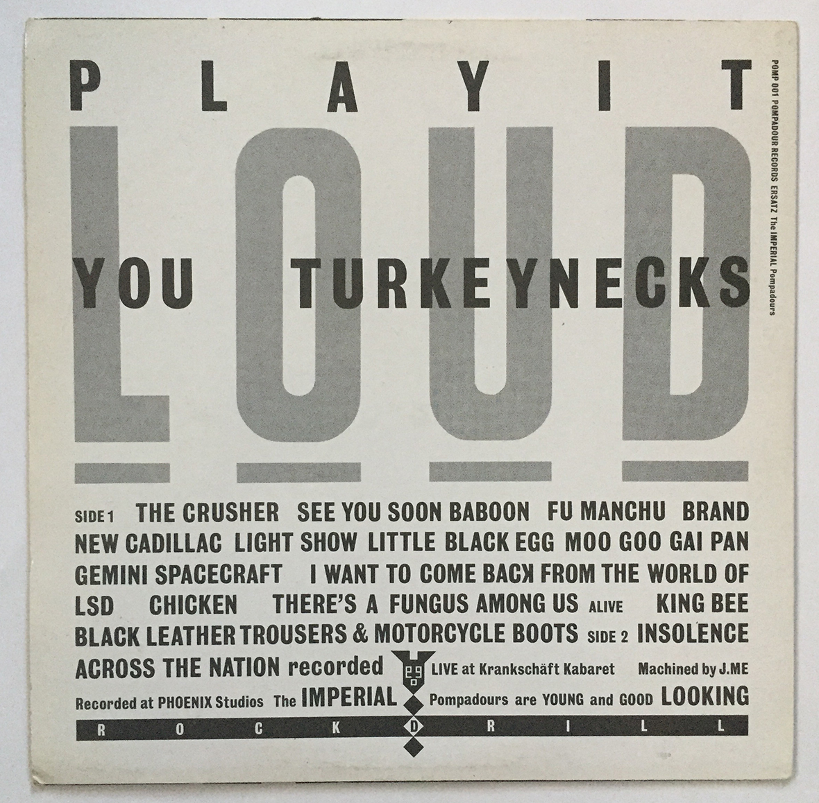
The inner sleeve of Johnny Moped’s Cycledelic (Chiswick, 1978) hews closest to the Modern intention of the information graphic form. Here he adopts the format of Peter Frame’s “Rock Family Trees” to detail the band’s lineage. However, though the graphic plays it straight (earning praise from Frame for improving on his concept) Bubbles sees fit to disturbingly set it over a photo of troops arrayed at a Nazi rally.

Other incidences result from an uncomplicated design ideation but with Bubbles’ inventiveness shaping the result. Following its technological source, Bubbles devised a graph graphic for the logo and label of Radar Records. Eschewing the obvious sound waves, he creates a ‘scope displaying signal pulses that spell out “radar.”

The graphics of the inner sleeve of Elvis Costello’s fourth album Get Happy!! (F-Beat, 1980) offer no edifying data. On the front, three ellipses represent “Big Man,” “Tall Man,” and “Extra Wide Short Man” with type scaled and weighted according to the description. The portrayal resembles a children’s book page, or a basic expressive typography demo. Tying into the album’s title, the obverse offers the “Happy Man,” intersecting ellipses arrayed in an “atom” shape.

Incidences of infographics tail off in Bubbles’ later years. The entirety of the front cover of Wang Chung’s Points On A Curve (Geffen, 1982) is given over to a graph in a rare example of literality (save for the enigmatic Brian Griffin cover photo). And for the back of Billy Bragg’s Life’s A Riot With Spy vs. Spy (Utility, 1982), Bubbles anthropomorphizes a graph that updates a World War II propaganda poster: “Beware the Squander Bug” (which on the record’s label, is captioned “A Ration of Passion.”)

Where Bubbles made information graphics an occasional element in his sleeves, Scher’s applications emerged after her album career. (Her current cartographic paintings extend this interest into another medium.) Even if absurd in content, her use is strategic, never wandering into the surrealism of Bubbles’ specimens. Her focus and wit are keenly fixed.

An early effort is the cover of the 1985 Print magazine parody issue: “The Complete Genealogy of Graphic Design.” More Monty Python than Phil Meggs, the chart rambles through a bizarre cataloging of historical figures, most unconnected to the field. Arrows and dashed, solid, or squiggly lines suggest connections or couplings between unlikely figures: Herbert Bayer and Queen Elizabeth II seem to gotten busy (or something). If there’s a commentary on graphic design history, it’s decidedly elusive: “The whole insane chart moved through history until it ultimately arrived at Milton Glaser.”

In Make it Bigger, Scher makes diagrams a central element of the text. She provides them throughout in a serial explication of her central thesis that “judgments made about graphic design…often have little to do with the effectiveness of a given design in the marketplace and more to do with how human beings naturally behave in complicated hierarchical social situations.”

scher

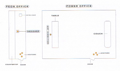
At first, the diagrams are functional tinged with humor: illustrating the approval processes at her workplaces, or contrasting “power” and “peon” office set ups. She then proceeds into more subjective—and astringent—presentations such as “Diagram of a Meeting” and “Personality Types in Combination.”

Unlike Bubbles, Scher isn’t struggling with or exploiting any contradictory impulses in her design. Ambiguity is the enemy of effective design. With her no-nonsense manner, Scher debunks any romanticism in the creative process. Much of the book’s text describes how worthy design is prevented: conditions related to the thesis above. Eluding them is the key—either through haste (rush jobs that short circuit the process) or indulgent clients (jazzers, mostly).

“Bob James was my first ideal client,” writes Scher of the musician and founder of Tappan Zee Records, “His was the only approval necessary…” Bubbles couldn’t agree more: “It’s just fun working with Jake (Riviera), we’d just walk around the block—‘cause he was so busy—it would all be done in five minutes. I could actually do what I wanted to do without being told off by the record companies that say: ‘Fantastic, but don’t you think…?’ and then they fuck it up!”

Arguably, Bubbles was allowed greater creative latitude in his situations. Major labels are risk- and cost-averse while the upstarts trade on the novelty of exotic packaging. Even as the company that, with Alex Steinweiss, pioneered the idea of album cover graphics, Columbia was staid and corporate.

Bubbles’ inventions were regularly bowdlerized or replaced in the U.S. (as occasionally were the musical contents of the albums). That Columbia was the U.S. distributor of a number of Bubbles-designed albums amply demonstrates the reality. If Scher had any awareness of Barney Bubbles, he would have served as a cautionary tale.

Scher’s is dead on in her analysis that the true determinants of design results are interpersonal dynamics and individual personality. Pushing distinctive design through the Columbia bureaucracy was likely a chore. However, she extrapolates this to all labels and fails to turn her jaded eye on herself.

Understandably, she attributes herself only the purest motives: “Money was irrelevant. It was more important to make uncompromised work.” There’s no reason to doubt her. But other motives go unspoken that play into her experience. One is plainly stated at the outset of her book: “Designers want to make things, or make things up, and have those things that they’ve made up seen, used, and appreciated by lots of people.”

Scher omits an important diagram that would complete her presentation. It should describe the inverse relationship between “uncompromised” and “lots.” In choosing to work for Columbia, she made a priority of the latter, depressing the likelihood of the former. Other labels, even other majors, offered greater creative freedom. Warner Bros.’ catalog was home to a variety of offbeat and artistic sleeves. Even Atlantic, the label she left for Columbia, issued sleeves that boasted “intelligence, wit, and a higher level of aesthetics.” But, in another unstated but crucial factor of the equation, they might not be of Scher’s aesthetic.

Other indices on the missing diagram probably should include geographical preferences. Working for Warners would likely require Scher living in L.A., which may be akin to a matter/anti-matter collision. And—though she excoriates it—a taste for corporate life. Stuffy as it may be, the corporate workspace was comparably sedate and neat. Scher may wryly depict the “peon” office she sought to escape—as described above, Bubbles literally labored in a “pee on” space.

Life is a series of trade-offs or compromises. Scher’s determination to defy this actuality is her defining trait. But where her otherwise refreshingly sober view of design activity lapses into fantasy is neglecting to account for this reality: choices must be made. Everything Scher says about the stultifying nature of corporate design is irrefutable. But the ultimate barrier isn’t the system, it’s the designer’s—her—choice of where to labor.

Bubbles likely recognized the trade-off and struggled with it. The Wang Chung commission got him a visible (hit single) major label job. But Points On the Curve ranks as one of the least interesting works in his oeuvre. While still avoiding the default cliché of sleeves—the band portrait is relegated to the back—it’s a disappointing effort. But when he makes something distinctive for a major—like The Psychedelic Furs’ Forever Now (CBS, 1982)—he only sees it get replaced with a New Wave cliché in the States.

Logo design is another difference between the two. Logos seemed to flow effortlessly out of Bubbles, all equally ingenious, no matter how spontaneous (“I phoned him and said, ‘I want a logo. It’s got to be black and white and square,’ Dury told Will Birch. ‘Then I heard somebody in his office say, ‘Wow’ and he said, ‘I’ve done it!’”)

He also deliberately fashioned more marks than he needed to (and probably was paid for). For both Stiff and F-Beat, he bespoke an array of marks that suggest a restless imagination or an abhorrence of design doctrine. However, they were masterful components of the labels’ brands and players in the larger identity game Bubbles was playing.

Scher is brief and self-effacing on the subject of logos: “I appreciated clever marks that had strong, simple, positive and negative shapes…but was never capable of designing them.” She states her preference for typography-based marks, such as the Manhattan Records logo. And though she discusses her Tappan Zee Records identity, its logo is neither reproduced nor mentioned. If it was Scher’s creation, it contradicts her evaluation of her facility with form.

publish_model

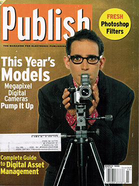
If Bubbles has an iconic cover image, one that transcends its specific usage, it may be Elvis Costello’s second album This Years Model (Radar, 1978). Costello’s confrontational, table-turning stance became a symbol of the post-punk era, which preserved the provocation of punk while broadening its sonic palette.

At its core, the image is a direct conception of the record’s title and its source songs, a contraction of “This Year’s Girl,” and the “she’s last year’s model” lyric from “(I Don’t Want To Go To) Chelsea.” Putting the artist on the cover is the no-brainer design strategy. Bubbles complicates the reading by extending Costello’s aggressive, anti-rock star poses from My Aim Is True. The U.S. version goes all-in in defying expectation, with the artist largely obscured, crouched behind the camera, peering over it at the viewer.

Scher’s most recognized cover is one she regards mordantly: the mega-selling eponymous first album of the group Boston (1975). Its appearance in Make It Bigger has the flavor of a musician dutifully but reluctantly performing a throwaway track that became a novelty hit. Scher gamely relates the gestation of the Roger Huyssen cover painting, perplexed at its ultimate ascendance to iconic status.

Of both the music and sleeve, Scher is dismissive: “Musically Boston is not a great album. “More than a Feeling” is decidedly mediocre, and so is everything about the album package, but it struck a chord with sixteen year-old boys and their girlfriends in 1976.” Even were I not of that specific age group at the time, Scher’s trivializing of an audience sounds snobbish—and commercially antagonistic. Aren’t sixteen year old boys and their girlfriends deserving of attention? More importantly, isn’t that a substantive chunk of the popular music market?

prom

Scher is too savvy to not recognize “the strange chemistry and karma of hit music. Hits don’t really have anything to do with qualitative decision-making or careful planning. Genius or originality don’t guarantee hits; you can’t even rely on predictable, salable mediocrity. Hits are happenings in a particular period of time that manages to capture the imagination of a large but specific audience in a specific and personal way that defies all logical explanation.”

The lesson to and frustration for the graphic designer is that you can replace “hits” with “great graphic design” and it’s just as accurate.

For that 16 year old me (and now, actually), Boston was an amusing trifle that I felt warmth for because of its hometown origin. And though musically it was the antithesis of the punk and new wave I was bonding with, it was a scrappy anti-corporate move. The record was a basement-made, against-the-odds triumph of Tom Scholz, a moon lighting Polaroid engineer. That is so rock and roll. The sleeve was silly but what do you want?

albums

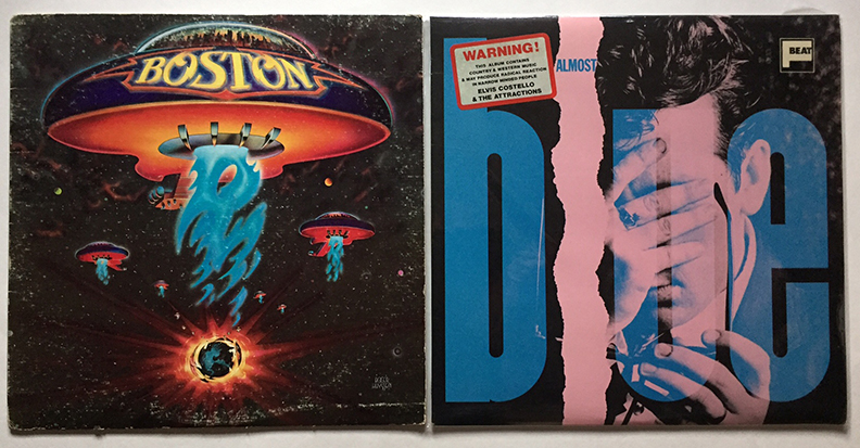
By all measures, Scher nailed it with Boston as she did with no other sleeve. Her account of the hushed awe that greets her introduction as its designer verifies its power. The sticking point is that in her greatest success as a cover designer, Scher was simply a facilitator of the client’s “idiotic” idea. And the client was right. That is not supposed to happen. I can only imagine Scher thinking, If only that blockbuster had my design instead of that “stupidity.”

Barney Bubbles, who mined kitsch without irony, would be at peace with such a notion. A fleet of city spaceships vaporizing planets would be another day at the office for the guy that illuminated his own zany Space Ritual. He got it: “All it is is rock and roll and it’s no big shakes.” Rather than dropping the quality of sleeves with this attitude, he elevated it.

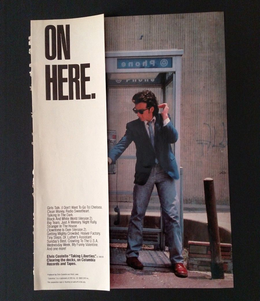
The Bubbles/Scher Venn diagram overlaps at Elvis Costello. Two artifacts cross over and demonstrate the designers’ affinities and departures: the 1980 U.S. compilation album Taking Liberties, and a Trust promotion poster.

Taking Liberties was a compilation of tracks that hadn’t seen release in the U.S.: either U.K. single A and B sides, or album tracks deemed “too British” by Columbia and removed or substituted. Its release came on the heels of Get Happy!! and sought to capitalize on the proliferating import market. In a clever reference, its title comes a lyric on the included song “Crawling to the U.S.A,” which satires American cultural domination.

Compilations represented a rare opportunity for Scher: “Repackages were generally nonpolitical album covers,” she writes in Make it Bigger, “antidotes” to the wrangling that occurs over new releases—bones thrown to persecuted designers.

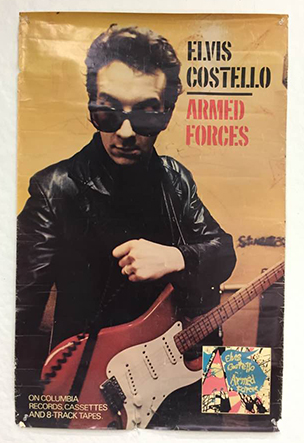
Beyond her position as art director, it’s unknown how involved Scher was with the design. The densely set Franklin Gothic text is a Scher hallmark, along with its unfussy layout. Rather than commission an illustration or craft a total departure, the covers seems a concerted attempt to relate to some of Costello’s previous releases. A 1979 Brian Griffin photograph of Costello in L.A. (which also yielded images that adorned Armed Forces and its attendant Live at Hollywood High EP) wraps around to the back of the sleeve. The picture has been inverted so Costello reaches to the left to grasp the noodly line spelling out the title.

In upper left hand corner of the cover, the artist’s name is spelled out all caps in a super bold sans serif face. The scale of the type and its tri-coloration are nods toward prevalent new wave stylings. Overall, the sleeve is tasteful, functional, and ordinary.

The lone gesture to the conceptual play of Bubbles’ sleeves is the disc label. Adapting a design from the 1920s, the word “Columbia” is replaced on one side with “Costello.” Though Bubbles regularly invoked and evoked period design styles, the impact here is blunted by the age of the sample. It predates the musical eras Costello channels in his music. Later designs would have been both conceptually and graphically more representative and interesting.

But the genuine Bubblesian meta-move doesn’t come from the designers or is part of the album package. For the print ads, the text “And the corporation logo is flashing on and off in the sky” is placed underneath the legal text at the bottom. The line is from “Night Rally,” a song excised from This Years Model and included on Taking Liberties. Was someone in PR hip to Barney?

taking_ad

The more prominent and telling intersection is a poster for Costello’s 1981 F-Beat album Trust. Scher features this work in her book, the result of successfully lobbying for oversized posters—an instance where she wants to make it bigger.

Source material and time are scant for the project. The Brits only provide a “grim” Photostat of an image intended to be the “back cover” (it’s actually the front). Scher remains incurious about the source of the image. No credit or attribution is provided. It’s a still from a Bubbles-directed video for album track “New Lace Sleeves,” with a closeup of Costello’s head and shoulders. Head tipped downward, Costello stares up over his horn rims. For the album’s cover, Bubbles cropped the image and placed a handwritten title in the upper right hand corner. It’s the shadow of Costello’s specs on his face that grabs Scher’s attention.

To mask the poor quality of the image, she pumps up the scale and the hue saturation. Perhaps as an unconscious gesture to the (musical) New Wave style of acid bright colors (Scher avers she can’t provide a specific rationale for the choice), she fills the lenses of Costello’s glasses with solid hues of red and blue. The portrait is bracketed top and bottom with the text TRUST ELVIS in the manner of a campaign poster. “Costello on Columbia” sprouts from Costello’s left ear. All type is in Scher’s preferred call-back slab serifs with the ear-emergent text set akin to a broadside.

Scher’s proof for the poster’s success is its subsequent widespread in-house theft when delivered fresh off the press. The volume of larceny executed by record company employees could be considered a measure of validation (where’s the diagram for that?) but is hardly authoritative. And fetching high prices as a collectable is similarly problematic. If sticky-fingered Columbia cogs snapped up the majority, scarcity could be the driving force. These rationales also don’t affirm of Scher’s original argument for the oversized poster: that shops would clear space for such a product. Did they? Maybe none were left.

As a Costello fan at the time, I was aware of the poster and didn’t care for it. It possessed none of the smart, feisty energy of the music or graphics of the U.K. releases. Its coloration seemed affected, a cynical designer’s sop to New Wave fashion. The typography was incongruously “American” and “soft”—it felt more suitable for label-mate Billy Joel. Altogether, it made a dynamic performer bland and routine. Then again, maybe my desire was sated because I possessed an Armed Forces promotion poster, gifted by the owner of my local record store.

armedforcespo

I agree with Scher that the poster is “well designed.” Considering the standards of her work, that’s hardly a concession, more a recognition of the obvious. Today, it’s desirable to me, but because of its provenance. The poster is the same but I’ve changed; it’s acquired new meaning. But while I admire it, I don’t love it like practically anything Bubbles might have done.

Reflexively, I try to attribute this to something in the design and not in me. As always, I blame Modernism. Its intellectual framework still suffuses our minds and insists everything resides in the object. But sometimes that object stars metropolis-bearing guitar spacecraft and everything goes haywire.

Looking into the designer only gets us so far and isn’t definitive. Bubbles loved rock and roll, a capricious but potentially indulgent client. His designs aspired to rock and roll in form: resonant, indulgent, transgressive…and merchandise. Scher preferred jazz and other less commercial musics. The artists were less image-conscious and open to illustration. They got out of a designer’s way. Rock was messy.

For Scher, sleeves were just another “everyday product” to bring a “higher level of aesthetics to.” Bubbles also endeavored for the latter but the former would be a gross simplification. He had abandoned the everyday product to embrace, for him, a higher plane of product. Albums had a special meaning for him.

It’s a truism that a designer’s personal engagement with the subject can result in better design. Bubbles obviously was more invested in rock and roll than Scher (I can’t track her personal taste at all from Make It Bigger). But any attribution of that as a deciding factor is belied by all of Scher’s consummate work for a variety of other cultural clients. All seem to have as much of her attention as any other.

And while the music didn’t mean as much to her as it did Bubbles (who played in bands and issued his own album), album covers did. Intriguingly, Scher cites three successive Beatles albums—Revolver, Sgt. Pepper, The Beatles—as emblematizing all design: “Everything everyone ever needed to know about graphic design was in those three album covers.” As exquisite as her taste is, it’s ironic that none are the work of a graphic designer.

Two are famously by contemporary British fine artists—Peter Blake and Jann Haworth for Sgt. Pepper, Richard Hamilton for ‘The White Album,” and Klaus Voorman—long-time band friend, artist and bass player—illustrated the front cover of Revolver. None follow the deliberate design process Scher adheres to. (Though “The White Album” arguably might to a degree. Hamilton’s proposal for the stark white cover was in deliberate contrast to the florid psychedelic fashion of the day—a strategic design move displaying an awareness of the marketplace.) Even if the concept/sketch/execution stages were followed, the decision to turn to fine artists and not graphic designers set them apart from the norm.

In his process and product, Bubbles seems closer to the spirit of these iconic sleeves. His works could be startling blends of unexpected imagery and eccentric interpretations of commercial imperatives. The variable covers of My Aim Is True and Do It Yourself were Bubbles own skewed updates of the editioned “White Album.”

Scher’s covers are textbook examples of contemporary professional graphic design process at its best. Every step is exacting and the result highly polished and fluent. In her employ of top illustrators and photographers, Scher’s sleeves were like the many popular records they housed, featuring top session players recorded in the best studios. Results were consistent and flawless.

For some, this was something to rail at: “…all those other faceless LPs involving this floating crap game of technically impeccable hacks,” spat Lester Bangs in 1975. This attitude provoked another music, and another design, that valued spirit over proficiency. Or, more accurately, fostered a different definition of skill.

Scher was, and remains, an exemplary practitioner of the established conception of design. Bubbles expanded that model in every direction. They each served their clients well. And the audience? As John Lydon chanted, “This is what you want, this is what you get.”

Despite abundant and exemplary work in the area, Scher isn’t usually included in the roll call of major cover designers, not the way Bubbles is. The reason may be that it was a short prologue to a long and distinguished design career. She quit Columbia and seldom looked back (you should have kept the original, ladies).

Considering the wonders to come later, this stands a major what if. Sleeves designed by the creator of the Public Theatre posters or Ballet Tech would have been epic. However, reading Scher herself, they may not have been possible within the contexts she chose to work. Leaving album design apparently was required for Scher to fully realize her design vision.

Though Bubbles anticipated his departure from album design in his later years and expanding into new areas, it wasn’t by choice. He expressed regret about being supplanted by younger practitioners. “They’re so creative—the kids that do the sleeves—it makes me feel so staid and boring, and I think: I’ve got to get out, it’s time for me to go.”

This is another facet of attitude: Bubbles was reflecting his client industry, not his profession. Rock and roll was a young person’s game. At 39, he was a dinosaur. This could only be exacerbated going through the crucible of punk and it’s past-rejecting ethos. Only through ferocious talent had he escaped scorn for his hippy origins.

Of course, Bubbles’ potential beyond record covers will be the most profound what if. On his own, the early death makes the heart ache for what was never realized. For me, Paula Scher’s masterpieces come after the cover career, in a steady upward trajectory of achievement. Many can’t be predicted from what came before, which is only testament to her talent. Bubbles, despite his apprehension, showed no sign of his talent slacking. Comparing Bubbles and Scher heightened my appreciation of both. And sharped my sense of loss. Damn you, bless you both.

Note: This is the second part of my ongoing study “Barney Bubbles: Offset Identities,” the first part of which is the previous entry in the “Writing” section. Both of these essays (and those to follow) owe a debt to and draw from Paul Gorman’s book Reasons To Be Cheerful: The Life and Work of Barney Bubbles (Adelita, 2010) for details and quotes about Bubbles’ life and work.

Work in progress—Barney Bubbles: Offset Identities

bowman

“When I went to art school, we were trained to be designers—if you could draw you became an illustrator; if you could just about draw, you became a designer; if you were just hopeless they would put you into exhibition display.” —Barney Bubbles, The Face, November 1981

There’s an astonishing quote residing on page 136 of Paul Gorman’s monograph Reasons to Be Cheerful: The Life and Work of Barney Bubblesone that only graphic designers can fully appreciate. It’s in a brief anecdote that succinctly summarizes why the man born Colin Fulcher is the graphic designer sui generis. Non-designers reading the sentence would likely skim right over it, unaware of its import.

The subject is the proposed title for musician Elvis Costello’s third album; the speaker is Costello’s long time manager and label honcho Jake Riviera (once known as Andrew Jakeman). Bubbles had already designed Costello’s first two albums, as part of his role as lead designer at Stiff and then Radar Records. “Originally Elvis wanted to call it Emotional Fascism but Barney was totally against that, so it became Armed Forces.”

By this time in the book, Gorman has provided numerous examples of notoriously strong-willed reps and artists contentedly deferring to Bubbles’ judgment. That this instance stars the acid-tongued and headstrong former Declan MacManus is of no special import. (The degree of Bubbles’ disfavor, however, intensifies between editions of Gorman’s book; the first quoting Riviera that “Barney just didn’t like it”).

Costello himself relates a different, briefer account in his recent memoir, Unfaithful Music and Disappearing Ink, one that doesn’t necessarily contradict Riviera’s telling. “Accepting that no radio station would play a record called Emotional Fascism, the album was eventually titled Armed Forces,” writes Costello. While Bubbles isn’t explicitly given agency for the change (nor is anyone), the designer is immediately invoked in the next sentence: “It came wrapped in a folding envelope of Barney Bubbles’ pop art design.”

A simple swap of common for proper nouns illustrates what makes Riviera’s statement so astounding: “Originally the client wanted to call it X but the designer was totally against that, so it became Y.” That sentence, especially among designers, is unheard of. Usually, designers take what they get. At best, they might boast of swaying the client to a particular approach for the art. Even among designers famed for their association with particular labels, such as Reid Miles and Blue Note, Vaughn Oliver at 4AD, or Barbara Wojirsch of ECM, this type of influence is unprecedented. And for designers overall? That’s crazy talk.

In his book, Gorman’s fuzzy on exactly why Bubbles enjoys such favor. Multiple individuals who worked with the designer testify to his “genius.” It’s the last statement in the book, provided by Nick Lowe on why there’s a book in the first place: “Barney was the closest we’ll ever get to genius, we’ve got no choice.”

The constituents of Bubbles’ virtuosity, however, aren’t really articulated. This is unfortunately common with the majority of designer profiles. The subject’s superiority is regarded as self-evident—just look at the work. As rewarding as that is, the visual aspect is only one aspect of his facility. That Bubbles was provided unparalleled authority and latitude is established. However, what’s more significant and profound is what Bubbles did with his favor.

In terms of skill, he was virtuosic at everything he took on. Short of photography, he handled every possible aspect of realizing a graphic design piece. His illustrative proficiency in pen was matched by his painting, equaled with his collage. His typography was unerring and exacting in contemporary and historic styles, plus displaying a range of arresting emotions and evocations.

But it was in his conceptualizing, its acuity and comprehensiveness, that he remains unparalleled. In many instances, Bubbles went places with his work that designers—and definitely clients—wouldn’t think to go. Most wouldn’t recognize Bubbles’ endpoint as a potential destination. All the while, he was adhering to and espousing the fundamental, mundane commercial imperatives of graphic design and advertising. But rather than following the orthodox, predetermined route to a result, he truly started from zero, remaking design as he added on.


He was a riddler wrapped in a mystery inside an enigma slipped within a foot square cardboard folder. That’s the perception at the tone-arm’s-length distance between an LP sleeve designer and the record-buying audience. Though Bubbles had the freest of hands over content, he declined to draw attention to his role by setting it in type. Even though he sported an alias, Barney Bubbles eschewed a design credit, to this day making a full inventory of his work an ongoing venture.

It wasn’t, however, a striving for anonymity. It was a selective withholding that drew attention to itself. Bubbles toyed with ideas of identity and identification throughout his work. In this, as he was in all pursuits, Bubbles was fully invested. His design, his art, had no conceptual boundary. The design credit —and lack thereof—was an element of the design concept. That concept, and his art, extended outward and was ultimately his life.

As if one nom de design wasn’t enough, Bubbles inserted an additional layer of offset identity by employing an assortment of fanciful pseudonyms (“Big Jobs, Inc., Grove Lane, Sal Forlenza, Jacuzzi Stallion, Dag, Heeps Willard”) or cryptic designations (his VAT—tax identification—number on Get Happy!!) as identifiers. His mask donned masks; Bubbles existed as a Constructivist-decorated nesting doll.

The absent acknowledgements was another throwback move, much like the period styles and references Bubbles transmuted for his layouts. It was only in the late 60s, a few years before he began doing sleeve work, that it became customary for designers to be provided a credit. Skipping it was simply consistent on sleeves that graphically evoked the previous era.

By using alternate aliases, Bubbles showed his game wasn’t anonymity but evasiveness. Ironically, a further proof can be found in his use of “Barney Bubbles” in design credits. Prior to his joining the Stiff circus in 1977, spotting a variation of “Sleeve design: Barney Bubbles” wasn’t uncommon. While unusual in his graphics, he was conventional in noting his agency.
Personally and professionally, the punk era marked a transition for Bubbles. He pared down both his personal appearance—gone was the beard, long hair and wardrobe of his hippy days—and graphic approach (Gorman: “brutal cropping, stark isolation of images, gritty photo-play”).

However, while the “Barney Bubbles” moniker spanned these periods as his preferred personal identity (Gorman quotes Stiff staffer Suzanne Spiro: “As much as I got to know him, I never knew his real name and in a way I think it’s a shame it’s been revealed. If you asked him he would just shrug his shoulders and giggle”), its removal from the album credits was simply conceptual due diligence.

Even then, it was a porous barrier. Work outside the Stiff/Radar/F-Beat network might note: “Sleeve design: Barney Bubbles” (Clover, Unavailable, Polygram, 1977) or “Sleeve design and artwork: Barney Bubbles” (Dr. Feelgood, A Case of the Shakes, United Artists, 1980). Still, releases with Bubbles’ design such as Depeche Mode’s debut Speak and Spell (Mute, 1981), and The Psychedelic Furs Forever Now (CBS, 1982) only acknowledge their photographers.

When asked how he regarded his role in his lone published interview (The Face, November 1981) and why he shunned a credit, Bubbles’ answer would have made any old school Modernist design pro proud: “I feel really strongly about what I do, that it is for other people, that’s why I don’t really like crediting myself on people’s albums—like you’ve got a Nick Lowe album, it’s NICK LOWE’s album not a Barney Bubbles album!”

Practically, being dodgy about his credits had a deleterious impact on Bubbles’ professional career. As noted above, bands outside of his home base sought him out. This extended to superstar territory: in 1978, The Who’s management invited him to propose a design for Who Are You. (Bubbles’ concept of spelling the title out in power cables was rejected but adapted for the photo that was eventually used.) However, according to Paul Gorman, Bubbles shopped his portfolio in 1982 “to some of the bigger music labels, only to hear his unsigned work had already been claimed by others.”

Gorman documents other brushes with high-profile music-industry clients, showing Bubbles had visibility and credibility in the field. Aborted and unrealized projects go with the territory. Gorman also cites unnamed sources as speculating that Bubbles’ naming evasiveness was a tactic to avoid tax problems. If so, it was inconsistent—and ineffective.

That Bubbles’ was engaged in a comprehensive gaming of identity is affirmed by his extension of the play into the graphics. In at least two prominent instances, Bubbles inserted fanciful self-portraits onto album covers. Right away, this is the ultimate audacity for a designer. The first example, considered a definite representation of his profile, is on Armed Forces—the record that Bubbles demanded and received a title change. He can be found in the abstract shapes to the left of the yellow paint splattered title “Elvis Costello and the Attractions Armed Forces.”

af_mini_innerbag_open_01In its original U.K. incarnation, this graphic is within the package, after unfolding the back flaps. The designer is literally behind the scenes on the album, embodied at the center of a mélange of high and low historical graphic styles. In a delightful irony, Columbia, Costello’s U.S. label at the time, evidently finding the U.K. cover unacceptable (a deliberately-kitsch painting of stampeding elephants adorned with discreet typography) made the inner splatter graphic the front image. Having rejected the designer’s preferred layout—probably as too British and obscure with tiny type—the company punished Bubbles by putting his grinning face on its cover.

For the second—though Paul Gorman hedges that the image is possibly lead singer Lee Brilleaux—it would be in keeping if Barney Bubbles’ profile was again dead center on the illustrative cover of Dr. Feelgood’s 1982 album Fast Women & Slow Horses. Seeing stars after an implied punch from a buxom, boxing-gloved mare, the man’s face emerges from the top of a large black ampersand. If it’s Bubbles, he is again one with the artwork. He is (the) design. Another potentially sly reference is that as a designer, his role is an “&” to the musicians.

R-1828879-1315427671.jpeg

In adopting a creative guise—one evidently identical with his everyday semblance—he was in league with the musicians for whom he designed. Many adopted or were given stage names, especially at Stiff. Bubbles was back-stage named. Even if using their natal names, artists craft professional personas. These are carefully managed and strategically deployed. However genuine and real that singer seems, it’s a performance. Sincerity is how convincing you repeatedly enact intimacy with an audience.

Bubbles’ deep interest in the avant-garde art from the beginning of the 20th century also suggests a purpose. In her introduction of the catalog for National Gallery of Art’s 2006 exhibition Dada: Zurich, Berlin, Hannover, Cologne, New York, Paris, Leah Dickerman, Associate Curator of Modern and Contemporary Art at the National Gallery, writes, “Artists within the movement gave birth to a striking number of alter egos, which served as parodic, at times debased, inversions of a rational and authoritative masculinity.” Dickerman points to Duchamp’s “Rrose Sélavy” as the ultimate reversal with the artist changing sex.

Bubbles never ventured into this realm of invention; his pseudonyms were all masculine. His life/design still adeptly illustrated how identity is mutable. Individuality is a postmodern playground, not a fixed state. He did this through the panoply of bespoke logos he generated for Stiff and F-Beat—and with himself. Bubbles formed an identity that was composed of its antithesis: flux. He grasped intuitively the elements that make up graphic identity and handled them effortlessly. Along the way, he effectively branded musicians and labels.

Note: This is the introductory section of what will be an extended essay on Barney Bubbles that will further discuss his identity play in his logos, the clues provided by his album as “The Imperial Pompadours,” his influence on contemporaries such as Malcolm Garrett and Peter Saville, a comparison/contrast with Paula Scher (who worked at Columbia designing albums at the same time as Bubbles was working), his unique status exploring and exploiting the physical aspects of commercial print production, his fascination with regal imagery (“King BB”), and more!