It’s Jacqueline Casey’s world, we’re just living in (a reflection of) it.
In the early 1990s, before ever envisioning a career in design, I spent months facing a framed copy of Jacqueline Casey’s 1985 poster Russia, USA Peace. It hung opposite my desk in the Massachusetts College of Art and Design Development office. Then I knew nothing about design’s history or Casey’s reputation. But the poster seemed to me ingenious and perfect—everything design was supposed to be.
The print came to the office via an exhibition of design alums I helped organize. At the opening reception, I chatted briefly with Jacqueline Casey. The show was my first exposure to her work and I expressed my appreciation to the frail, soft spoken woman. More than any other piece, or even her photo, when I look at Russia, USA Peace, I think of that short exchange of pleasantries. After all, she was in it, as was everyone on our planet.
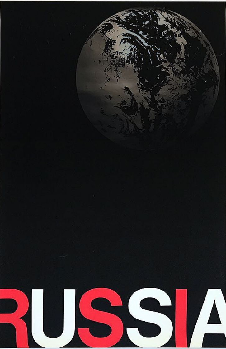
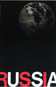
The poster features a monochrome photo of Earth, shown in full in the upper right corner. Printed in a varnish, it floats in a black void that fills the poster’s frame. At the base of the poster runs the letters RUSSIA, the R and concluding A extending off the trim edges. The characters alternate in a solid, vivid red and reversed out white, which form USA.
Casey created the work for the exhibition Images for Survival organized by the Japanese Shoshin Society. The collection marked the 40th anniversary of the atom bombing of Hiroshima. At the time, a nuclear conflict between the two superpowers was the direst threat to humanity. Russia was then, technically, the USSR. Now, the poster seems prescient and timeless—both in appearance and message.
In all of Casey’s oeuvre, this work may be most emblematic of her method. She was the foremost U.S. practitioner of the International Style and deserves inclusion among its exemplars anywhere. While Müller-Brockmann is the style’s most renowned and doctrinaire practitioner, it was Casey that fully demonstrated its potential as an accessible design methodology. Müller-Brockmann may have generated the most music posters in the manner but it took Casey to make that style sing.
Casey represented an advance for the International Style separate from the “New Wave” represented by Wolfgang Weingart. (And it took another supremely talented American woman designer—April Greiman—to make that approach resound.) New Wave sought to bring down to Earth an airless typography (“do we live on the Moon?”). It didn’t make it breathe so much as make it hyperventilate.
In her process and product, Casey bridged the Swiss and American Modern strains: a fusion of the best Müller-Brockmann (discipline and structure) and Paul Rand (personability and formal imagination) could offer. She was the fulfillment of Modern intent, methodical and human.
High Modernist design overall developed from a celebration of mechanization and systemization. Its foremost performers operated sleek, clock-work devices of representation. Casey became the ghost in that machine.
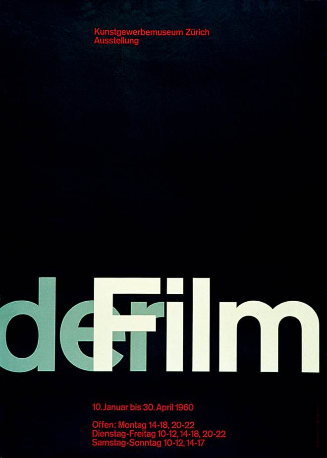
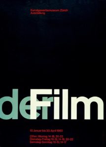 A comparison of Der Film and Russia, USA Peace is instructive. Both are signature works of the respective designers. The core aspect of each is a depiction of an effect of light: Casey using varnish, Müller-Brockmann an overlap that implies light projected through a transparency.
In this spot varnish, Casey engages the materiality of design, subtly. Müller-Brockmann is all about the ink that resides on the sheet’s surface. Material effects and manipulation: stock, die cuts, emboss, seem almost vulgar in his context. Casey’s usage is rare for her and typically restrained.
Staying true to the International Style’s formal fundaments, Casey infused it with an open, flexible sensibility. Müller-Brockmann’s design was an austere intellectual exercise, a distillation to craft a formal representation of a message’s “essence.” He pared to the pure. His favorite of his works was the blank verso of the printed sheet—this page ideally left blank.
Müller-Brockmann was ultimately unable to transcend language and its subjective confines. So, ironically, words became the primary, often sole, constituent of his works. For Müller-Brockmann, language was text, another formal element to arrange, along with image—ideally, usually, geometry—and color. Its role was limited to being positioned, scaled and read. That reading was singular and apparent.
With posters largely consigned to phenomena that could be reduced to names (activity, performer, venue) and dates, he self-selected the ideal forum for his essentialist art. The greatest challenge was overcoming the initial public reaction to his graphic austerity. Once normalized, the field was clear.
But it was Jacqueline Casey that fulfilled Müller-Brockmann’s promise, to divine and impart essential messages. She was able to summarize complex and arcane subjects using a limited but endlessly adaptable palette of effects. Overall, she orchestrated a wider range of topics, imagery, color schemes, graphic elements and compositions. Casey was a maximalist of the minutest.
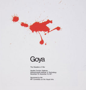
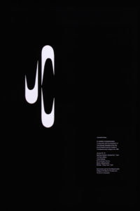
Her 1971 poster for the exhibition Goya: The Disasters of War is illustrative of her ability to realize a concise, evocative message. She condenses Goya’s paintings to an expressive, active spatter. It’s simple and readily recognizable, but also ambiguous, suggesting paint and blood equally. This is consistent with the many shapes that adorn Casey’s posters, forms that often toggle between representation and abstraction. The “JC” of the poster for an exhibition of her work is a deliberate, telling manifestation of this treatment.
Most importantly, Casey utilized language as a resonant, variable communication medium, beyond simply being text. Language’s manifold character wasn’t to be transcended but exploited. Müller-Brockmann’s design denied language’s nature, Casey’s embraced it. She would split words apart as if they were atoms, to reveal their component elements and spin off additional illumination. For instance, in addition to the nested RUSSIA/USA display, OIL is accented within POLLUTION for another poster.

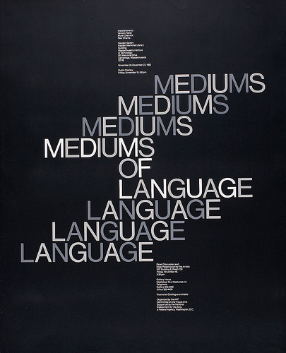
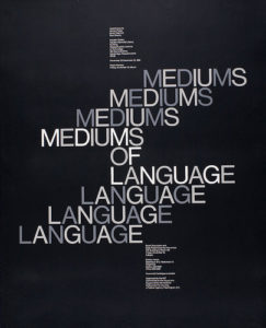
Variety in typeface was naturally found in heads and titles, though Helvetica still dominated. These texts could perform, reinforcing and representing the poster’s topic. At times, her typography approached concrete poetry in forming patterns and exotic arrays. Mediums of Language is a natural showcase of this impulse, where the occasional tool of repetition and stacking signals language’s structuring and multiplicity. Type becomes dimensional, a framework, multiplies, breaks apart.
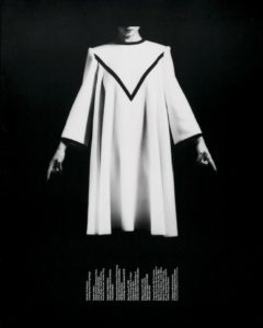
Casey regularly has more body copy in her posters than found in Müller-Brockmann’s. This is always set in a regular weight of Helvetica—exclusively set in ragged columns hung from their heads. Depending upon the overall layout, the columns may be horizontally spaced unevenly. Or, in Intimate Architecture, rotated 90 degrees to echo and extend the shape of the pleated dress hem.
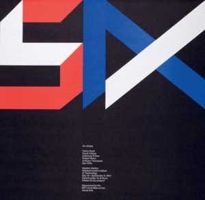
On the boundary of text and pure form are characters constructed from basic shapes, such as the ‘SIX’ of Six Artists. Characters are, of course, forms in their own right, though more charged and defined than the primary shapes—circle, square, triangle—that populate Casey’s posters.
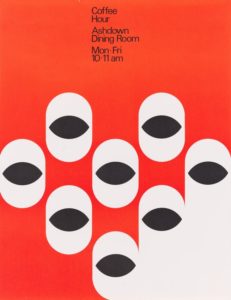
Casey employed a wide range of imagery as a regular component of her posters. She was willing to employ representation while maintaining a connection with abstraction. As previously noted, her abstractions frequently straddle the borderline with representation (the “cups” of Coffee Hour). At the same time, her abstract forms play different roles across works depending upon context: here symbolic, there pure geometry, elsewhere metaphoric.
Casey was also working with subject matter that while more diverse than that addressed by Swiss Internationalists, was still limited to focuses conducive to the minimalist approach. MIT wasn’t showcasing the broader hurly-burly of culture. The preponderance was art exhibitions, music performances and technology-related matters, where charts and graphs resided naturally. Though limited in topics, Casey wrung maximum meaning out of her reduced subjects and process.
Her achievement shouldn’t be cast only in contrast to Josef Müller-Brockmann and the International Style. Her work deserves regard within the entirety of design activity, historically and conceptually.
Though diffuse and amended, Modernist principles still permeate most of design practice. Many critical statements are often posed in relation or opposition to Modernism. Modern design still lives as design’s default position.
In this context, Casey’s work serves as an executive summary of our discipline, an ideal fig.1 textbook illustration of design’s most effective product. It’s design not at its most minimal but its most succinct.
To view a collection of Jacqueline Casey’s posters, visit the Rochester Institute of Technology Graphic Design Online archive.