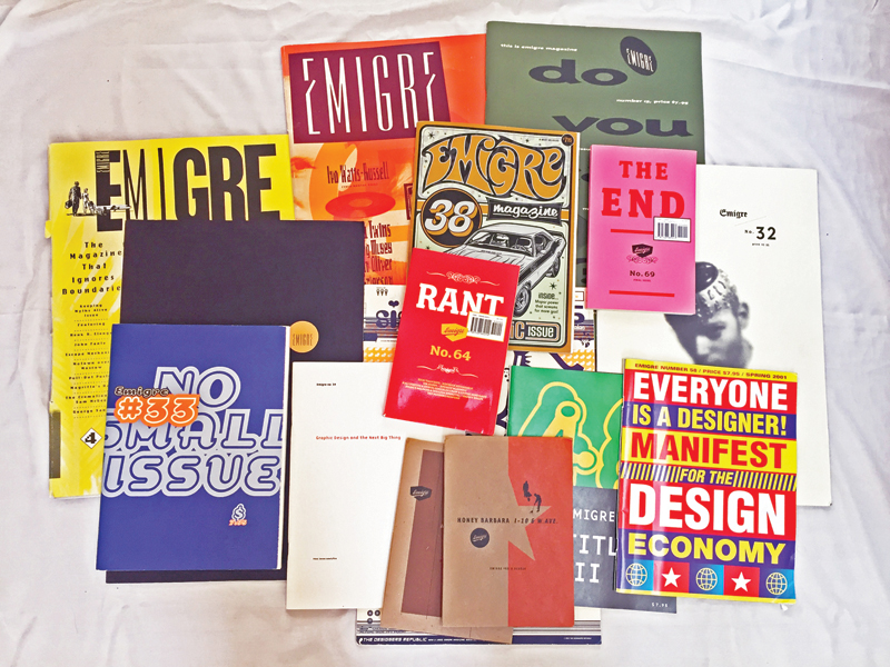
I wrote a short appreciation of Emigre magazine as part of the article “The Most Influential Designs of the Past 33 Years” by Jason Tselentis in HOW magazine. The issues shown with the article are from my own collection. I contributed to the magazine from 1996 to its final issue in 2005.
Tag: Emigre
Character References: On Emigre type specimens
Earlier this year, Gingko Press published Emigre Fonts: Type Specimens 1986-2016, a comprehensive collection of Emigre’s distinctive print samplers. A couple years previous, I went through my personal collection of their specimens dating back to the early 1990s and wrote this appreciation for a project that wasn’t realized. However, on the (late) occasion of Emigre’s book, here’s the essay.
When Rudy VanderLans announced that issue 69 would be the final publication of Emigre magazine, he emphasized—via a “reminder” from partner Zuzana Licko—that it wasn’t the end of the company. Considering the magazine’s primary role in determining Emigre’s identity, and that the journal was its namesake, the notice was necessitous. The foundry that had become the core business would continue developing and vending type.
In addition and importantly, the specimens that promoted their typographic works would continue to be produced. VanderLans had separately declared a commitment to continue these print pieces. The pledge placed Emigre in a distinct minority. We’re in a time that has seen a marked decrease—if not total abandonment—of foundries issuing physical type catalogs. Whether it was a decision based in pragmatic marketing or a nostalgic nod to the unended print, VanderLans’ avowal was welcome among aficionados of everything Emigre. The magazine was an acceptable but tough loss. Having to also bid farewell to the catalogs could have been devastating.
While Emigre magazine was a fundament in its firmament of products, it was always only one aspect of a constellation of printed works that grew up around it and the foundry. By VanderLans’ estimate, the company has generated close to 200 printed artifacts, comprising catalogs, specimens, posters, brochures, postcards, pamphlets, and other printed ephemera published since 1984. All converged in the magazine and spun off from it.
Foremost amongst those ancillary works were the specimens that introduced individual or a selection of faces, and the annual inventory of the Emigre library. In the magazine’s heyday, the boundaries between it and the specimens blurred. For many designers and some critics, Emigre magazine was little more than a glorified type catalog. Curiously, and revealingly, the distinctive critical content is downplayed, if not dismissed. The pioneering type design and marketing originalities are highlighted. Zuzana Licko’s typographic innovations have been evidently easier for the design field to assimilate than the ideas set in her landmark faces.
The appraisal of Emigre magazine as elaborate sales brochure denigrates both the journal and the full-fledged specimens. Emigre absolutely made, and continues to make, glorified type catalogs—but they are the catalogs.
Emigre’s type specimens are the intersection of its two signal accomplishments, the magazine and type design. They are also the most representative artifacts of the partnership of Licko and VanderLans. The reputations of their other products understandably overshadow the catalogs. While the magazine and type have received considerable attention and documentation—most recently in the Emigre no. 70 anthology—the specimens go largely unnoted.
Both for their connection to and fusion of Emigre’s more celebrated work, and as artifacts in their own right, the type specimens are worthy of separate attention. All the aspects of Emigre’s contributions to contemporary design are present in form and content. If, as Rudy VanderLans regarded them, issues of the magazine are considered graphic “albums,” the specimens are the “EP’s” and “singles.”
Emigre’s specimens are notable for the negotiation of practical considerations and creative idealism—the essence of all graphic design. They demonstrate an adept dovetailing of these concerns, crafting a format that stimulates desire then provides an efficient vehicle for satisfying it. A balance is struck between providing an enthusing context for the type while not overwhelming it. Though far from “neutral,” the framework is evocative and clear.
This framework has become more involved than embellishing the traditional catalog display. A rethinking of purpose and presentation is evident across the history of the pieces. Emigre’s specimens advance upon earlier examples of the form that utilized it to advance a wider conceptual agenda on how typography is defined and practiced.
A precursor is William Addison Dwiggins’ specimens for his new type designs. His were more realized, progressive publications centered on type display. A simple necessity was embraced as opportunities to explicitly express his typographic philosophy.
Dwiggins’ “Emblems and Elektra” specimen eschewed the rote alphabetic exercise to put forth a manifesto. “How is one to evaluate and assess a type face in terms of esthetic design? Why do the pace-makers in the art of printing rave over a specific face of type? What do they see in it? Why is it so superlatively pleasant in their eyes? Good design is always practical design. And what we see in a good type design is, partly, its excellent practical fitness to perform its work.”
Of course, that final statement is purely subjective. But as is often the case, the distinction of the type design supplies affirmation for his rhetorical position. Plus, you get a measured dose of Dwiggins’ delightfully idiosyncratic abstract illustrations.
Along with spurring a surge in digital type design, Emigre’s catalogs sparked a spate of inventive promos from a variety of short-lived and established foundries. Simply having the specimens was a practical necessity that isn’t attributable to Emigre. But the venturesome contexts adopted by many of the other foundries owe a debt to Emigre’s examples.
Often, the specimens were the most—sometimes only—interesting aspect of these other type designers’ efforts. As abstract works, separated from their sales imperative, they were engaging artifacts, parading wild, unfettered graphic novelties riffing off the theme of character sets. As proffers of usable type, they were far less viable. Simply put, I’d rarely imagine ever using faces from these specimens. But as elements in an “artist’s book” of Roman characters, they were engaging marks.
That the faces were disposable didn’t lessen the charm of the specimens, which could get baroque in concept and hyperactive in the number and variations on a theme. Another intriguing exponent of the surge in specimens was that they provided scarce examples of graphic design by individuals known foremost as type designers. Jonathan Hoefler’s Muse publication lasted the one issue but was succeeded by a few catalogs that shared the same delightful classicist sensibility. Much as I admire his typefaces, I’d put money down for more Hoefler print objects.
The earliest Emigre specimen I own, “Signs of Type,” is similarly unique for its rare “Design: Zuzana Licko” credit. Absent the notice, the piece might easily be attributed to her partner in its presentation of her low-rez faces illustrated with bit-mapped scans. With all respect to Rudy’s work, I’d fantasize at times that on a lark, Zuzana might take on the layout of one my articles and afford me a singular design triumph.
The overall design sensibility of Emigre specimens naturally moved in parallel with the flagship magazine. Roughly, specimen history can be divided into the pre- and post-4-color eras. Pre-color, the specimens proffer VanderLans’ distinct formal sensibility but are straightforward in text and concept. The phrases set in the faces are descriptive of the type’s features and formal rationales. Or, as with Dwiggins, propound terse typographic manifestos: e.g. “Typefaces are not intrinsically legible; rather it is the reader’s familiarity with typefaces that accounts for their legibility. Studies have shown that readers read best what they read most.”
With the advent of full color publication—the time leading up to and after the end of Emigre magazine—the specimens bloom as deeper, broader artifacts in their own right. A preservation principle seems at work. The energy of the magazine couldn’t be destroyed, only channeled and adapted into another form. One of these alternate outlets was VanderLans’ book projects— Supermarket, the Palm Desert/Cucamonga/Joshua Tree music trilogy. And the specimens also received an additional infusion of vitality.
Specimens became small journals in their own right, offering broader speculations and investigations of type design. Short accounts of a face’s origins and the designer’s intentions regularly appear and expand. Experts such as John Downer provide extended essays on topics related to typographic revivals.
The text examples become extended haikus or proffer full-on stories. Writer David Barringer was commissioned to bring his fluent prose to the two volume “Little Book of Love Letters.” Other republished texts feature early-20th century writers on subjects like the geography of the U.S. southwest (a VanderLans obsession).
Other specimens give the type designers the opportunity to frame their creations in artist-book quality promotions. The late Frank Heine crafted two amazing booklets for his Tribute and Dalliance faces. Mark Andresen wrote and illustrated a VouDou tale for his NotCaslon booklet. Mr. Keedy generates a visual/textual polemic for Keedy. Elliott Earls does Elliott Earls. VanderLans himself imagines eccentric and elaborate historical markers for the Historia specimen.
The ultimate and ongoing charm of the pieces transcends their status as product catalogs. However attractively designed any specimen may be, it is as disposable as any graphic design artifact, if not more so. That the specimens’ primary type product is essentially unchanging presents a significant design challenge. Change is mostly through accretion: the addition of new faces to the library.
In broader terms, a common charge against graphic design as a discipline is the unapologetic disposability of its product. The overwhelming majority of graphically designed artifacts are properly characterized as ephemera. What then the products for a graphic design audience? Is the factor doubled? VanderLans’ fancy flights confront these realities and serve a very pragmatic purpose: how to make the same collection of forms fresh.
The particular genius of these works is their beautiful functionality: an equal balance of abstract aesthetic qualities and clarity of use. The feature in the specimens that best expresses this balance was the now discontinued order form. Their layouts were also divided across the introduction of process color. Within these diversities, they’ve remained fairly consistent: an incidence of an inability to improve upon perfection.
The forms are the most succinct expression of VanderLans’ design approach (his “inner classicist” in Rick Poynor’s description)—an articulate and resonantly apparent structure. As formal compositions, the order forms residing somewhere between El Lissitzky’s “prouns” and Sol LeWitt. Pre-process, the layouts were all right-angular, sectioned by thick rules that strategically extended beyond the form’s basic framework. With the introduction of color, circles came into play, accenting in hues and shapes. Actually writing on the forms didn’t ruin the effect. Rather, it became a lively, improvised vernacular accentuation.
Often, the underlying structure of VanderLans’ layouts are visible and made decorative graphic elements in its own right. (See Emigre #40, The Info Perplex issue for his most elaborate expression). This strategy has tangential relation to designs that display a visible grid, as can be seen in a number of classic Josef Müller-Brockmann posters. VanderLans’ structures, however, are more flexible and colorful. Their agile geometries are efficient to their task of segmenting and structuring space.
If enthusing over an order form as a counterpart to signature works by renowned artists isn’t grandiose enough, I’ll take a step further. As previously mentioned, many of the booklets stand among the finest artist books of any era. The Hypnopædia specimen, for one, is a marvel of pattern and color that rivals many painters’ output—not to mention its status as a triggering expression in the “rational/decriminalized ornamentation” movement now in full flower.
More than this, these specimens provide one of the best examples of graphic design demonstrating content in its own right. It’s a near universal tenet that graphic design is an applied activity, possessing no substance upon its own. But when considering these catalogs, they can be “read” the same way that abstract painting are. A color field painting by Mark Rothko is “about” color, physically about paint. These specimens are about character forms, physically about type. The specimens transcend the mundanity of words to express ideas of the representation of language. We can contemplate the letter as we might upon the hue of blue.
It is a charge, a challenge, I regularly place upon my students, and ultimately upon all graphic designers. Is this discipline of graphic design worthy of contemplation on its own terms? Might you pick up any graphic design artifact and enjoy it for the pure joy of its unique status that straddles and fuses form and function? Can you pick up and delight in a type specimen as you would a painter’s (or sculptor, or photographer, or what have you) monograph? Not seeking professional “inspiration” but sensual indulgence?
Graphic design artifacts are like nothing that came before them. Their motives and intentions are unlike any creative form now or since. And this stature is best represented in forms like type specimens. They speak volumes of potential, in the works they will conjure into being, and what they suggest for how we regard our past and current print culture.
A thorough documentation of the Emigre’s specimens is a valuable undertaking. Like the entire Emigre enterprise, the boundary was sometimes crossed to encompass booklets for its nascent music label, and some non-paginated pieces (though excluding posters). I’ve focused on the type aspect of these pieces, though most may be rightly considered catalogs for the entire Emigre product line. Whatever you want to call them, enjoy.
Conjure Man: The Evocations of Mark Andresen
Note: In 2008, Eye magazine published my profile of Mark Andresen, titled “Pesky Illustrator.” It was actually the second version I produced, after editor John Walters requested a different slant to the article. While I was content with the directive and the result, I remain fond of the original piece, which is reproduced below.)
The VouDou practice of conjuring is an evocative metaphor for illustration. A conjurer employs common, native materials to “evoke Spirits for practical ends.” An illustrator crafts an image to summon awareness toward a worldly result. There’s also the magical, unpredictable, and somewhat spooky aura that surrounds conjuring—it’s otherworldly. And the most profound imagery is ultimately ineffable—affective beyond its constituent colors, forms, and materials.
This comparison is apt when applied to illustrator/graphic and type designer Mark Andresen, long-time New Orleans documenter, and now, exile. He fled an hour or two ahead of Hurricane Katrina, accompanied by his wife Paula and their cats. Among their few belongings were some notebooks Paula insisted on taking, and the computer hard-drive he grabbed. Nearly everything they left behind, including the bulk of his life’s work, was ruined. The hard-drive contained images of most of his work. But of the physical pieces, little more than a tenth was eventually saved from the subsequent storm damage and looting.
Now situated in Atlanta, Georgia, he simultaneously downplays his personal account while doing all he can to invoke the memory his former, adopted home. He’s determined not be defined solely by his personal tragedy, yet is resolute in keeping its spirit animate. Like a psychic medium, he’s conflicted: charged with giving voice while uncomfortable being the focus of attention. At the same time, Andresen’s voice is distinctive on its own.
That voice is a rough mix of channeled personalities. Andresen describes himself as a blend of Marcel Duchamp, the reincarnated White Russian spy Sidney Reilly (who’s still grudged about his Bolshevik murderers), and Klattu—the Michael Rennie character from the sci-fi film The Day the Earth Stood Still: “I’m a bit alien to what passes for normal and I think my karmic task is to wake up planet Earth to change.”
Andresen has strong opinions about art, design and politics—especially what he considers the corrupt and callous practices of the U.S’s Federal Emergency Management Agency (FEMA)—and is unreserved when expressing them. During its heyday, few discussions on the Speak Up design blog lacked a demonstrative post from “Pesky Illustrator.” He’s keeping at it, rambling, determined, selfless, and sardonic.
The ideal of making something enduring and preserving the past was impressed upon Andresen early. He grew up in the New Jersey suburbs, where his parents were artists, but his father gave up art to work on the 1960s U.S. space program. His mother was an amateur Egyptologist, capable of writing hieroglyphics. On a trip to New York’s Metropolitan Museum, one image captivated him: “I saw the hand of some ancient Egyptian artist in the moment of putting quill to papyrus . . . it struck me what immortality is.”
He studied art at the Pratt Institute in New York from 1967–1969, but dropped out before graduating, and hitchhiked across the country. Back in New York he began work at an ad agency, “drawing things.” In the mid-80s, moved to Atlanta, to work as a designer on Atlanta magazine. Andresen enjoyed the work, and was successful at it, though he seldom lasted long in a job.
He moved to New Orleans in 1987 when he was offered a position redesigning New Orleans magazine. Andresen found the city to be an endless, vivid source of imagery-the people, the culture, the architecture — a “place of carefree joy and mysterious pleasure.” What isn’t outwardly flamboyant can contain wonders: “the front door is nothing to speak of but it’s lush on the inside.”
His fascination with VouDou led him to be initiated into the religion. VouDou isn’t a practice you can observe: you must be a “participant or nothing” to witness its activity. VouDou brought Andresen a new perspective on his creative activity. Illustration and VouDou are joined in “pulling out the hidden meanings of things.” The true essence of VouDou is service to others, as image making is also a revelatory act for its audience.
Andresen’s New Orleans job ended in a year, after a falling out with the editor, so he moved into freelance illustration, primarily for ad agencies. But Andresen’s mercurial nature extends to his illustration and complicates matters. He found illustration representatives befuddled by his responsive, chameleon changes of media in his work. One-trick ponies are easier to place (and show). But Andresen’s expressions go beyond pragmatically marketing himself. Ultimately, the demands of the project determine the illustration method.
When he was called on to create an image of the seventeen Mardi Gras Indian Chiefs, Andresen turned for the first time to realism. He wanted a recognizable, group portrait. Four hundred hours of study of gouache technique resulted in the final work, reproduced in a now rare poster.
Illustrators are proficient in a variety of methods, and Andresen, like a good conjurer, is adept with what’s on hand. He presses letterforms (in the form of rub-downs) into image service.
Andresen moves between illustration and design, sometimes combining the tasks on jobs, and regards himself as more the latter than the former. To any given project, his awareness of the entirety of the process brings ideas beyond the typical illustrator. He strives for literate graphics, responsive to the design situation and possessed of a depth of knowledge of the subject
Some jobs have paid long-term dividends, such as his on-going relationship with McIlhenny Tabasco Sauce. Andresen has crafted thousands of illustrations for the family-owned business over just a few years, from the de rigueur leprechauns for St. Patrick’s Day ads to dancing Cajuns adorning Tokyo subway cars. Andresen’s commissions from McIlhenny are now on hold, as the company recovers from being hit hard by both hurricanes Katrina and Rita.
In 2003, Andresen was contacted Monique McCall of the New Orleans mayor’s office to remake his city’s symbol. McCall, who handled graphics for the city, had begun restyling the iconic fleur-de-lis. Andresen investigated other symbols but was directed to return to McCall’s original drawing. By hand, he redrew the symbol, providing a symmetry that was missing from previous incarnations. Andresen considers himself a “co-creator” with McCall of the resultant mark, as she established the “essence” of what emerged.
Still in use, the logo was used broadly, from stationery to chocolates. This widespread treatment became another bittersweet aspect of Katrina. Normally, a designer would thrill to behold his logo on every city vehicle. However, not if those vehicles ended up on the TV screen—awash in floodwaters.
Merely observing has never satisfied Andresen: he remains an informal, often mordant commentator on design blogs. He’s likely to weigh in on anything: sexism in the field (“Must seem irritating to competent women designers to always be excluded or patronized, except for the anointed few. If it’s changed up in the star-celebrity designer Pentagramworld Pantheon someone tell me differently.”), the vulgarity of popular culture (“There will never be another Guernica because that requires a consensus of decency and outrage. I think the absence of both is a sign of a death culture in progress.”), and his choice to employ a pseudonym when posting comments (“I’m for anonymity whoever wants it. The reassurance of non-traceable identity in a world were real privacy issues are eroding seems like a subject worth studying. As Hakim Bey, author of The Temporary Autonomous Zone writes, in the future being anonymous will be a privilege.”)
His visual punditry went public in the early 1990s when he sent Emigre editor Rudy VanderLans “funny faxes” — some of which ended up in its pages — that commented wryly on the magazine’s obsessions. Such as Andresen’s conceptual “My New Typeface.” “The typeface consisted of only two characters,” VanderLans recalled, “one had all vowels placed on top of each other with the instruction ‘use for vowels.’” Consonants received a similar treatment. “This was during the days when we published a lot of experimental typefaces in Emigre. Mark has a way of bringing people down to earth. His tongue-in-cheek type submission made good fun of the absurdity of some of the so-called experimentation of the time.”
One of these whimsical submissions became an actual typeface. For the text on a early 80s music club poster, Andresen used fragments of Caslon swash italic press type. He repeated the process to expand on the few original letters. Zuzana Licko then tweaked Andresen’s creation, establishing a baseline, while Andresen expanded it to a full character set. Emigre released the font, appropriately dubbed “Not Caslon,” in 1995.
In the midst of a decade littered with extremist type fabrications, Not Caslon was a conspicuously sly creation. It transcended the timely and disposable faces that proliferated, being contemporary in conception and historic in reference. Not Caslon remains an eccentric and refreshingly unaffected typeface in name and form. Applications have ranged from Madonna and Lou Reed CD packages, to scarves, wine bottle labels, and Cirque du Soleil.
Andresen showcases the entirety of his talents in a 2001 specimen booklet for the typeface. He wrote, designed and illustrated an episode when his VouDou godmother, Reverend Lorita Honeycutt Gamble (“a decent lady working spiritually”) dispels a troublesome ghost, the former occupant of a coffin discovered buried in Andresen’s front yard. Through the Reverend’s ministrations (which include cigars, beans, rum and a rooster), the 200-year-old spirit is induced to return to his casket.
The sampler is just a taste of the visual flavors cataloged in Andresen’s 2006 book, New Orleans As It Was. It’s an elegy to the city that’s comprised of work scavenged from saved notebooks and what survived in the storm. Andresen’s original intent was to create a limited edition as a gift to people who had helped him after Katrina. Rudy VanderLans offered to help with the design, and suggested contacting Gingko Press for wider distribution. At his wife’s urging, Andresen proposed the book. Gingko agreed and put the project on a fast track to release.
The publisher took the book as submitted. For Andresen, the process of organizing the images was wrenching but therapeutic. To do the project helped him from “unraveling” in the year following the disaster. Portrayals of the after-Katrina destruction were set aside. The lone image related to the aftermath is on the book final page: a man, chest high in floodwater (his T-shirt sporting the fleur-de-lis symbol), balancing a box containing a child on his head. The sketch is made on a Red Cross info sheet for evacuees.
Images of New Orleans’ “fleeting moments” — musicians, preachers, chiefs, monuments, ‘absurdly comedic’ structures, the ‘walking, talking Surrealism of Mardi Gras — are interspaced with brief texts and captions by Andresen. While he apologetically terms his words “purple prose,” they are sentimental but never maudlin. “The population of this city always knew they shared the land with ghosts of the past. You can count among those spirits the pirate Jean Lafitte, Buddy Bolden and Louie Armstrong; the fancy ladies of Storyville; the countless drifters and adventurers who came down the Mississippi River looking for work or trouble; and the elegant Creole families who carved civilization out of the swampland; the French, Arcadians, Spanish, English, Germans, and later the Irish and Sicilians. And, of course, the slaves and Free People of Color who brought their own Afro-Caribbean secrets to this wild place.” When his relatives wonder why he didn’t draw “nice things” instead of “hookers, old buildings and winos”, Andresen dryly replies that “They stood still for me.”
VanderLans designed an all type cover for the book that resembles a placard, or historic marker. It also suggests those New Orleans houses with plain doors Andresen cherished. VanderLans’ own photographic explorations of Western landscapes make the book the product of two artists intimately engaged with place.
Katrina was a diving point for Andresen and the city, and ending that stretches on. He lives and works now in his wife’s hometown of Atlanta, still a struggling “working stiff,” who gives little thought to career building. Practically all the work he scrapes together comes, ironically, from New Orleans. Andresen remains a “sucker for pro bono.” He teaches occasionally, stays connected to the designers’ network. “Designers cluster,” he says. Illustrators are lone wolves, who, more than designers, regard their peers as competition.
Andresen’s house in Metairie section of New Orleans has since been repaired and sold. Work still comes from New Orleans but not enough to make a move back feasible. He doesn’t foresee returning—physically—anytime soon. New Orleans is a “cubist city now,” he says, “all angular and broken.” For the 2007 design annual issue of Print magazine, Andresen wrote a short piece on illustrators from New Orleans, that typically directed attention away from himself, and contained far less of the story he could write.
“I’m still feeling dislocated. I am now a man caught between two cities: one I remember and one that survived.” He’s adamant that Katrina will not dominate his life but sometimes he’s breached by the anger and sorrow of the loss. The sorrow is for the city, and a way of life. Andresen isn’t sentimental or despairing of the work that he had to dispose of after Katrina. “I can always draw again,” he says. He knows too many people who suffered greater losses.
Atlanta yields some subjects for his sketchbooks—“water and trees,” “outcroppings of weeds”—but nothing like New Orleans. There will be no more jubilant images of that city from Andresen. But there will be others. “I need more. I don’t think of myself as only an illustrator but some broader, designer sense . . . a conceptualist. A conjurer if you want…”
It is this broader sense that’s Andresen’s strength, and a rare example of his full potential and ability. As skilled and inventive as he is as an illustrator, it’s almost a disappointment that he represents other people’s words, and writes in blog posts. Andresen is a natural storyteller, possessed with a unique voice and the ability to wholly give the tale form, from the shape of the words’ characters, to the accompanying images. In this way, the Not Caslon type sampler stands as his most through and effecting work. An Andresen account of Katrina could be that tragedy’s In the Shadow of No Towers (presented with this proposal, Andresen demurs; he evacuated and didn’t experience the full calamity.).
However, though he’ll always, by choice, be associated with New Orleans, his stories could be about anything. The stories would likely be lush, discomforting and very real.
Paul Rand: From Abacus to Zeus
1: The occasion determines the type
It was Paul Rand’s 100th birthday in August. I thought I should send a card and, finally, express my feelings about the famed designer. Really, if you’re going to write about design, how can you not consider its most storied practitioner? Not to would just be bad form (ha ha). Sure, I cast him in cameo appearances for an essay here and there. Often, I admit, in an unflattering light. It was time to give him his full due.
I intended something short and sweet—but not sloppy. Something along the lines of “Hey! I get it! ♥ KFG.” It seemed appropriate under the circumstances, Rand not being much for sentimentality, despite all the ♥’s that dot his work. But soon I was scribbling thoughts all across the card’s inside, down the back, and over the front, obliterating the picture and the printed message. I ended with a cluttered, unstructured mess. Mr. Rand might regard it as a deliberate provocation—an in your face on his big day. Worse still, I ended up expressing my love for someone else.
2: The birth of a new package
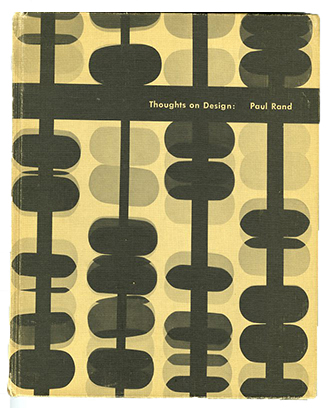
On the occasion of Rand’s centenary, Chronicle Books brought out a new edition of Thoughts on Design, the legend’s first book. Here was the primary document of graphic design, available again in paperback and for your Kindle. I first wrote “modern graphic design” in that last sentence but realized the modifier was unnecessary, redundant. By design’s accounts, this is where it all began.
As moderately priced as the new edition is, I wasn’t tempted to pick one up. That’s because I’m fortunate to own a copy of the 1951 Wittenborn & Company second edition (purchased at a library remainder sale for $1—a steal from its previous owner, who had to fork over $5, according to the penciled notation on the title page). Since this was billed as the return of the landmark tome, I could just consult my find to opine on the Master’s masterwork.
I expeditiously navigated the book’s 136 main text pages: 97 of them entirely composed of reproductions of Rand’s work or containing no more than a paragraph of text, another 16 either totally blank or having just a caption for the facing page reproduction of a design piece. But I quickly became disoriented when I perused on line commentaries on what I’d just encountered.
The first perplexing instance was reading Michael Bierut’s introduction for the reprint, posted at Design Observer. The subtitle for the article on the site’s home page immediately didn’t jibe: “On Paul Rand’s 96-page masterpiece.” 96? What was he counting? Reading the article, I was confronted with other disparities.
“This, perhaps, has never been said better than in the book’s most quoted passage,” Bierut wrote, “the graceful free verse that begins Rand’s essay ‘The Beautiful and the Useful.’ Graphic design, he says, no matter what else it achieves, ‘is not good design if it is irrelevant.’”
I had just read the book and couldn’t recall such a passage. And it wasn’t as if the text was that long to slip my mind. You could possibly commit the entirety—captions too—to memory and recite it verbatim in short order. “Graceful free verse”? That described nothing in my copy, all straight prose paragraphs. Were we reading the same book?
It turned out we weren’t. When I scanned the blurb on the Chronicle Books web page for the book, the discrepancy became clear:
“One of the seminal texts of graphic design, Paul Rand’s Thoughts on Design is now back in print for the first time since the 1970s. Writing at the height of his career, Rand articulated in his slender volume the pioneering vision that all design should seamlessly integrate form and function. This facsimile edition preserves Rand’s original 1947 essay with the adjustments he made to its text and imagery for a revised printing in 1970, and adds only an informative and inspiring new foreword by Pentagram partner Michael Bierut. As relevant today as it was when first published, this classic treatise is an indispensable addition to the library of every designer.”
What is being advertised as “seminal” is actually supplanted. The 1970 version removed earlier examples of work, added new ones, and substantially reworked—and abbreviated—the text. For example, these are the words being quoted as opening the first essay:
“Graphic design—
which fulfills esthetic needs,
complies with the laws of form
and the exigencies of two-dimensional space;
which speaks in semiotics, sans-serifs,
and geometrics;
which abstracts, transforms, translates,
rotates, dilates, repeats, mirrors,
groups, and regroups—
is not good design
if it is irrelevant.”
Rand actually began his first book this way:
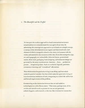
“To interpret the modern approach to visual communication as mere sensationalism is to misunderstand the very spirit of our time. In advertising, the contemporary approach to art is based on a simple concept, a concept of the advertisement as an organic and functional unit, each element of which is integrally related to the others, in harmony with the whole, and essential to the execution of the idea. From this standpoint, copy, art, and typography are indissoluble. Editorial layout, promotional matter, direct mail, packaging, book designing, and industrial design are governed by the same considerations: function…form…production process…integrated product. Such an evolution logically precludes extraneous trimmings and ‘streamlined’ affectations.”
Not as uplifting. What was terse to begin with becomes practically telegraphic. “Adjustments” glosses over a substantial elision of the book’s look and meaning. While not exactly misleading, the publisher’s blurb—and Bierut’s introduction—vaults in its claims between decidedly different books. The 33-year-old Rand is given credit for what the 56-year-old wrote. In his new introduction, Bierut states that despite his age, the younger Rand “was ready” to compose his first book. By his subsequent actions, he plainly wasn’t.
Matters grew more complicated when I consulted my copy of what is said to be Rand’s second book—1985’s A Designer’s Art. This “revised and updated” volume incorporated and adapted much of Thoughts on Design’s content, with further rewriting, substitution, and addition of imagery. This book saw reprint by his estate in 2000 (the edition I have) and is now, itself, out of print.
That Thoughts on Design has been technically unavailable for 44 years is then doubly immaterial. Rand’s original conception is long gone—by the author’s choice.
So what is being cast as an event really isn’t one at all. The blurbs properly note that this new book is the 1970 version. However, they do so without noting how different it is from the first. And if, as claimed by its publisher and its forward (then parroted by many design outlets), its message is “as relevant today as when first published,” shouldn’t we see and read precisely what was first published?
3: Why make changes?
Whatever one thinks of Paul Rand and his ideas, the book is a classic: a landmark artifact of graphic design history. I’m usually not much for shoulds, but it’s a book that should stay available. Without an awareness of the concepts identified with Paul Rand, you can’t understand much of graphic design activity globally over the past 60+ years—either production by Rand’s disciples or his detractors. And I’d readily grant Rand and his estate purer motives than, say, David Carson’s attempt to nullify critics by rushing out—after only five years—a revised The End of Print with fresh editorial dissembling.
In spirit, the Thoughts are the same. Rand abandons none of his core principles. This isn’t a Tschichold-like renunciation. But in many details, the doctrines are shaded and lessened. In the first of the three-paragraph preface to the 1970 third edition, Rand points out the changes:
“In this edition of Thoughts on Design, the writer has made certain emendations. However, these do not materially alter his thoughts or intentions. It is for the purpose of clarifying some of the ideas and enriching the visual material that a portion of the text has been revised and a number of illustrations have been replaced.”
(The second paragraph becomes the core of the even shorter preface to A Designer’s Art.)
More is going on than Rand honing his arguments and writing skills. His use of the term “emendation” displays an erudite self-deprecation. Supposedly, Rand was insecure about his writing ability throughout his life. But while he didn’t perform a large-scale retreat from his essential positions between editions, corners are rounded off and edges trimmed.
Rand also simply needed to have the book live up to its title. A suitable name for the original would have been Thoughts on Design of Advertisements (and Application to Select Book and Magazine Covers). It was a narrowly focused study that neglected a broad swath of commonplace design activity. The 1970 edition expanded the circle of artifacts only slightly. The important additions—ones that likely necessitated the book’s overhaul—were corporate trademarks. In the years between editions, the logo became the locus of Rand’s practice, renown, and theory. Corporate identity was key in every way—and nowhere to be found in Thoughts on Design.
This absence is a case for the creation of A Designer’s Art. But why gut the first book in between? The omission of logo and corporate identity work created a yawning chasm in that first book, one that Rand elected to backfill. The 1970 edition papers over the gap: See? I knew it all along. Simply put, it’s revisionist history. If anything, Rand was behind the curve in directly addressing the rise and eventual dominance of corporate identity in design activity. To be fair, he was busy driving the development in his own work.
So, to talk as if the reissue is the work of the young wunderkind is to misrepresent the reality. For instance, in Fast Company’s “5 Timeless Marketing Lessons for Today’s Brands from Visionary Designer Paul Rand,” by-liner Hugh Hart approving quotes the Master “in his remarkably prescient 1947 book Thoughts on Design about the value of surprise in marketing”:
“For an advertisement to hold its own in the competitive race, the designer must steer clear of visual clichés by some unexpected interpretation of the commonplace.”
The problem is, again, that Rand did not write that in 1947. Instead, he wrote this:
“However, for the advertisement to ‘hold its own’ in a competitive race, it must be off the beaten path by some more interesting device: the abstract symbol.”
These two statements are distinctly different. The original instruction calls for a specific formal device in any and all instances, regardless of subject or situation. A modifying directive—“If this symbol is too obscure in itself, it should be balanced with universally recognized forms”—is as demonstrative, and intellectually suspect.
Though common Modernist design dogma at the time—and is still quite detectible today—a belief in the actuality of “universally recognized forms” has (to be charitable) not worn well. Tellingly, Rand saw fit to completely remove this chapter altogether; “Individuality and Abstract Forms” is retired for the new “Imagination and the Image.”
The replacement text is less prophetic than anodyne. It took Paul Rand nearly four decades in the design profession to counsel against cliché? How influential was that 1947 book if it made this decree necessary? Meanwhile, the remedy (“some unexpected interpretation of the commonplace”) could possibly be less specific—but only with some effort.
However, as with many of Rand’s pronouncements, his writing skill lies more in making vague hand-waving sound authoritative. Overall, rather than giving assertive testimonies, Rand seems to be struggling to find things to say. The obvious evidently ranks high. To deliver these basic instructions constitutes an unkind indictment of his profession. It’s a wonder Rand is so revered by his fellow practitioners. No enemy has depicted designers as so clueless.
4: Terra nova
In assessing Paul Rand’s seerage, we must recognize that neither the content nor the context for the 1970 book was the same as the 1947 original. The intervening 23 years, with Rand’s accretion of accolades, the climb to exalted stature within his field, all played a substantial role in how that 1970 edition was received.
That the edition being considered is not the original doesn’t automatically negate the claims. And it’s just as possible that appreciation for the book’s achievements might increase were we to evaluate that 1947 edition. But, on the whole, the design profession doesn’t really care to know. 1947, 1970, 1985, 2014—what’s the difference?
To argue that these variances are irrelevant is to assert that words don’t matter, that specific meanings are unimportant. This goes against Rand’s own clearly articulated belief. Why make these changes unless words, and meanings, are significant?
Of the qualities that Rand is honored for, high amongst them is precision. If it is to be said that he was “prescient,” we must alter the start date on his clairvoyance by over two decades. We must also say that, in a number of subtle yet profound ways, he got it wrong. He also clung to problematic opinions throughout revisions.
For instance, in “The Symbol in Advertising,” the crucifix is claimed to be “a perfect union of the aggressive male (vertical) and the passive horizontal (female). And it is not too far-fetched to infer that these formal relations have at least something to do with its enduring quality.” The passage remains in the 2000 edition of A Design’s Art and the current Thoughts.
Is it not too far-fetched to catch at least a whiff of misogyny here? Rand’s reading of the crucifix is utterly cultural. It may also be a concept borrowed from Adolf Loos’ influential 1908 essay “Ornament and Crime”: “The first ornament that came into being, the cross, had an erotic origin. The first work of art, the first artistic action of the first artist daubing on the wall, was in order to rid himself of his natural excesses. A horizontal line: the reclining woman. A vertical line: the man who penetrates her. The man who created it felt the same urge as Beethoven, he experienced the same joy that Beethoven felt when he created the Ninth Symphony.”
As a foundational document of Modern design thought, it’s in keeping that Rand might incorporate a Loos reading of form, acknowledged or not. It’s an open question if Rand even knew Loos to be the source. But Rand wasn’t reticent to footnote. Might it be that the full quote was deemed too risqué by a genteel practitioner?
(A further, peculiar aspect of the Loos reference is that there are at least two similar but different versions of the “Ornament and Crime” article in circulation in print and on line. Most feature the crucifix reference, while others—notably the current book collection of Loos essays—do not.)*
That Rand then wanders into the “Oriental and Occidental thought” of the Book of Changes to provide corroboration can’t salvage a maladroit rationale. Again, Rand seems to be casting about for “objective” reasons for what were intuitive choices. He’s trying too hard.
It’s readily acknowledged that advertising copy was the template for Rand’s writing. Short and snappy, ad copy is all about assertion with minimal (if any) evidence. It trades on received wisdom, brooks no ambivalence nor admits to nuance. All of these are hallmarks of Rand’s text. The copy within the ads he designed for Benzedrine Inhalers blends perfectly with the surrounding heady theory he produces. Product and process; it’s all the same.
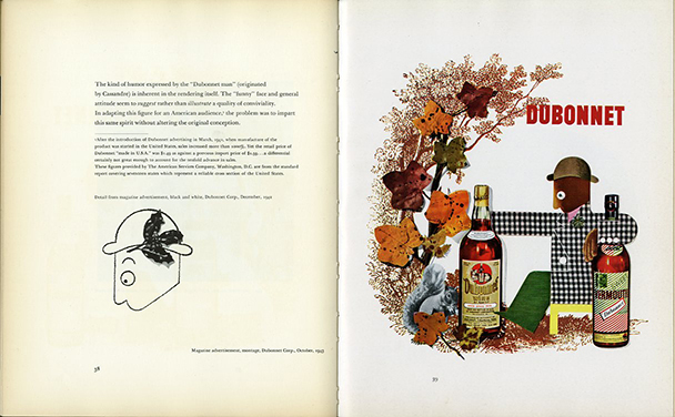
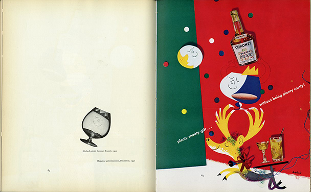
Another noteworthy aspect of the original Thoughts redacted in later editions is the citation of sales figures for advertising campaigns. In three instances (Dubonnet, Coronet, Air-Wick), Rand footnotes his text on specific projects to flourish hard, high numbers:
“After the introduction of Dubonnet advertising in March, 1941, when manufacture of the product was started in the United States, sales increased more than 1000%. Yet the retail price of Dubonnet ‘made in U.S.A.’ was $1.49 against a previous import price of $1.59…a differential certainly not great enough to account for the tenfold advance in sales.”
While taking care to dispense disclaimers that his design might be exclusively responsible for the sales increase (“It would be impossible, of course, to prove that this popularity is due entirely to Coronet advertising”), Rand’s proffering of such statistics was plainly meant as affirmation of his craft’s ability to boost bottom-lines. (It also suggests we could read the book’s cover as more than an engaging photogram pattern—might it be a sly reference to calculating revenues?)
Now, and for many years previously, such bold reference to gelt appears crass. It sets up an awkward straddle: design has to proclaim its practical, economic viability while eschewing quoting actual earnings. The door can be opened to a dangerous conclusion: the most effective design is that which sells the most. This places too much power in the hands of the consumer, who has historically been portrayed by designers as, by turns, intuitively discriminating and damnably philistine. Design’s policy is to move the goalposts. Precise evidence of sales of specific products is dropped for a corporation’s overall prominence in its field (see: IBM).
Design continues to have an ambivalent—if not inconsistent—affiliation with evidence for its effective power. The recent uproar over AIGA’s restructured “Justified” competitions is a case in point. The core scorn was for the requirement that applicants provide some objective measure of the design’s success. For many practitioners, it’s vulgar to tout a design’s “Return on Investment” as an aspect of determining its quality.
That said, it’s to Rand’s credit that he wasn’t above hitting the spreadsheets to prove his dedication to advertising’s raison d’etre—profit. “Accessible…aesthetic development” is all well and good but not on the company’s dime. And had Rand continued the practice, we might salute him as intellectually daring and progressive.
A few years ago, an art history panel at the College Art Association annual conference featured a unique and controversial paper. Instead of turning to critical opinion of the time, the researcher actually investigated gallery sales figures to determine what the influential art of a particular era actually was. What might seem commonsensical was, in this context, radical. Art’s own connection to sales is no more purer or less tangled that that of design.
A service that Thoughts on Design provided was to emphatically situate graphic design activity in relation to fine art, while performing a deft—if ultimately unsuccessful—two-step that supplied design with its own discreet identity. While Rand’s intended end was visionary—to consider graphic design in a contemporary art context—his route there is unconvincing. In terms of locating graphic design in culture, Thoughts on Design was a major missed opportunity. Rand simply didn’t have the intellectual chops (note: this is not to say that Rand was at all unintelligent, just unversed in art discourse). An unfortunate legacy of the book is design’s ongoing cramped and retrograde view of art, one that squelches any substantive discussion.
Were Rand truly aware of and comfortable with his times, he might have articulated a progressive, coherent position for himself and his activity. He could reasonably claim a status as the most influential artist of his day. Unfortunately, in his ruminations, Rand stays within the realm of an outmoded aesthetics, leaping over the immediate European Moderns—and most importantly, American—to those of a recent, but superseded group.
Rand chooses a flavor of Modern more to his taste. By the calendar, Roger Fry’s musings are nearly contemporaneous with Rand’s activity. However, the people chosen to quote are backwards looking. They describe art that, however meritorious, was no longer the leading cultural edge. Just as soon as graphic design establishes a Modern identity, it is shackled to the past.
Of course, discussing the art portions of Thoughts on Design is arguably moot. Except for the most artistically naïve graphic designers (which actually encompasses the majority of practitioners), Rand’s art philosophizing is considered pretty duff stuff. Those bits get skipped. However, his meditations continued throughout his writing career and were part and parcel of his total ethos. Cutting out the art aspects of Thoughts—focusing only on his direct design theorizing—excises the book’s heart.
Publication of Thoughts on Design fired a starter’s pistol for a race between Rand’s reputation and developments in art. Rand’s stature easily outpaced the latter. His fame quickly grew to proportions that, in design, made the accuracy or relevance of his theorizing beside the point. Rand created his own reality.
5: Terra incognito
By summoning only select critics to support his “functional-aesthetic perfection” Rand skirted the prominent art thinkers of the immediate day to find succor from early 20th century British critics—such as Bloomsbury Grouper Roger Fry—who valued aesthetics and scorned social utility. Notable by their absence are any contemporary art critics, of about the time of the original book or later. In his thinking about art, Rand was decidedly retro and Anglophilic his entire life, steering clear of our country’s pioneering Modern art theorists. Foremost amongst them is Clement Greenberg, whose view of art was antithetical to Rand’s ambitions.
Passages like this from the 1939 essay “Avant-Garde and Kitsch” wouldn’t sit well:
“A society, as it becomes less and less able, in the course of its development, to justify the inevitability of its particular forms, breaks up the accepted notions upon which artists and writers must depend in large part for communication with their audiences. It becomes difficult to assume anything. All the verities involved by religion, authority, tradition, style, are thrown into question, and the writer or artist is no longer to estimate the response of his audience to the symbols and references with which he works.”
Greenberg demolishes the idea of sureties and verities, while almost a decade later Rand proclaims them. Throughout his writing career, Rand posits a near-monolithic culture that could be entertained and commanded through the application of carefully crafted “symbols and references.”
The capitalism system that nurtures Rand—with Rand reciprocating the love—and is his vehicle for bettering society, is for Greenberg “in decline” and “finds whatever of quality it is still capable of producing becomes almost invariably a threat to its own existence…Today we look to socialism simply for the preservation of whatever living culture we have right now.”
Worse still is where Greenberg would place graphic design and advertising. It’s the “kitsch” of the essay’s title.
“Where there is an avant-garde, generally we find a rearguard. True enough—simultaneously with the entrance of the avant-garde, a second cultural phenomenon appeared in the industrial West: that thing to which the Germans give the wonderful name of Kitsch: popular, commercial art and their chromotypes, magazine covers, illustrations, ads….”
As you might expect, Greenberg doesn’t have kind words for kitsch:
“Kitsch is mechanical and operates by formulas. Kitsch is vicarious experience and faked sensations. Kitsch changes according to style, but remains always the same. Kitsch is the epitome of all that is spurious in the life of our times. Kitsch pretends to demand nothing of its customers except their money—not even their time.”
Rand could legitimately counter that he also rejects formula and stylistic volatility. If Rand’s critical lights traded in an early Modern highbrow snobbery, Greenberg was exhibiting his own singular brand of snooty with his remarks on designed artifacts.
Greenberg at least addresses what was in formation and, for good and ill, what he played a key role in forming. What would have made Thoughts on Design truly perceptive would have been to engage the avant-garde art of his day, and the thinking behind it. In many ways, the world in which Rand’s work was experienced was more in line with the tastes of Roger Fry. Culture didn’t change course so abruptly.
But if Thoughts on Design fit the prevalent aesthetic context in which it appeared, said context was rapidly being ousted. I quote Greenberg not to certify his views—he’s had a legion of legitimate opponents—but to illustrate where progressive Modern thought traveled in art. But yet again, it may all be extraneous. In the end, it’s unlikely that even Rand’s preferred culture experts would embrace advertising.
6: A rough test of quality
This level of analysis may be heavy-handed. It’s widely accepted that Rand’s book are essentially portfolios, not objective explorations or expansions of ideas. They are polemics, repeatedly underscoring of one word writ large: Modernism. If played properly, in its time and ours, repetition can be moving. Most artists delineate an aesthetic space and draw upon and over it for the entirety of their careers. This is merely to affirm what Thoughts is—a personal/professional validation—and what it isn’t—an open investigation of creative possibilities.
Monograph or manifesto, to properly assess Thoughts on Design and its relevance, critics and commentators need to contemplate the original artifact within its historical moment. It’s more than a scholarly interest. Creators can’t be trusted to interpret and preserve their own visions, or to understand the implications that “emendations” can have on their art and image.
While Rand pointed out his textual modifications and the substitutions of images in his 1970 edition, he made no mention of his layout changes. Apart from the cover image, the later book sports an entirely different look. His desire to rework his words, an area not to his expertise, is reasonable. Design is another matter. Substantial revisions here should garner some attention.
With Paul Rand, even minor formal moves are significant. For him to embark on a wholescale reimaging of a book is conspicuous. For it to go unmentioned by the designer, and unnoticed by its audience, is noteworthy at least. Even if benign, the scale of this particular change begs explanation.
Rand didn’t consider his creations inviolate. Reportedly, he offered, at his own expense, to tweak his iconic UPS logo and resolve a formal irregularity. If there’s an aspect to the redesign that smells suspicious, it’s that the design audience pays it no mind.
Though the abacus photogram remains as the cover graphic, we immediately see a typeface substitution that carries over to the interior pages on the revised editions. The original titling Futura Bold font is swapped out for Rand’s beloved Bodoni (“an example of a basic design that never goes out of style and a reminder of Dewey’s ‘a work of art is recreated every time it is esthetically experienced’”). The terminal colon after “Thoughts on Design” is also excised.
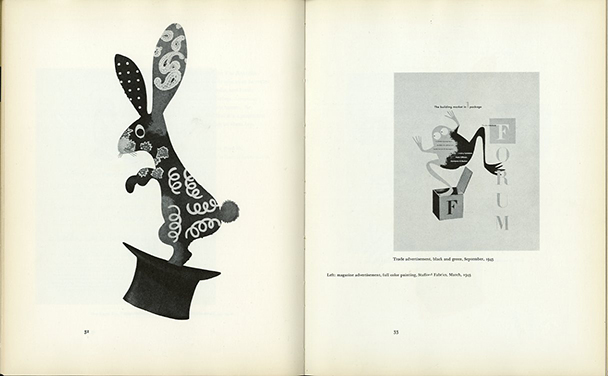
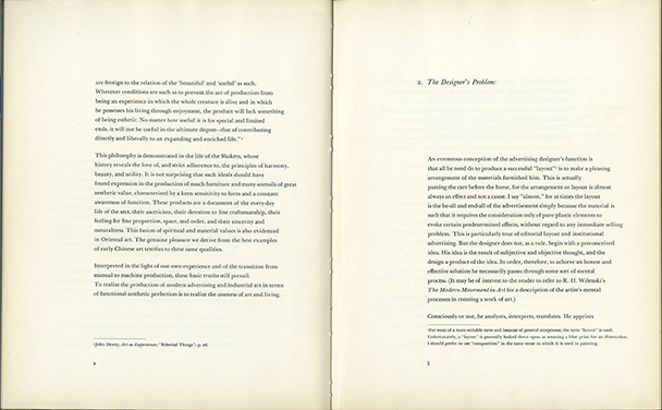
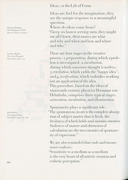
The original interior layout is an airy, straightforward asymmetric presentation with touches of Rand “sparkle” to enliven the structure. Generous margins surround ragged-right blocks of Baskerville, which dresses all interior text, save for the book title on the title page. An eccentric setting choice is to disdain hyphenation, leading to some gawky line-ends. Still, it’s a less egregious typographic flaw than the double spaces after punctuation (!) found in his type a year previous for Modern Art in Advertising.
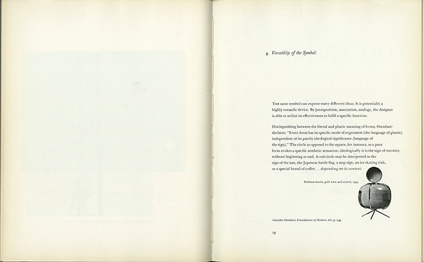
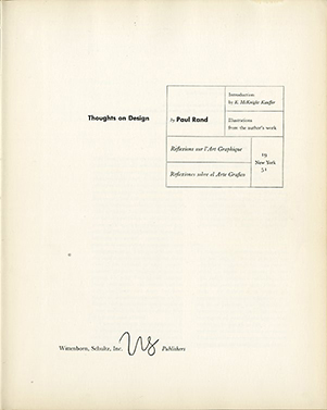
Footnotes are set at the bottom of text columns, with captions usually aligning to the left edge of images or occasionally floating independently, if not placed on a facing, otherwise blank page. Images of Rand’s design work and the main text largely occupy separate pages. However, in chapter 4, “Versatility of the Symbol,” he places a perfume bottle tight to the base of the text block to the right, energizing that page. Another arrangement that could count as fanciful is the title page. A thin-ruled flag-like frame of six sections holds the majority of text, set opposite the book title.
All told, the original book has 159 numbered pages, plus ten Roman-numbered introductory pages. Another feature that did not survive emendation is French and Spanish translations of the text, set in the back of the book (save for the introductory material) in two narrow justified columns of smaller type.
The entirety of this scheme is junked in favor of a layout that graces all successive Rand pamphlets and books. The “Transitional” Baskerville is, perhaps, deemed (literally) insufficiently Modern and replaced with the favored Bodoni—whose high contrast makes it a dubious (though classic in appearance) text face.
While the body copy remains in ragged right settings, the point size jumps to an over-standard scale. The look is reminiscent of Large Print editions or a children’s book. Combining the latter with the pedantic tone of much of the text conveys a patronizing air to the affair. The text columns now reach to the top of pages, filling more of the vertical space. The narrower left measure opposite the main text columns now contain chapter heads and footnotes, set across from the referring copy. Though now hyphenated, the shorter-measured lines still sport an inelegant rag.
This schema was evidently introduced with the 1970 edition of Thoughts. Another curiosity of Rand’s overall handling of his books was that he then strayed from this layout—which was to become the template—taking a slight detour for A Designer’s Art (Univers! Helvetica!). Was it a stutter?
It’s the norm for designers to tinker with their approaches across incidences of the same artifacts. A new book is an opportunity to reconsider its form and function ad infinitum. It’s what designers do. Even if—probably especially if—you’re Paul Rand. What’s at issue isn’t the simple fact of Rand directing changes in his work. It’s the inconsistent inquiry afforded his products in comparison to his outsized reputation. Paul Rand is simultaneously the most and least scrutinized practitioner.
7: House-organ
Self-scrutiny is also notoriously unreliable. Artists aren’t trustworthy analysts of their motivations or perceptive of the actual reasons for their accomplishments. If an artist meets with success when wielding a specific creative program then it’s natural to attribute said triumph to the system.
Rand deftly described his philosophy and its application—and how it influenced clients and audiences. But as was observed in his later years, when corporations turned to design Rand regarded as inferior, he was at a loss to explain it—other than to declare said companies’ CEOs foolhardy. A faulty diagnosis on his part didn’t occur to him.
Just as designers themselves are unreliable witnesses to their work and times, so are the profession-centric authors to which the field entrusts its history. Though Steven Heller dedicates an entire chapter to “Paul Rand: Author” in his lauded 1999 monograph, he makes no mention of the second, substantially reworked edition of Thoughts on Design, skipping to A Designer’s Art. As is often the case in design field, Heller’s bio emphasizes celebration over scholarship.
Celebration is the order of the day with Thoughts on Design’s reappearance. From the varied commentary in its wake, there seems little in contemporary graphic design that the book didn’t foresee or for which it isn’t responsible. It’s incontestable that the author was a profound influence on a generation of designers. And it was Paul Rand’s first book. However, this doesn’t necessarily add up to Thoughts on Design warranting regard as the prescient, pioneering article that’s claimed.
As we’ve seen, today’s commentators are describing a simulacrum. And trying to locate the source of proof for the various distinctions conferred upon the book—or, for that matter, most praises bestowed within the design profession—is often frustrating. The mainstream design press is a round robin of opinion, each bird re-tweeting the previous with no checking or sure derivation. In other words, says who? Answer: someone (else) famous.
Assessing the legacy of Thoughts on Design is therefore more complicated than allowed. After the fact that many commentators haven’t even read the true 1947 version (unaware that it’s a dissimilar book), or even the reissue (and are depending on someone else having read it and knowing what they’re talking about), there’s the actuality that said pundits likely haven’t bothered to investigate the possibility of other claimants.
8: Novel. But how novel?
The picture of early 20th century design painted by Thoughts—new or classic—and its present-day devotees is that of a fusty, dour expanse of feeble hoopla. Into this turgid marketing hackscape swoops Paul Rand, brandishing the liberating power of (bowdlerized) European Modern formalism. This one-man funnel cloud of fresh air disperses the stale stench of business bromides, transforming design into an edifying and lucrative dynamo.
As origin stories go, this is fairly archetypical—particularly for artists (except the lucre part, we look away from that)—and plays well in an individualistic culture. But when isn’t this derivative scenario of lackeys and lacklustery mapped onto the present day? And we’ve been enjoying an extended golden age of invention and prosperity since 1947, right?
Paul Rand’s is an inspiring, hardscrabble tale of attainment through prodigious talent and effort. It’s no less momentous for its applicability, with differing degrees of fortune, to other design figures in history. And the “hotshot young ad exec on the make” is an established, stock character.
In many cases, categories must be sliced molecule thin to dispense credit to Rand for being the trailblazer. Other designers of his time were producing effective and engaging ads, book and magazine covers, logos, identities, and posters. Placing Rand amongst the preeminent practitioners is fitting. But giving him primary positioning requires distinctions that distort rather than refine meaning.
The design stage of the time boasted a number of gifted actors alongside Rand in channeling European Modern style. Alvin “Born Modern” Lustig and Lester “Thrust and counter-thrust” Beall are just two conspicuous names we might conjure. What puts Rand on the top rung? First with a book wins design? Thoughts on Design certainly can’t claim that distinction. In fact, there was an eminent book on design that saw its reissue the year after Rand puts out his first.
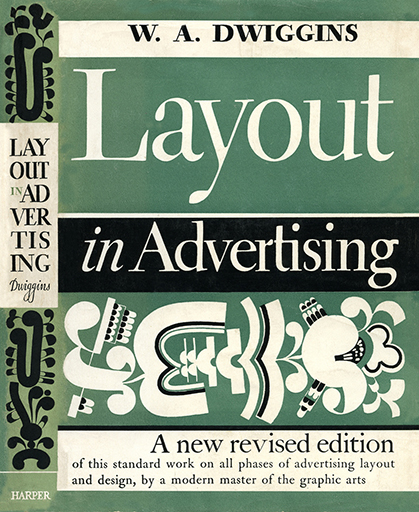
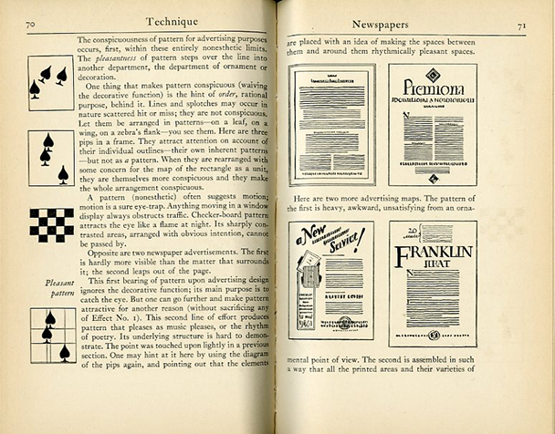
William Addison Dwiggins’ Layout in Advertising, first published in 1928, “was considered the standard text on the subject,” according to his bio for Art Directors Club Hall of Fame. Dwiggins is legendarily recognized—or should be—for coining the term “graphic design” in 1922. His book was just one publication in a wide-ranging and extensive writing career that included fiction and non-design-related topics. Rand was well aware of Dwiggins’ text, including it in the “Select Bibilography” of his final book From Lascaux to Brooklyn.
Dwiggins was also an advertising designer, book designer, type designer, typographer, letterer, calligrapher, illustrator, theorist, historian, playwright, master marionettist, and more. In its existence as a discreet discipline, graphic design hasn’t produced a figure that comes closer to being its Renaissance man.
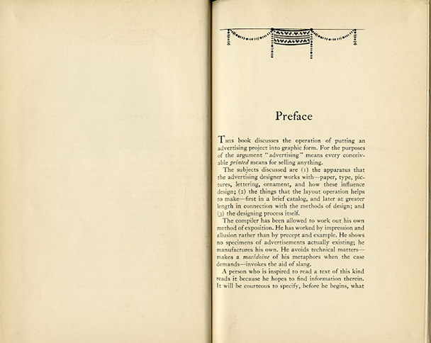
Ironically, between the respective books, each man’s label is more suitable for the other’s. Where Rand speaks almost exclusively of the graphic arrangement of advertisements, Dwiggins examines a variety of products, from “blotters” to billboards. “This book discusses the operation of putting an advertising project into graphic form,” begins the Preface, “For the purposes of the argument ‘advertising’ means every conceivable printed means for selling anything.”
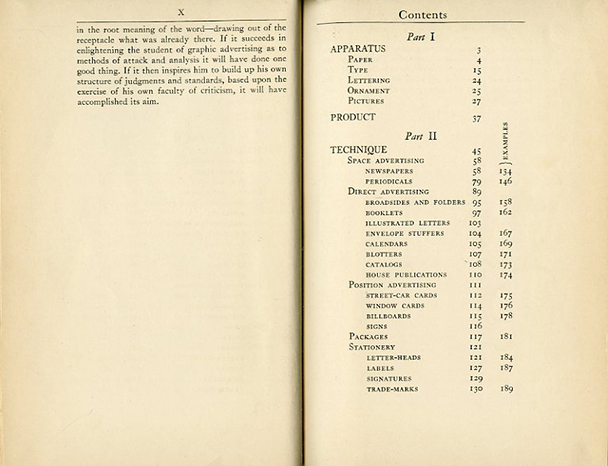
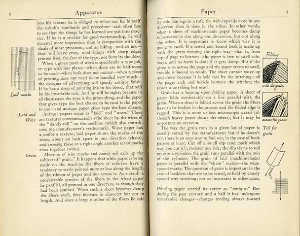
In 200 pages (including index), Dwiggins crafts an authentic how-to guide that is detailed, specific, clear, and clear-headed. He first discusses the physical components of design pieces, and the process of printing and constructing them. His presentation of design is holistic, confronting the individual concerns of doing design along with the practical. Instead of offering his own work or that of others to elucidate his principles, he fashions speculative sketches.
Dwiggins is opinionated yet aspirational, refusing to lecture or impose his particularized vision. Readers are encouraged to develop their own critical sensibilities and personal voices:
“…the writer has not assumed to give directions. He has aimed, rather, to help the practitioner compile his own book of directions. The help that the text may be expected to provide, then, will be along the lines of evocation—or education in the root meaning of the word—drawing out of the receptacle what was already there. If it succeeds in enlightening the student of graphic advertising as to methods of attack and analysis it will have done one good thing. If it then inspires him to build up his own structure of judgments and standards, based upon the exercise of his own faculty of criticism, it will have accomplished its aim.”
This promotion of diverse approaches, balanced with an unwavering commitment to craft and a critical component in making is thoroughly contemporary and far-sighted. Layout in Advertising’s instructions on organization, ideation, layout, and typography are as applicable today as they were in 1928. Only an updating of its visuals—and some period idioms and references—would be required to put the book back on the shelves.
In comparison, Thoughts on Design is vague, officious, and disinterested in the actuality of design practice—its process and physicality. Rand’s design is about the surface. His prose is stiff and struggling, reliant in large part upon the words of other, non-design writers to elucidate his notions. Dwiggins is smooth, conversational, playful and confident.
9: Logical import shapes the map
Articles promoting the reissue of Thoughts on Design haven’t stinted on the praise. By all accounts, Rand is responsible for initiating most everything he deigned to mention. However, there’s little that Layout in Advertising didn’t get to first. Rand’s original first paragraph quoted above sounds as if he was reporting on Dwiggins’ main points.
What about “the role of typography in terms of both amplifying and complementing a message?” Dwiggins has you covered:
“Printers who advertise indulge in a great deal of talk about the expressiveness of this type and that, about making typography fit the crime….One is inclined to doubt the truth of these arguments….it isn’t so much the types that give expression to a mood as it is the way they are put together….In the pursuit of novelty it is probably wiser to depend for that quality upon a way a normal type is handled rather than upon an eccentric type. It is dangerous to play pranks with the actual reading process itself—with legibility….”
The almighty logo? On it. Dwiggins opens with a jaundiced eye on the marks of his time: “A trade-mark—the usual trade-mark—is a necessary evil. It is utterly indigestible.” He then zeroes in on the essentials:
“A proper trade-mark needs to mean something. At its best it is an epigram—a tense and pungent summary of some significant fact about the business. The words to be stressed are ‘epigram’ and ‘summary.’ A trade-mark that attempts to illustrate a process in detail, for example, fails on both accounts.”
Missing from Layout in Advertising is the European Modern-inspired fetish about the abstract symbol and Gestalt principles. Again, spurning trendiness, Dwiggins offers timeless advice that doesn’t require multiple modifications.
Another aspect of design where Rand is bestowed a foundational role is validating humor throughout the profession. According to Michael Bierut, “Rand’s essay on humor…really had a lot to do with setting the tone for a whole school of design and the tone of advertising that would follow.” If tightly aimed on advertising (“advertisements were dominated by exclamation points and all these explicit overwritten evocations of convenience, modernity, product performance”), Bierut’s assessment may be sound. However, a few sentences later, Rand has suddenly “introduced humanity” to design.
Though evidence of Rand’s humor continues to elude me (if present, it’s so dry as to be dessicated, and a far cry from wit), advocating in favor of drollery is always welcome. But it’s a stretch to stand Rand above all comers in using a light touch, to say nothing of “introducing humanity.”
In Thoughts, Rand himself cites another effectual use of humor, and in an arena less expected to display it than advertising: “…as an aid to understanding serious problems in war training, as an effective weapon in safety posters, war bond selling, morale building, humor was neglected neither by government nor civilian agencies during the war.”
Before getting carried away with Rand’s supposed instillment of humor or humanity into design, we must keep in mind that it was all strategic: “Readership surveys prove the magnetic force of humor as applied to visual presentation, whether in advertising, editorial matter, or miscellaneous design problems.” It wasn’t comicality or personality for its own sake. It was just another powerful tool of persuasion—just like the abstract symbol—to sell goods.
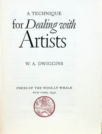
By contrast, humor suffuses all of Dwiggins’ work and is ever-present in his writing. In 1941, he self-published the pamphlet A Technique for Dealing with Artists, a tongue-in-cheek manual advising businessmen how to manage designers (sample chapter: “How to Lower the Conceit of an Artist”). In Layout in Advertising, his prose displays his typical spritely tone that doesn’t need to explicitly instruct designers to lighten up. (Although, a subheading in the “Technique” sections asks “Why so serious?”) In humor, Rand was playing comic catch-up.
In “humanity,” Dwiggins promoted a plurality of approaches and self-empowerment that was alien to Rand:
“It must be pointed out again that the method of design indicated by these expressions is only one of a number of methods successfully used in advertising layout. The procedure advocated is not unique. The methods are almost as many as the practitioners. There is no established and standard practice that can be quoted to aid the student of layout—he will need to evolve his own method of design under the tutelage of his own convictions, his taste, and his experience.”
People came first for Dwiggins. And he allowed for Rand, but not vice versa.
This statement about the basic principles of graphic design would comfortably fit into either book:
“If the reader of this text should be inspired to make a statistical analysis of it, he would find certain words used over and over again: logical, simple, simplicity, pleasing pattern, controlling line, blank space, space design, unity…”
Layout in Advertising also stands out for concluding with a ringing declaration of personal ethics:
“…there are projects that undertake to exploit the meaner side of the human animal—that make their appeal to social snobbishness, shame, fear, envy, greed. The advertising leverage that these campaigns use is a leverage that no person with a rudimentary sense of social values is willing to help apply….”
Repeatedly, tenets commonly identified with Paul Rand are found in Dwiggins’ book. Foremost is the big M:
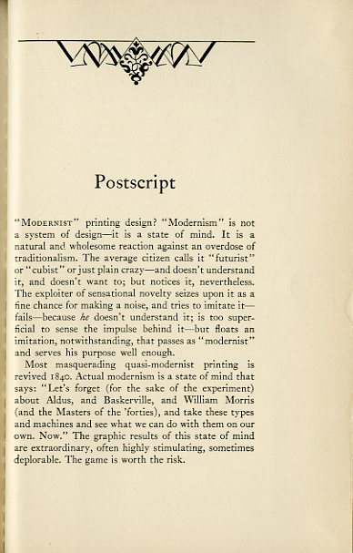
“’Modernism’ is not a system of design—it is a state of mind. It is a natural and wholesome reaction against an overdose of traditionalism. The average citizen calls it “futurist” or “cubist” or just plain crazy—and doesn’t understand it, or doesn’t want to; but notices it, nevertheless.”
The two designer’s respective Modernisms diverge. Rand’s creative gaze is fixated eastward, drawing his immediate inspiration from the European Modern strain, then of that continent’s artistic and intellectual histories. At times, the only American Rand seems able to abide is someone like expatriate E. McKnight Kauffer, who wrote the introduction to Thoughts. No such limitation is displayed by Dwiggins, whose internationalism included identifying with his home country’s creative legacy.
As he danced around “advertising art” and it being an “easily accessible means of aesthetic enjoyment,” Paul Rand’s goal was to elevate design and the public. The unfortunate result was to fashion Thoughts into an ersatz art history text, adopting the form of such books while misapprehending their substance. He then compounded the error by refashioning the book (and all that followed) into a self-declared “primer,” complete with the condescending manner it entailed.
Another sad legacy of Thoughts is that with the veneration of Rand’s epigrammatic prose, graphic design snuffed out a nascent critical sensibility. Design might have built a distinctive literature upon Dwiggins’ varied and engaging writings, one that invited deep and diverse investigations. Today, that kind of writing is fugitive and dismissed in the field.
Instead, design prizes short, subjective bursts of assertions whose authority largely rests not with the cogency of argument, but the author’s level of professional achievement. Rand surely hoped that his books would garner respect for design activity from thinking, visually perceptive people. By hewing to his example, design ensures it won’t be taken seriously outside its boundaries.
Bill Dwiggins related to his audience as an expert but still a fellow traveler. He confronted design as design, a uniquely Modern mode of representation. Dwiggins’ work embodied the formal ideas Rand wore on his sleeve. Were we to draw a Venn diagram of the two designers’ books, there would be substantial overlap. But Layout in Advertising would almost entirely consume Thoughts on Design. The difference is what happened after, and where we are now.
How Dwiggins was shunted aside and largely forgotten by a profession that should (still) extol him was bluntly articulated by Jeffery Keedy in his 1997 essay “Greasing the Wheels of Capitalism with Style and Taste or the ‘Professionalization’ of Graphic Design in America” (also available in Looking Closer 4). Corporate design and its enablers were elevated to the pinnacle of design activity and activism. There was no higher calling—than to be able to call the head honcho direct. In short, money talked—loud and about logos…and still does. Real designers shill for moneyed interests. Everyone else is walking.
Having turned his back on commercial striving, the career path of W. A. Dwiggins—though rich with formally accomplished, effective design—didn’t fit the new mold. (Hingham, Massachusetts? Please.) It didn’t help that he declined to adopt the European style of Modernism—and referred to designers like Paul Rand as “Bauhaus boys.”
A simpler reason for Dwiggins’ stock drop and Rand’s rise is that many contemporary, prominent designers had personal contact with the latter. If not a former student, lecture attendee, or occasional lunch date, Rand was an immediate, living role model. Dwiggins is a dated, distant abstraction.
However, it’s now a categorically “eclectic” era where varied models of design practice and performance are expressed and applauded. For instance, individuals can again combine ingenious decoration with idiosyncratic writing—and be praised for it. WAD stands as a predictive figure that designers didn’t know they had…and needed. We’ll always have Paul Rand.
10: What we choose to see
In its concision, Thoughts on Design continues to act as both perfect mirror and blank slate. On Rand’s sparse surface, designers perceive their reflected aspirations and project their desires. Meaning isn’t found between Rand’s lines; sparsely set, meaning is to be imposed upon them. For my money, Michael Bierut’s homilies on Rand’s writing are far more affecting and lyrical than anything his hero generated. I just eliminate the front man.
For untold designers, the actual Thoughts on Design is literally and figuratively ideal. Were this new edition a faithful reproduction of that 1947 volume, they would probably impose the same lessons on that text and declare it equally portentous. Provenance and chronology are transcended: only Paul Rand could write the hallowed words and he always wrote them.
I realize my mistake about the book was more profound. I wasn’t consulting the wrong text so much as using it incorrectly. The cadence, the short verses, the avowals, the rote repetition: now I really get it. Thoughts on Design is the design profession’s liturgy.
So, having revealed its true nature to us, there’s only one suitable response: Amen.
*My thanks to Marian Bantjes for alerting me to the likely Adolph Loos reference after the initial posting of the essay.
More images of the 1951 second edition of Thoughts on Design and other examples of Paul Rand’s work mentioned can be found on Pinterest here.
More images of the 1928 Layout and Advertising are here.
More W. A. Dwiggins work is here.
