This is my all-time favorite card design. Maybe it’s my favorite design, ever.
I’ve devised a number of gallery exhibition announcements over the years and I’ve always been determined to subvert the standard format. That plan is: full bleed color photograph of an artwork on the front, show information set in Helvetica on the back. Yawn. When mandated to follow this convention, I’ve inserted small eccentricities to break the tedium. It’s also design-strategic: my quirks may make the card stand out.
This is absolute when it’s been for a show of my own work. I first endeavor to disrupt the template for its own sake. But it’s then a response to reality: my work is such a mélange of artifacts that choosing a single piece would be unrepresentative. In any and every way possible I’ve tried to make the show card an artwork in its own right. Following the set pattern is an opportunity lost.
My contrarian notion was indulged early (1982) when I volunteered to design show cards for our annual major exhibitions when I was an undergraduate in Ceramics at Massachusetts College of Art and Design. Those days, my interest in graphic design pretty much began and ended with album covers.

Both of my cards were painstakingly typeset with Letraset, channeling Peter Saville and an uneasy Malcolm Garrett/M&Co. fusion, respectively. Type-only art announcements weren’t uncommon but, to my eyes, they were all Modern literalness and didn’t engage typography’s potential. They didn’t have the same mystery and sophistication that Saville’s work evidenced.
My limited pride in my cards came from their simple existence. Aesthetically, I couldn’t see past my sources. Plus their stock made them feel insubstantial: a shiny red cover stock for the first, a lightweight heavy text for the latter.
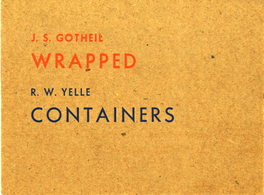
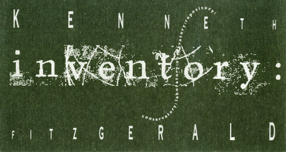
It was in this context that I received the Wrapped/Containers card, which instantly crystallized my desires and became an exemplar. Thirty-one years later, I still cherish it and occasionally design-geek-out over it with students.
The enhancement this card brought was that it extended into materiality through its heavier, speckled, rough stock. It suggested and reflected dimensional objects by being sculptural in its own right. Modernist “truth in materials,” done right. However, it was the slight impression of the characters into the board that gave it its frisson. At the time, I had no idea how it was produced. If I ever had the chance to design a card again, I wanted to use the unique technique. It took me years to discover letterpress, which complicated matters.
Typographically, I still admire the subtle placement and scaling of the lines. Then there’s the quirky choice of complementary colors. All added up to a subtle subversion that may not have been intended. This ability to read into a work, to be invited in and construct meaning, is one I value highly. It’s more than the lack of detail which energizes the reading into—it’s the presence of the detail that is present.
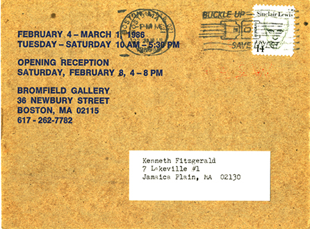
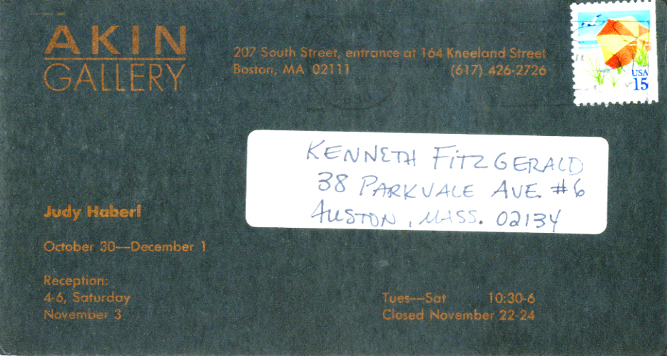
The verso is just as terse but sustains the enigmatic tone. Letterpress evidently wasn’t an option here and it goes offset. And too much pragmatic information must be imparted, limiting the potential. Yet it’s still styled and stylish: a typographer is absolutely at work—em dashes surrounded by spaces! The Helvetica is somewhat of a bum note but is ameliorated by the bolder font and setting. I suspect that Helvetica was all that was available. If so, the deft handling makes the best of a default non-option.
Meanwhile, something’s going on with that ‘phone number. The first hyphen gets spaced…but not the second. Typo? Don’t think so with something this succinct. How would someone otherwise so adept miss that? Unless someone else did the back. I take it to be the designer’s way of distinguishing the area code without resorting to the distracting shape of parentheses. The barbs above the cap line and below the baseline would visually disrupt the flush horizontal momentum of the text. Clever.
That artists’ names and show titles aren’t repeated is another restrained touch. Say something once, why say it again? The blue inking connects back with front despite the typeface change and avoids employing default black. The designer isn’t missing a trick: maximal impact from minimal moves.
That designer remains unknown. I may have considered going to the gallery and asking after a name. But I never even attended the show to my memory. Or if I did, I don’t recall the work. The card sticks with me, though.
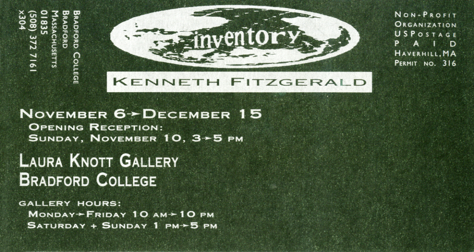
A possible coda arrived in my mailbox a few years later from another gallery. I instantly recognized the typeface and the impressed letters. Now, a flat, semi-gloss black stock, tendering metallic copper characters.
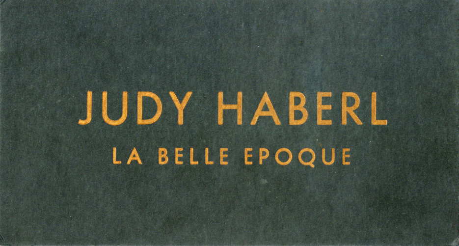
On La Belle Epoque, the artist gets prime hierarchical billing on the front. The reverse features a more distributed, active typography with what appears to be an attempt to relate to the front face with the use of Futura.
But the enterprise seems off, a poor sequel by clumsy student of the first. The front can hold up but not the back. Why those inconsistent alignments? The justified settings aren’t an inspired choice. And what’s up with the hyphens and em dashes? So long, ens, we hardly knew ye.
I was blind to these niceties then, so when I had my next opportunity to design my own show card, I spun off of the poor cousin. To its delinquencies, I added a host my own with a manic layout and typography that tries to do everything at once and delivers nothing.
“Moderation in all things, including moderation,” was one of my mottos (lifted from a John Gardner novel) and it was in full flower here. Another example of the wonders and/or abuses that early 1990s access to Mac desktop publishing made possible. Considering the times and that I was a fine-art-interloping, self-taught design dilettante, I could get credit for a peculiar style of restraint. You could read my card—if you spun it around a few times. Had I access to letterpress, it may have chilled me out some more.
While I secrete my ersatz offerings deep in the drawer, Wrapped/Containers is always on display and in easy reach. It clears space around itself and speaks boldly but softly. It’s provides a valuable lesson. On its own, nuance isn’t a developed design theory—but it’s always an aspirational attribute. Be real, be right.