“Singing the Surface” Live!

A video of my presentation “Singing the Surface,” is available at the VCFA MFA in Graphic Design YouTube channel. The talk was part of my 2016 visit as guest critic, lecturer and workshop leader for the April residency, and had been previously given at Kookmin University in Seoul, and Phoenix Design Week. An adaptation (with different graphics) was published earlier this year in Print magazine.

Print Magazine Manifesto

My article “Singing the Surface,” which I also designed, appears in the Winter 2016–17 issue of Print magazine. The piece is adapted from a lecture I’ve presented at a number of different forums. It was commissioned by the magazine for its “Manifesto” feature which began in 2015 and features “insightful essay-length commentary on the field from people who weren’t afraid to give it and take a stance.” Previous contributions were from James Victore, Art Chantry, Rick Poynor, Mark Kingsley, and David Carson.

Character References: On Emigre type specimens

esamplers

Earlier this year, Gingko Press published Emigre Fonts: Type Specimens 1986-2016, a comprehensive collection of Emigre’s distinctive print samplers. A couple years previous, I went through my personal collection of their specimens dating back to the early 1990s and wrote this appreciation for a project that wasn’t realized. However, on the (late) occasion of Emigre’s book, here’s the essay.

When Rudy VanderLans announced that issue 69 would be the final publication of Emigre magazine, he emphasized—via a “reminder” from partner Zuzana Licko—that it wasn’t the end of the company. Considering the magazine’s primary role in determining Emigre’s identity, and that the journal was its namesake, the notice was necessitous. The foundry that had become the core business would continue developing and vending type.

In addition and importantly, the specimens that promoted their typographic works would continue to be produced. VanderLans had separately declared a commitment to continue these print pieces. The pledge placed Emigre in a distinct minority. We’re in a time that has seen a marked decrease—if not total abandonment—of foundries issuing physical type catalogs. Whether it was a decision based in pragmatic marketing or a nostalgic nod to the unended print, VanderLans’ avowal was welcome among aficionados of everything Emigre. The magazine was an acceptable but tough loss. Having to also bid farewell to the catalogs could have been devastating.

While Emigre magazine was a fundament in its firmament of products, it was always only one aspect of a constellation of printed works that grew up around it and the foundry. By VanderLans’ estimate, the company has generated close to 200 printed artifacts, comprising catalogs, specimens, posters, brochures, postcards, pamphlets, and other printed ephemera published since 1984. All converged in the magazine and spun off from it.

Foremost amongst those ancillary works were the specimens that introduced individual or a selection of faces, and the annual inventory of the Emigre library. In the magazine’s heyday, the boundaries between it and the specimens blurred. For many designers and some critics, Emigre magazine was little more than a glorified type catalog. Curiously, and revealingly, the distinctive critical content is downplayed, if not dismissed. The pioneering type design and marketing originalities are highlighted. Zuzana Licko’s typographic innovations have been evidently easier for the design field to assimilate than the ideas set in her landmark faces.

The appraisal of Emigre magazine as elaborate sales brochure denigrates both the journal and the full-fledged specimens. Emigre absolutely made, and continues to make, glorified type catalogs—but they are the catalogs.

Emigre’s type specimens are the intersection of its two signal accomplishments, the magazine and type design. They are also the most representative artifacts of the partnership of Licko and VanderLans. The reputations of their other products understandably overshadow the catalogs. While the magazine and type have received considerable attention and documentation—most recently in the Emigre no. 70 anthology—the specimens go largely unnoted.

Both for their connection to and fusion of Emigre’s more celebrated work, and as artifacts in their own right, the type specimens are worthy of separate attention. All the aspects of Emigre’s contributions to contemporary design are present in form and content. If, as Rudy VanderLans regarded them, issues of the magazine are considered graphic “albums,” the specimens are the “EP’s” and “singles.”

Emigre’s specimens are notable for the negotiation of practical considerations and creative idealism—the essence of all graphic design. They demonstrate an adept dovetailing of these concerns, crafting a format that stimulates desire then provides an efficient vehicle for satisfying it. A balance is struck between providing an enthusing context for the type while not overwhelming it. Though far from “neutral,” the framework is evocative and clear.

This framework has become more involved than embellishing the traditional catalog display. A rethinking of purpose and presentation is evident across the history of the pieces. Emigre’s specimens advance upon earlier examples of the form that utilized it to advance a wider conceptual agenda on how typography is defined and practiced.

A precursor is William Addison Dwiggins’ specimens for his new type designs. His were more realized, progressive publications centered on type display. A simple necessity was embraced as opportunities to explicitly express his typographic philosophy.

emblemselektra

Dwiggins’ “Emblems and Elektra” specimen eschewed the rote alphabetic exercise to put forth a manifesto. “How is one to evaluate and assess a type face in terms of esthetic design? Why do the pace-makers in the art of printing rave over a specific face of type? What do they see in it? Why is it so superlatively pleasant in their eyes? Good design is always practical design. And what we see in a good type design is, partly, its excellent practical fitness to perform its work.”

Of course, that final statement is purely subjective. But as is often the case, the distinction of the type design supplies affirmation for his rhetorical position. Plus, you get a measured dose of Dwiggins’ delightfully idiosyncratic abstract illustrations.

Along with spurring a surge in digital type design, Emigre’s catalogs sparked a spate of inventive promos from a variety of short-lived and established foundries. Simply having the specimens was a practical necessity that isn’t attributable to Emigre. But the venturesome contexts adopted by many of the other foundries owe a debt to Emigre’s examples.

othersamplers

Often, the specimens were the most—sometimes only—interesting aspect of these other type designers’ efforts. As abstract works, separated from their sales imperative, they were engaging artifacts, parading wild, unfettered graphic novelties riffing off the theme of character sets. As proffers of usable type, they were far less viable. Simply put, I’d rarely imagine ever using faces from these specimens. But as elements in an “artist’s book” of Roman characters, they were engaging marks.

hoeflersamplers

That the faces were disposable didn’t lessen the charm of the specimens, which could get baroque in concept and hyperactive in the number and variations on a theme. Another intriguing exponent of the surge in specimens was that they provided scarce examples of graphic design by individuals known foremost as type designers. Jonathan Hoefler’s Muse publication lasted the one issue but was succeeded by a few catalogs that shared the same delightful classicist sensibility. Much as I admire his typefaces, I’d put money down for more Hoefler print objects.

The earliest Emigre specimen I own, “Signs of Type,” is similarly unique for its rare “Design: Zuzana Licko” credit. Absent the notice, the piece might easily be attributed to her partner in its presentation of her low-rez faces illustrated with bit-mapped scans. With all respect to Rudy’s work, I’d fantasize at times that on a lark, Zuzana might take on the layout of one my articles and afford me a singular design triumph.

The overall design sensibility of Emigre specimens naturally moved in parallel with the flagship magazine. Roughly, specimen history can be divided into the pre- and post-4-color eras. Pre-color, the specimens proffer VanderLans’ distinct formal sensibility but are straightforward in text and concept. The phrases set in the faces are descriptive of the type’s features and formal rationales. Or, as with Dwiggins, propound terse typographic manifestos: e.g. “Typefaces are not intrinsically legible; rather it is the reader’s familiarity with typefaces that accounts for their legibility. Studies have shown that readers read best what they read most.”

With the advent of full color publication—the time leading up to and after the end of Emigre magazine—the specimens bloom as deeper, broader artifacts in their own right. A preservation principle seems at work. The energy of the magazine couldn’t be destroyed, only channeled and adapted into another form. One of these alternate outlets was VanderLans’ book projects— Supermarket, the Palm Desert/Cucamonga/Joshua Tree music trilogy. And the specimens also received an additional infusion of vitality.

Specimens became small journals in their own right, offering broader speculations and investigations of type design. Short accounts of a face’s origins and the designer’s intentions regularly appear and expand. Experts such as John Downer provide extended essays on topics related to typographic revivals.

The text examples become extended haikus or proffer full-on stories. Writer David Barringer was commissioned to bring his fluent prose to the two volume “Little Book of Love Letters.” Other republished texts feature early-20th century writers on subjects like the geography of the U.S. southwest (a VanderLans obsession).

Other specimens give the type designers the opportunity to frame their creations in artist-book quality promotions. The late Frank Heine crafted two amazing booklets for his Tribute and Dalliance faces. Mark Andresen wrote and illustrated a VouDou tale for his NotCaslon booklet. Mr. Keedy generates a visual/textual polemic for Keedy. Elliott Earls does Elliott Earls. VanderLans himself imagines eccentric and elaborate historical markers for the Historia specimen.

The ultimate and ongoing charm of the pieces transcends their status as product catalogs. However attractively designed any specimen may be, it is as disposable as any graphic design artifact, if not more so. That the specimens’ primary type product is essentially unchanging presents a significant design challenge. Change is mostly through accretion: the addition of new faces to the library.

In broader terms, a common charge against graphic design as a discipline is the unapologetic disposability of its product. The overwhelming majority of graphically designed artifacts are properly characterized as ephemera. What then the products for a graphic design audience? Is the factor doubled? VanderLans’ fancy flights confront these realities and serve a very pragmatic purpose: how to make the same collection of forms fresh.

The particular genius of these works is their beautiful functionality: an equal balance of abstract aesthetic qualities and clarity of use. The feature in the specimens that best expresses this balance was the now discontinued order form. Their layouts were also divided across the introduction of process color. Within these diversities, they’ve remained fairly consistent: an incidence of an inability to improve upon perfection.

The forms are the most succinct expression of VanderLans’ design approach (his “inner classicist” in Rick Poynor’s description)—an articulate and resonantly apparent structure. As formal compositions, the order forms residing somewhere between El Lissitzky’s “prouns” and Sol LeWitt. Pre-process, the layouts were all right-angular, sectioned by thick rules that strategically extended beyond the form’s basic framework. With the introduction of color, circles came into play, accenting in hues and shapes. Actually writing on the forms didn’t ruin the effect. Rather, it became a lively, improvised vernacular accentuation.

Often, the underlying structure of VanderLans’ layouts are visible and made decorative graphic elements in its own right. (See Emigre #40, The Info Perplex issue for his most elaborate expression). This strategy has tangential relation to designs that display a visible grid, as can be seen in a number of classic Josef Müller-Brockmann posters. VanderLans’ structures, however, are more flexible and colorful. Their agile geometries are efficient to their task of segmenting and structuring space.

If enthusing over an order form as a counterpart to signature works by renowned artists isn’t grandiose enough, I’ll take a step further. As previously mentioned, many of the booklets stand among the finest artist books of any era. The Hypnopædia specimen, for one, is a marvel of pattern and color that rivals many painters’ output—not to mention its status as a triggering expression in the “rational/decriminalized ornamentation” movement now in full flower.

More than this, these specimens provide one of the best examples of graphic design demonstrating content in its own right. It’s a near universal tenet that graphic design is an applied activity, possessing no substance upon its own. But when considering these catalogs, they can be “read” the same way that abstract painting are. A color field painting by Mark Rothko is “about” color, physically about paint. These specimens are about character forms, physically about type. The specimens transcend the mundanity of words to express ideas of the representation of language. We can contemplate the letter as we might upon the hue of blue.

It is a charge, a challenge, I regularly place upon my students, and ultimately upon all graphic designers. Is this discipline of graphic design worthy of contemplation on its own terms? Might you pick up any graphic design artifact and enjoy it for the pure joy of its unique status that straddles and fuses form and function? Can you pick up and delight in a type specimen as you would a painter’s (or sculptor, or photographer, or what have you) monograph? Not seeking professional “inspiration” but sensual indulgence?

Graphic design artifacts are like nothing that came before them. Their motives and intentions are unlike any creative form now or since. And this stature is best represented in forms like type specimens. They speak volumes of potential, in the works they will conjure into being, and what they suggest for how we regard our past and current print culture.

A thorough documentation of the Emigre’s specimens is a valuable undertaking. Like the entire Emigre enterprise, the boundary was sometimes crossed to encompass booklets for its nascent music label, and some non-paginated pieces (though excluding posters). I’ve focused on the type aspect of these pieces, though most may be rightly considered catalogs for the entire Emigre product line. Whatever you want to call them, enjoy.

Work in progress—Barney Bubbles: Offset Identities

bowman

“When I went to art school, we were trained to be designers—if you could draw you became an illustrator; if you could just about draw, you became a designer; if you were just hopeless they would put you into exhibition display.” —Barney Bubbles, The Face, November 1981

There’s an astonishing quote residing on page 136 of Paul Gorman’s monograph Reasons to Be Cheerful: The Life and Work of Barney Bubblesone that only graphic designers can fully appreciate. It’s in a brief anecdote that succinctly summarizes why the man born Colin Fulcher is the graphic designer sui generis. Non-designers reading the sentence would likely skim right over it, unaware of its import.

The subject is the proposed title for musician Elvis Costello’s third album; the speaker is Costello’s long time manager and label honcho Jake Riviera (once known as Andrew Jakeman). Bubbles had already designed Costello’s first two albums, as part of his role as lead designer at Stiff and then Radar Records. “Originally Elvis wanted to call it Emotional Fascism but Barney was totally against that, so it became Armed Forces.”

By this time in the book, Gorman has provided numerous examples of notoriously strong-willed reps and artists contentedly deferring to Bubbles’ judgment. That this instance stars the acid-tongued and headstrong former Declan MacManus is of no special import. (The degree of Bubbles’ disfavor, however, intensifies between editions of Gorman’s book; the first quoting Riviera that “Barney just didn’t like it”).

Costello himself relates a different, briefer account in his recent memoir, Unfaithful Music and Disappearing Ink, one that doesn’t necessarily contradict Riviera’s telling. “Accepting that no radio station would play a record called Emotional Fascism, the album was eventually titled Armed Forces,” writes Costello. While Bubbles isn’t explicitly given agency for the change (nor is anyone), the designer is immediately invoked in the next sentence: “It came wrapped in a folding envelope of Barney Bubbles’ pop art design.”

A simple swap of common for proper nouns illustrates what makes Riviera’s statement so astounding: “Originally the client wanted to call it X but the designer was totally against that, so it became Y.” That sentence, especially among designers, is unheard of. Usually, designers take what they get. At best, they might boast of swaying the client to a particular approach for the art. Even among designers famed for their association with particular labels, such as Reid Miles and Blue Note, Vaughn Oliver at 4AD, or Barbara Wojirsch of ECM, this type of influence is unprecedented. And for designers overall? That’s crazy talk.

In his book, Gorman’s fuzzy on exactly why Bubbles enjoys such favor. Multiple individuals who worked with the designer testify to his “genius.” It’s the last statement in the book, provided by Nick Lowe on why there’s a book in the first place: “Barney was the closest we’ll ever get to genius, we’ve got no choice.”

The constituents of Bubbles’ virtuosity, however, aren’t really articulated. This is unfortunately common with the majority of designer profiles. The subject’s superiority is regarded as self-evident—just look at the work. As rewarding as that is, the visual aspect is only one aspect of his facility. That Bubbles was provided unparalleled authority and latitude is established. However, what’s more significant and profound is what Bubbles did with his favor.

In terms of skill, he was virtuosic at everything he took on. Short of photography, he handled every possible aspect of realizing a graphic design piece. His illustrative proficiency in pen was matched by his painting, equaled with his collage. His typography was unerring and exacting in contemporary and historic styles, plus displaying a range of arresting emotions and evocations.

But it was in his conceptualizing, its acuity and comprehensiveness, that he remains unparalleled. In many instances, Bubbles went places with his work that designers—and definitely clients—wouldn’t think to go. Most wouldn’t recognize Bubbles’ endpoint as a potential destination. All the while, he was adhering to and espousing the fundamental, mundane commercial imperatives of graphic design and advertising. But rather than following the orthodox, predetermined route to a result, he truly started from zero, remaking design as he added on.


He was a riddler wrapped in a mystery inside an enigma slipped within a foot square cardboard folder. That’s the perception at the tone-arm’s-length distance between an LP sleeve designer and the record-buying audience. Though Bubbles had the freest of hands over content, he declined to draw attention to his role by setting it in type. Even though he sported an alias, Barney Bubbles eschewed a design credit, to this day making a full inventory of his work an ongoing venture.

It wasn’t, however, a striving for anonymity. It was a selective withholding that drew attention to itself. Bubbles toyed with ideas of identity and identification throughout his work. In this, as he was in all pursuits, Bubbles was fully invested. His design, his art, had no conceptual boundary. The design credit —and lack thereof—was an element of the design concept. That concept, and his art, extended outward and was ultimately his life.

As if one nom de design wasn’t enough, Bubbles inserted an additional layer of offset identity by employing an assortment of fanciful pseudonyms (“Big Jobs, Inc., Grove Lane, Sal Forlenza, Jacuzzi Stallion, Dag, Heeps Willard”) or cryptic designations (his VAT—tax identification—number on Get Happy!!) as identifiers. His mask donned masks; Bubbles existed as a Constructivist-decorated nesting doll.

The absent acknowledgements was another throwback move, much like the period styles and references Bubbles transmuted for his layouts. It was only in the late 60s, a few years before he began doing sleeve work, that it became customary for designers to be provided a credit. Skipping it was simply consistent on sleeves that graphically evoked the previous era.

By using alternate aliases, Bubbles showed his game wasn’t anonymity but evasiveness. Ironically, a further proof can be found in his use of “Barney Bubbles” in design credits. Prior to his joining the Stiff circus in 1977, spotting a variation of “Sleeve design: Barney Bubbles” wasn’t uncommon. While unusual in his graphics, he was conventional in noting his agency.
Personally and professionally, the punk era marked a transition for Bubbles. He pared down both his personal appearance—gone was the beard, long hair and wardrobe of his hippy days—and graphic approach (Gorman: “brutal cropping, stark isolation of images, gritty photo-play”).

However, while the “Barney Bubbles” moniker spanned these periods as his preferred personal identity (Gorman quotes Stiff staffer Suzanne Spiro: “As much as I got to know him, I never knew his real name and in a way I think it’s a shame it’s been revealed. If you asked him he would just shrug his shoulders and giggle”), its removal from the album credits was simply conceptual due diligence.

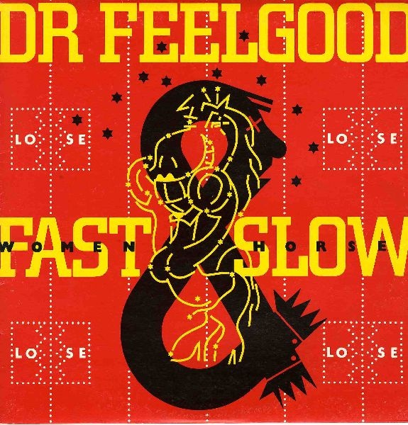
Even then, it was a porous barrier. Work outside the Stiff/Radar/F-Beat network might note: “Sleeve design: Barney Bubbles” (Clover, Unavailable, Polygram, 1977) or “Sleeve design and artwork: Barney Bubbles” (Dr. Feelgood, A Case of the Shakes, United Artists, 1980). Still, releases with Bubbles’ design such as Depeche Mode’s debut Speak and Spell (Mute, 1981), and The Psychedelic Furs Forever Now (CBS, 1982) only acknowledge their photographers.

When asked how he regarded his role in his lone published interview (The Face, November 1981) and why he shunned a credit, Bubbles’ answer would have made any old school Modernist design pro proud: “I feel really strongly about what I do, that it is for other people, that’s why I don’t really like crediting myself on people’s albums—like you’ve got a Nick Lowe album, it’s NICK LOWE’s album not a Barney Bubbles album!”

Practically, being dodgy about his credits had a deleterious impact on Bubbles’ professional career. As noted above, bands outside of his home base sought him out. This extended to superstar territory: in 1978, The Who’s management invited him to propose a design for Who Are You. (Bubbles’ concept of spelling the title out in power cables was rejected but adapted for the photo that was eventually used.) However, according to Paul Gorman, Bubbles shopped his portfolio in 1982 “to some of the bigger music labels, only to hear his unsigned work had already been claimed by others.”

Gorman documents other brushes with high-profile music-industry clients, showing Bubbles had visibility and credibility in the field. Aborted and unrealized projects go with the territory. Gorman also cites unnamed sources as speculating that Bubbles’ naming evasiveness was a tactic to avoid tax problems. If so, it was inconsistent—and ineffective.

That Bubbles’ was engaged in a comprehensive gaming of identity is affirmed by his extension of the play into the graphics. In at least two prominent instances, Bubbles inserted fanciful self-portraits onto album covers. Right away, this is the ultimate audacity for a designer. The first example, considered a definite representation of his profile, is on Armed Forces—the record that Bubbles demanded and received a title change. He can be found in the abstract shapes to the left of the yellow paint splattered title “Elvis Costello and the Attractions Armed Forces.”

af_mini_innerbag_open_01
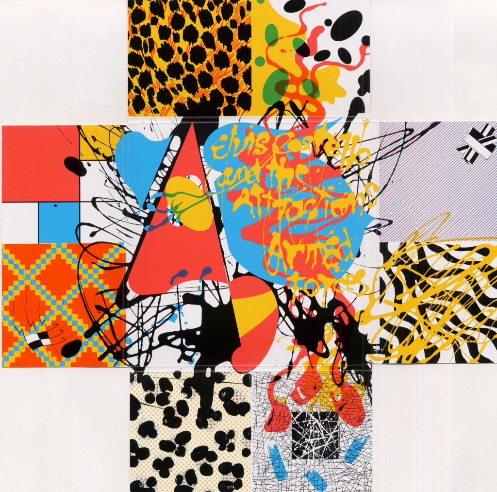
In its original U.K. incarnation, this graphic is within the package, after unfolding the back flaps. The designer is literally behind the scenes on the album, embodied at the center of a mélange of high and low historical graphic styles. In a delightful irony, Columbia, Costello’s U.S. label at the time, evidently finding the U.K. cover unacceptable (a deliberately-kitsch painting of stampeding elephants adorned with discreet typography) made the inner splatter graphic the front image. Having rejected the designer’s preferred layout—probably as too British and obscure with tiny type—the company punished Bubbles by putting his grinning face on its cover.

For the second—though Paul Gorman hedges that the image is possibly lead singer Lee Brilleaux—it would be in keeping if Barney Bubbles’ profile was again dead center on the illustrative cover of Dr. Feelgood’s 1982 album Fast Women & Slow Horses. Seeing stars after an implied punch from a buxom, boxing-gloved mare, the man’s face emerges from the top of a large black ampersand. If it’s Bubbles, he is again one with the artwork. He is (the) design. Another potentially sly reference is that as a designer, his role is an “&” to the musicians.

R-1828879-1315427671.jpeg

In adopting a creative guise—one evidently identical with his everyday semblance—he was in league with the musicians for whom he designed. Many adopted or were given stage names, especially at Stiff. Bubbles was back-stage named. Even if using their natal names, artists craft professional personas. These are carefully managed and strategically deployed. However genuine and real that singer seems, it’s a performance. Sincerity is how convincing you repeatedly enact intimacy with an audience.

Bubbles’ deep interest in the avant-garde art from the beginning of the 20th century also suggests a purpose. In her introduction of the catalog for National Gallery of Art’s 2006 exhibition Dada: Zurich, Berlin, Hannover, Cologne, New York, Paris, Leah Dickerman, Associate Curator of Modern and Contemporary Art at the National Gallery, writes, “Artists within the movement gave birth to a striking number of alter egos, which served as parodic, at times debased, inversions of a rational and authoritative masculinity.” Dickerman points to Duchamp’s “Rrose Sélavy” as the ultimate reversal with the artist changing sex.

Bubbles never ventured into this realm of invention; his pseudonyms were all masculine. His life/design still adeptly illustrated how identity is mutable. Individuality is a postmodern playground, not a fixed state. He did this through the panoply of bespoke logos he generated for Stiff and F-Beat—and with himself. Bubbles formed an identity that was composed of its antithesis: flux. He grasped intuitively the elements that make up graphic identity and handled them effortlessly. Along the way, he effectively branded musicians and labels.

Note: This is the introductory section of what will be an extended essay on Barney Bubbles that will further discuss his identity play in his logos, the clues provided by his album as “The Imperial Pompadours,” his influence on contemporaries such as Malcolm Garrett and Peter Saville, a comparison/contrast with Paula Scher (who worked at Columbia designing albums at the same time as Bubbles was working), his unique status exploring and exploiting the physical aspects of commercial print production, his fascination with regal imagery (“King BB”), and more!