I contributed an essay for the touring exhibition Graphic Advocacy: International Posters for the Digital Age 2001–2012, curated by Elizabeth Resnick. The essay, “12 Views of 120 Posters,” will be included in the catalog to be published in fall 2013, but is available now on the exhibition website here. The show is the third in a series of socio-political poster exhibitions that Resnick has co-curated, following The Graphic Imperative: International Posters for Peace, Social Justice and The Environment 1965–2005, and Graphic Intervention: 25 Years of International AIDS Awareness Posters 1985–2010. Graphic Advocacy just opened at its first venue, the Stephen D. Paine Gallery at Massachusetts College of Art & Design in Boston (my alma mater twice over) on January 15.
Tag: Graphic Design
Transmission (Part 1)
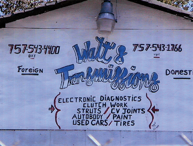
Walt’s Transmissions has a new sign, its third in as many years. It took a while for me to notice, even though I drive past twice a day on the way to and from work. The new sign was placed to the left of their garage door, posted no higher than an average person’s height, on the side of a small addition to the cinder-block structure. The cab of the battered pick up truck stationed in front easily obscures the sign. The previous two signs announced from the obvious spot facing the main street, just below the apex of the roof. This one may have found its less prominent location not so much out of some sense of self-effacement than someone’s diminished desire to climb a ladder.
Whatever the reason for its less than optimal positioning, the new sign was an encouraging sign. From all appearances, the shop appeared in the process of closing: activity slowed, the number of distressed cars in the fenced-in yard decreased significantly. That latter development first seemed a positive step toward a leaner, meaner, and cleaner facility. Then I noticed the shop’s sign—its second—had been removed along with the junk cars. What appeared at first to be a freshening up quickly took on features of a winding down.
My interest in Walt’s was largely due to its original sign, which I had delighted in. It was hand painted directly onto the building, by someone with a degree of experience or training. The letter forms were fanciful, more in keeping with graffiti than professional sign painting. Corporate logos and the stylized lettering of packaging influenced graffiti itself. Here was culture sampling and remixing itself. And the artist had signed the work.
Having avoided any transmission trouble with my car, I had no practical connection with Walt’s. If I had the need, I would have gone elsewhere, to mechanics I already had a relationship with. As much as I treasured the sign, it didn’t affect my consumer choices. It’s problematic if this or any sign could provoke me to a service purchase.
While my attention to Walt’s was for purely aesthetic reasons related to the sign, its replacement represented basic debates on the purpose and capacity of design. It also came to stand for our area’s revitalization attempts. Long-awaited changes were underway in our borough of South Norfolk, Virginia. Many more were planned or hoped for, all to rescue a sorely neglected section of Chesapeake. After decades of decay, any change seemed for the better—even a new sign for a transmission shop.
Technically, Walt’s was just over the city line and in Norfolk proper. But its proximity—a ten-minute leisurely stroll east over the railroad overpass—brought it within the scope of what I consider our locale. The quality and character of the streets and houses were consistent well beyond the borderline. Our area was a zone of “before” pictures yearning for an “after.” Or, as a designated historic district, longing to return to its beneficent before.
Walt’s sign entered emblematic status in its substitution. Not long after I got around to documenting my beloved sign, it was covered over with a new one. The replacement was a dully commercial product, surely promoted as able to increase visibility—AND sales! In place of the eccentric lettering was the consistency of a typeface. Though in this context, was unconventional in its own right, being “Souvenir,” a 1914 creation of eminent type designer Morris Fuller Benton that found its full favor in the 1970s. (I’ll always think of it as the Innervisions type, as my first exposure to it was on the sleeve of that classic 1973 Stevie Wonder album.)
All told, the new sign was more professional. It included credit card info and a web address: indicators of an efficient and tech-savvy business. The sign wasn’t ugly—just anonymous and bland, despite the unusual typeface. The product of a standardized process, it was unlikely to acquire any admirers. But is that a sign’s job? What’s most important to the business? It’s specious to claim that the original sign, by virtue of its novelty, attracted more attention. And, from that, potential customers. Then again, is “artistic” signage what you’re looking for when you’re in the market for a CV joint? I want my mechanic to be like the sign: competent—but with a little personality. Still, all of the original sign’s information was perfectly readable. By basic rules of design, it was successful. Why replace it?
This gets us into another transmission issue: of messages by design, both perceptible and imperceptible. The design styling of the sign—or any artifact—modulates what’s transmitted. That original graffiti-sign probably was broadcasting a message that was too “folksy” for the owner. Or, perhaps, a new owner wanted to put his stamp on the business.
From the perspective of the neighborhood, any upgrade in a local business is a good thing. The area is economically depressed, in need of bolstering its tax base and drawing people in. And while a house on that corner would be more visually commodious and in keeping with the largely residential nature of the block, the area’s still zoned light industrial. Everything’s a trade off. As it is with the new sign: there’s not much you can do to make a transmission shop “sexy” graphically—except maybe an unusual font.
What you quickly encounter is the ongoing drama pitting “revitalization” against preserving the “character” of a neighborhood. Wrecking ball against renovation. It’s an impromptu theater piece being staged across the country in all varieties of communities. The scorched-earth urban renovation schemes of the 1970s instigated a preservation movement that has engendered its own backlash. This was echoed in graphic design as the modernist impulse sought to pave all visual culture with an austere Helveticascape.
Revitalization isn’t an abstract topic for me, having bought a home within South Norfolk’s historic district. Restrictions are placed here on what and how renovations may be made. However, in attempting to invigorate neighborhoods, the civilian review board that must approve all changes often misses the spirit of the initiative for the letter. The greater goal would seem to be encouraging conscientious homeowners to buy into the area to restore and maintain properties at a reasonable common standard. Instead, residents find themselves trapped under leaking tin roofs because of the expense of replacing them with identical materials. The mandate mutates into one requiring deep pockets rather than good faith.
Were our area composed of tracts with uniform house styles from the same era, the prohibitions on contemporary additions considered not in keeping would be consistent. However, our neighborhoods and the houses themselves—as they are everywhere—are mélanges. Still, with the establishment of the historic district, an arbitrary baseline was established. Existing structures were declared acceptable, no matter their peculiar makeup. For instance, common throughout the district are Craftsman-style bungalows retrofitted in the 1940s with brooding metal awnings. Neither historically “accurate” nor particularly attractive, the hybrids have been deemed acceptable and worthy of preservation. Meanwhile, our desire to construct an architecturally sympathetic second-floor sun porch gets squelched as improper, as it wouldn’t have been a feature on an early-1890s home.
The result is our mixed feelings about the guidelines and its attempt to standardize variety. The effort is another example of how the designation of “original” has always been a moving target, a matter of interpretation rather than objective analysis. While we acknowledge that the guidelines have been for the area’s betterment, the regimented, capricious application potentially thwarts our plans and frustrates us.
Fortunately, for most of us, graphic design isn’t macro-managed on the citizenry (it’s the high Modernist designers and visionary/grandiose architects/urban planners who count this as misfortune). Supervision occurs at the micro stage, within organizations. Unless it’s signage, graphic design occurs at an immediate, personal level. For his signs, Walt evidently worked off of his own, subjective sense of how design worked.
Corporations have much more at stake and adopt a more strategic approach. Their situation is somewhat similar to crafting and enforcing guidelines for historic districts, as they aspire to retaining graphic aspects of their established identity—their brand—while injecting stable doses of contemporaneity.
Companies may have come to their graphic identity through happenstance—meaning it was adopted before the rise of focus group testing of designs. However, the companies incur significant risk from deviating too far from established characteristics. It’s the younger graphic designers that may chafe under the resultant regimented identity systems (mandated by other designers)—much as I do under the historic district’s decrees.
But it’s also graphic designers—primarily the older, seasoned ones—who raise the hue and cry when some iconic logo receives an update—deviating from identities fashioned by other, often legendary designers. When Paul Rand’s 1961 UPS logo (the company’s third) was reworked 42 years later, numerous designers rejected the change solely due to the original being a work of the master. You don’t revise Paul Rand—like you don’t revise a Picasso.
(To be continued.)
To Arrive Where We Started
I designed the materials for To Arrive Where We Started, a curatorial project by Peter Eudenbach that recently opened at the Redwood Library & Athenaeum in Newport, Rhode Island. My work included a 24 x 36 poster, paper and metal signage, and a 10 x 30 hexa-fold 2-color brochure/map that guides visitors through and articulates the installation. The map idea and layout scheme was Peter’s concept that I elaborated upon and performed the typography (the face is Matthew Carter’s Miller.). Peter also supplied the imagery and did the requisite Photoshop work (except for the three-panel halftone image of him holding a triangular mirror up to the library pediment). Similarly, he devised the poster’s image juxtaposition that I executed. The map was printed by Liskey Printing in Norfolk. The exhibition runs until June 30, 2013, and a catalog is planned. (Sign photo by Peter Eudenbach, brochure photos by Leaf FitzGerald.)
Occupy What’s Next poster

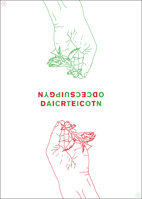
I submitted a (virtual) poster to the Occupy What’s Next web site, an action begun by a trio of San Francisco designers. Graphic designers were called upon “to participate in a global campaign to generate solutions for a constructive future.” Posters were submitted from around the world and will be part of a competition to select “99 strong and functional posters” and to additionally award 5 contestants some Adobe software swag that I don’t need.
The image on my poster is of a hand grasping a nettle and the type is what it says.


