
Transmission (Part 2)

Eight years later, the revision still stings logo connoisseurs. In “How to Ruin a Great Design” in the March 13, 2011 New York Times, design critic Alice Rawsthorn categorized it as a “crime against design.” “…UPS did this by replacing the wonderful “present” logo designed by Paul Rand in 1961, with a dispiritingly bland version devised by the global design group FutureBrand. The new logo is described on FutureBrand’s Web site as “a simplified dynamic curve” that expresses “the evolution of the company’s services and its commitment to leading the future of global commerce.” A waggish design blogger summed it up more succinctly as the “golden combover.” Each time I see it, I yearn for its predecessor.”

That “waggish design blogger” (D. Mark Kingsley) expressed his opinion on the (now defunct) Speak Up site, co-founded by designer, writer, and entrepreneur Armin Vit. (Note: others have claimed or been attributed as coiner of the term.) When I asked for his current take on the UPS remake, Vit—who now comments on corporate identity at the site Brand New—took a holistic view of branding, one with healthy elements of idealism and pragmatism: “I still hate the execution of the logo, but I have come to understand how necessary it was to get rid of Rand’s logo. It made business sense. It was strategic. It didn’t cater to the utopian Preservation of Classic Logos Society. It was a stab at the heart of nostalgia. But guess what? We all survived. Hundreds of corporate logos have changed since then and hundreds more will change. As long as the product or service doesn’t change, or changes for the better, we just have to adjust to the changing visual landscape. We can lament it, but that doesn’t move us forward.”

Designers overreach when calling down cultural or commercial calamity should prized public graphics be deleted from the landscape—or paltry ones be introduced. Ensuring the economic efficacy of particular signage and logos is impossible; too many unknown or uncontrollable factors are involved. As Vit indicates, logo redesigns can only be signifiers of a substantive change (and, we hope, improvement) in the product or service.

At the same time, culture matters—and not only to graphic designers. If society overall didn’t care about such concerns, designers wouldn’t exist. Faced with a potential aesthetic enhancement to the environment, why not have it? The problem, always, is individual taste…and what it transmits.

Were any of these considerations part of Walt’s deliberations when he changed his signs? The evolution was curious. The current sign, along with its casual placement, was stylistically odd. In its five lines of type, it managed to employ four different typefaces. “SAVE MONEY W/OUR SERVICE” it now advised, and that we should “ASK FOR ‘TWIN.’” Type was all CAPS—but in red, unlike the previous sign’s blue.
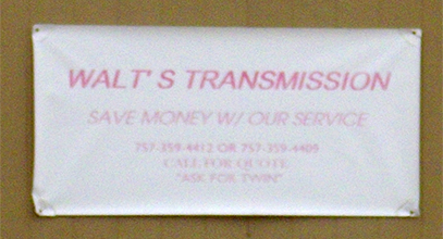
Rather than rely on any more speculation, I took the ten-minute walk to Walt’s to inquire about their signs. A young man left his work on a garaged vehicle to greet me and when informed of the reason for my visit, identified himself as Ulysses, the original sign’s artist. He painted it when he was in high school, indulged by his dad, “Walt.”

I expressed my admiration for his work and asked why it was displaced. The cause had nothing to do with aesthetics or a business plan. A customer that owned a sign store found himself unable to pay his car-repair bill. Rather than get stiffed, Walt took his payment in the customer’s product. This didn’t please Ulysses but he resigned himself to it. “You don’t argue with your pop,” he stated.

The sign was painted over and the yard cleared when Walt’s lost its business license. Ulysses and his brother had recently reopened the shop on their own. They acquired the current sign to announce their reopening and serve as a placeholder. With his brother deferring, Ulysses made plans for a new airbrush painted sign.

As we chatted, a young woman yelled to Ulysses from across the street, crossed, and joined us. He was obviously pleased by her attention, though he teased her about being over-demonstrative with her call. With the shift in his focus, I thanked Ulysses for his time, said I looked forward to his new creation, and moved on. He had a new audience and message to transmit.

After a couple a months, there was another change in signage, though not what my chat with Ulysses had led me to anticipate. The minimal tacked-up sign, now faded, had shifted position to adorn a small, garden shed-like building alongside the cinder block shop. This windowless structure had a single door in the center, over which was another sign stating “OPEN” and an arrow pointing toward the shop.

Occupying the space above the garage door was another homemade, wooden sign: red and grey painted letters on white background, obviously accomplished with a stencil—but with the gaps filled in. “WALT’S TRANSMISSION” stood over two phone numbers. No flourishes. Simple and functional.

Or was it? I found myself imparting a knowing, deliberate stylishness to the block lettering. And was that a hint of a drop shadow to the phone numbers? Below, for the signs “STRUTS” and “BRAKES” he hadn’t even bothered to go beyond the stenciling. Was I seeing a nuance, a design brut perhaps? Or did my admiration for the original sign have me attribute its maker an intentional aestheticization—one that didn’t exist?

Just as I may have been projecting my desire onto the sign, I may have additionally ascribed a flourishing of the business. The brothers seemed to be laboring every day of the week. A car or two or three always occupied the yard, awaiting or fresh from repair. My disappointment in not experiencing a dramatic new Ulysses creation was overridden by satisfaction that they were making a go of it. If business was steady, their current signage was successful. Post hoc ergo propter hoc, right?

Whatever prosperity I believed I witnessed abruptly ended, at least from my perspective. The garage door closed one day and I’ve yet to pass when it’s open, no matter the time of day or week. Then what few cars waited outside in the yard went away, as did everything that wasn’t a structure or attached to it. Once more, for whatever reason, the business seemed dormant—or dead. On occasion, a small pickup truck with “REPAIR” spray-pained on the side, and a hand truck, appeared outside the shack.

Though my previous speculations on the reasons for the sign changes at Walt’s were off base, I feel confident in my conjecture about what may be the last. Ulysses had priorities, and crafting creative signage wasn’t high amongst them. Just get something up there. The new sign was enough…until it wasn’t enough.

However, assigning any responsibility for the business’ fortunes onto the signage, especially considering the capricious routes to their crafting and installation, seems foolish, if not simply unfair. Some other cause may have shuttered Walt’s: one or the other brother falling ill, finding a better job, a falling out, a legal or licensing problem—any number of reasons. Maybe it’s another hiatus.

The signs were just carried along by circumstances, rather than directing them. They projected and were projected upon. Design gives, and receives.
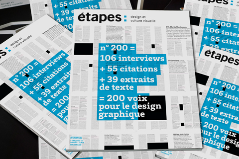
Étapes numéro deux cent

etapes 200

I am one of the 200 “voix pour le design graphique” included in the 200th issue of the French design magazine étapes. The special issue presents the comments of designers, collectors, curators, festival organizers, teachers, and critics on aspects of the state of contemporary graphic design. I was asked to respond to a brief questionnaire on critical writing. If, like me, you’ve forgotten most of your high school French, here’s the text in English:

Q. Is there a renewal of interest in graphic art criticism? In your country or worldwide speaking?
A. Discussion of graphic design criticism has arguably increased but I can’t discern an increased interest for an actual criticism. There has been a spike in calls for additional celebratory journalism from the profession that is termed (but isn’t) “graphic design criticism.”

Q. How has this developed?
A. The graphic design field has little institutional memory since reading of criticism or graphic design history that’s not an examination of storied practitioners isn’t encouraged academically or professionally.

Q. How can stepping back and taking stock of graphic design help its practice evolve? Does it bring about a creative revival?
A. I don’t see practical evolution as the purpose of graphic design criticism. If engaged, criticism might bring about a deeper cultural and social awareness amongst practitioners by expanding graphic design beyond a “profession” and into a “discipline.”

Q. Are there opponents or obstacles to the existence of critical thinking?
A. The graphic design profession. Professions do not value or support critical literature, disciplines do.

Q. Should criticism be part of a graphic designer’s training?
A. For vocational training in graphic design, probably not. If meant as a component of an art and/or liberal arts education, yes.

I Believe in Design (More)

An expanded version of my essay “I Believe in Design” was published in Volume #29: The Urban Conspiracy. The article is included in a special insert to the magazine produced by the Trust Design project of Premsela, Netherlands Institute for Design and Fashion. Trust Design “explores the relationship between trust and design through various publishing, research and discussion platforms.” The original version of the article was published at Design Observer and can be found here.

U & M-B

JMB book cover

Nothing is perfect; perfect is nothing.

In his last year, Josef Müller-Brockmann gave a lecture in Mexico on his work. The renowned Swiss designer brought down the house with his final slide—which was blank. “This is my best piece of work,” intoned Müller-Brockmann. According to biographer Kerry William Purcell in his 2008 monograph, Josef Müller-Brockmann (Phaidon), the statement was meant, “as if to illustrate how the reputation of designers always reside in their potential, not their past realizations.” Purcell’s reading may be correct. And the declaration certainly wasn’t tossed off. For the second question of a 1995 Eye magazine interview (vol. 5, no. 19) at around the same time, Müller-Brockmann was asked what work he regarded as his best. The response: “The white reverse sides of my posters!”

That Eye interview was my first encounter with Müller-Brockmann’s own words on his art—and I was taken aback by the declaration. Perhaps it was only puckish humor on the renowned designer’s part—riffing off his reputation. And his answer can be interpreted many ways. Sardonic or not, I thought the answer spoke volumes—big, blank ones—about Müller-Brockmann. It managed to simultaneously claim as exemplary all his works and none—while tersely combining both humility and conceit. I felt it to be the definite statement of a quest not for an expression of the ultimate communication but of formal purity. It was also an astonishing irony. For Müller-Brockmann, the most articulate design was one that literally said nothing.

The incident related in Purcell’s biography hasn’t served to change that first impression. Müller-Brockmann’s oft-caustic self-deprecation offers proof of a sort for Purcell’s interpretation. That combined with Müller-Brockmann’s relentless search for the essential design expression. It’s a pursuit that encompasses and defines the designer’s life.

Purcell’s biography came at a particularly relevant time. Müller-Brockmann’s importance to graphic design and visual culture makes him a suitable subject of recurring study in any era. However, the 2000s saw a purposeful, large-scale return to the formal attributes of the “Swiss International Style” of design of which Müller-Brockmann was the leading theorist and performer.

Josef Müller-Brockmann has a defensible claim as the 20th century’s most influential visual artist. The formality he made iconic transformed visual expression internationally. Fine artists may have a hold on high culture regard but Müller-Brockmann is more widely disseminated within culture.

It might be said in any noted graphic designer’s biography that the subject’s recognition within popular culture falls far short of that figure’s impact. Biographies of designers remain rare, especially if not autobiographies. There’s a significant backlog of historical figures in design deserving of examination—and an over-abundance of monographs on contemporary practitioners early in their careers.

The lives of creative people aren’t conducive to affecting biographies—or shouldn’t be. If the artist is at all dedicated to the craft, time should primarily be spent working. Pretty thin drama. Any escapades must occur during off-hours—with questionable relevance to the work. For designers, sample extracurricular activities typically comprise of drinking, drugging, wrangling with clients, browbeating students, and giving innumerable far-flung lectures extolling the supremacy of one’s concepts.

For an ascetic like Josef Müller-Brockmann the going’s even tougher for the biographer. A fitting chronicler of this subject may be a writer conversant in subtlety and minutia—wringing maximal meaning out of minimal gestures. Nicholson Baker, author of U and I, an intensive-obsessive appreciation of John Updike, may be the man. Perhaps there were bacchanalian excesses that go undocumented in Josef Müller-Brockmann, but it seems unlikely. The latter three spectacles are, however, well represented.

With his biography, Kerry William Purcell has turned in a well-researched and respectful product. Properly, the volume is geared toward the design neophyte: many details will seem obvious or repetitive to a design-aware reader. This is unavoidable as Müller-Brockmann’s ideas are embedded within design’s DNA. As with his posters, Müller-Brockmann honed his doctrine through years of rigorous explication and is left to quote extensively from Müller-Brockmann’s autobiography.

Purcell’s role is then to provide historical and professional context. Additionally, he broadens Müller-Brockmann’s own self-abridged personal and creative narrative. With the expanded portfolio, it’s illuminating to have rarely-seen illustration, exhibition, and set design works. Unsurprisingly, things the artist dismissed as unskilled or unacceptably subjective are lively and deserving. While no patch on the marvels to follow, they deserved recoup as more than curiosities.

When the famed concert posters take stage, the book sings. For the connoisseur, their splendor is self-evident. The work embodies its proof, confirming any rationale offered for their being. Time (and replication) dulls awareness of how startling these posters were (Purcell provides the obligatory complaints of baffled concertgoers)—and still can be. Though Müller-Brockmann scorns designers resorting to “splash,” in their own way, his masterpieces spatter abundantly. Subject matter, artistic intent, and an ideal historical moment produced aesthetically profound pieces that manage to be both intellectually contemplative and visually stunning.

Purcell stumbles over his own exposition of Müller-Brockmann’s accomplishments. These passages are frustratingly abstract and dense. Purcell’s analysis is in keeping with the Modern form-based, dialectical structure claiming objectivity. The works, however, are no less open to interpretation as any other broadside. Purcell’s lone step outside the Modernist frame is a fleeting and obscure statement that “a final meta-language is forever out of reach.” Otherwise, “universality” is presented as a tangible, obtainable state. A design’s “essential character” is discernable and inarguable. Though delivered as self-evident, these assertions are mysticism alchemized into fact.

An authorized biography is an unlikely showcase for a substantive critical examination, especially a contentious one. However, some questioning of Müller-Brockmann would be welcome, if not obligatory. For instance, Purcell chooses to ignore that a substantive challenge to Müller-Brockmann’s agenda came from within Swiss design—in the form of Wolfgang Weingart. This neglect is simply bad history and suggests Purcell is engaged in hagiography.

Through doubt some objective affirmation might be provided for the designer’s claims. Instead, the book obediently supports the patronizing and apocalyptic tenor of Modernist designers: all other methods are shit and civilization hangs on each font choice. Müller-Brockmann’s tacit dismissal of anything non-Constructivist and a preening self-deprecation quickly grows tiresome.

The strength of Müller-Brockmann’s philosophy is its internal consistency and rigorous application. But its essential flaw is that while regarded as objective and neutral due to its mathematical basis, Müller-Brockmann fails to acknowledge that this status is still but one option amongst many. Many geometries are employed to describe our world, each mathematical and objective, each internally consistent. If you stay within a system, you get the right answers. You just can’t cross between or combine geometries.

If you accept the premise of Müller-Brockmann and his conceptual adherents, his system alone is rational. Any other design sensibility is irrationality. However, the reality is that there are separate rationalities—literally, different perspectives. Other systems exist that are just as scrupulous and purposeful. Müller-Brockmann believed he was describing the world in his philosophy. What he crafted instead was another simulacra, another metaphor.

As did many Modernist designers of his generation, Müller-Brockmann thought he pioneered a formality outside of time. Instead, his principles were wholly of the times. The formal foundation of Müller-Brockmann’s philosophy is the grid: “In his own words, the grid expressed a ‘professional ethos,’ supplying the “designer’s work…[with] a clearly intelligible, objective, functional and aesthetic quality of mathematical thinking.’” The grid’s ordering function and representation of societal memes is accurate. But the latter aspect was far from fixed throughout time.

As described by Jack H. Williamson in “The Grid: History, Use and Meaning” (Design Discourse: History, Theory, Criticism, The University of Chicago Press, 1989), and at greater length by Hannah B. Higgins in The Grid Book (MIT Press, 2009), the grid structure has a long, complex history. The arrangement has been imbued with and promoted a variety of meanings. Müller-Brockmann’s utilization was distinctly of its time. History belies the transcendent virtues claimed for the grid.

Purcell emphasizes Müller-Brockmann’s ethical profundity but its foundation is shaky. In the book’s introduction, Müller-Brockmann is proclaimed a trailblazing advocate of “socially accountable design,” decades in advance of “the flurry of books on ethical graphics published in the past decade.” Is the rationale for this decree the designer’s decades of work for altruistic or socially active organizations? Was it his stance against rampant consumerism and the reification of corporate design practice? No and no. It’s because Müller-Brockmann was a tireless advocate of design “where the form should reflect the content and the content the form.” In other words, he relentlessly, unashamedly, and daringly championed…himself.

As a practitioner, Müller-Brockmann was conscientious and honest. But his vaunted moral stance was based on his rigid adherence to a formality he considered preeminent for any and all clients. This was no more than the rest of a field condemned as being critically short of such values.

Indeed, the design profession is portrayed as an expanse of conscienceless hacks. This is an unconscionable slur against a multitude of practitioners past and present also possessed of integrity and commitment. These postures demean countless designers and Müller-Brockmann’s achievement. Instead of diminishing Müller-Brockmann’s accomplishments, a broader critical examination could illustrate its true dimensions.

As is the fashion with most designer monographs, other eminent practitioners are given cameos to affirm the subject’s supremacy. Purcell goes top shelf, trotting out Paul Rand at various points to embrace Müller-Brockmann as his peer. (To drive the point home, Rand is given the book’s final words, eulogizing Müller-Brockmann with a “geometric analogy.”) Müller-Brockmann manages to one-up the American design idol, wresting an IBM book commission away from Rand, who, while “supposedly very unhappy,” is magnanimous over a loss on his home turf.

Subsequent events have not been kind to Müller-Brockmann’s status as seer. His predictions are marked more by wishful thinking than a clear understanding of culture. His forecast (in History of the Poster, 1971) that “factual knowledge and powers of judgment and discrimination based on credible information will impel advertising in the direction of objectivity” may still be realized but has, so far, been wildly off the mark. Müller-Brockmann’s own objective advertisements—such as a late 1950s campaign for Nestlé dried milk rendered in his distinct austere style—seem like Print magazine “Humor Issue” parodies of the International style.

Purcell glosses over inaccuracies, continually pressing on to the next project. Design seems almost to die along with Müller-Brockmann, just as no creditable work (outside of his protean peers) is produced during his life. A meaningful appraisal of Müller-Brockmann’s legacy would observe and speculate upon the revival of the austere Swiss style in the 2000s—as most celebrated in the work of Dutch design group Experimental Jetset. On its face, this revival may be evidence of the enduring quality of Müller-Brockmann’s approach. But in the statements of the many young European designers reanimating the austere approach, there is an ambient nostalgia.

They hearkened back to a previous era, insisting upon the continued relevance of this purest expression of modernism. And there was none of Müller-Brockmann’s authoritarianism. Theirs is a deliberate, conceptual quotation of Müller-Brockmann and his influence. Contemporary designers have steered clear of proselytizing the style with the zeal—and fundamentalist fervor—of Müller-Brockmann and his peers. Plus, the revivalists demonstrably embrace pop culture, channeling the Beatles, Stones, and Sonic Youth to mellow the stark mood. (Rock the grid!) The upstarts’ verbosity about their concepts equal Müller-Brockmann’s, yet, conversely, the new products often are more interesting to think about than actually look at.

It remains the special hell of Modern designers such as Josef Müller-Brockmann that their overriding narrative has been overridden—and overwritten—by Post-modernity. While the young Moderns invoke the idealism at the core of the drive to essentialize design, it’s also—if not more—all about those cool forms. So it is for everyone—especially Josef Müller-Brockmann.

The great designer was committed to his design. That passion was his kink, the excess Purcell’s book clumsily details. If design is like a relationship, it was, with Müller-Brockmann, a three-way—him, his design, and you. And it’s your role—proscribed and passive—to observe mechanically, and feel abstractly.

Note: This is an expanded version of the review “Embedded in Design’s DNA” that appeared in Eye vol. 16, no. 64, summer 2006.