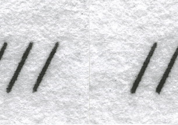
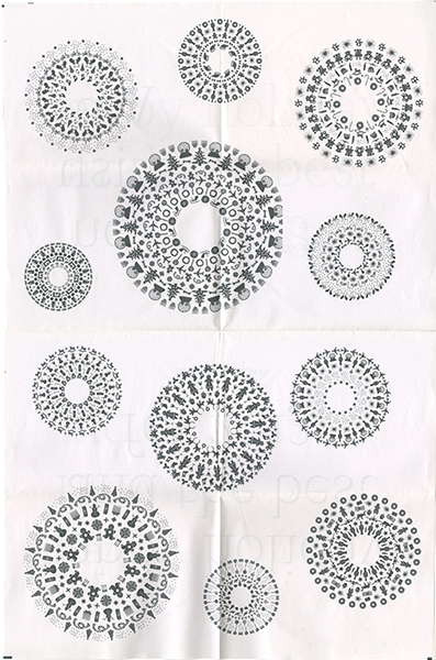
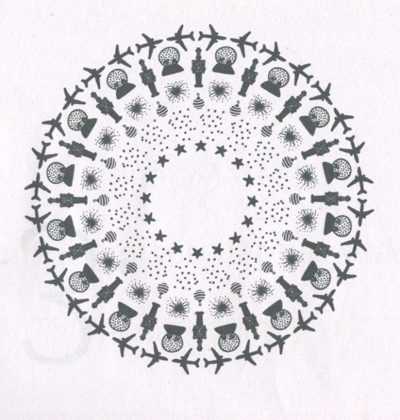
I designed the materials for To Arrive Where We Started, a curatorial project by Peter Eudenbach that recently opened at the Redwood Library & Athenaeum in Newport, Rhode Island. My work included a 24 x 36 poster, paper and metal signage, and a 10 x 30 hexa-fold 2-color brochure/map that guides visitors through and articulates the installation. The map idea and layout scheme was Peter’s concept that I elaborated upon and performed the typography (the face is Matthew Carter’s Miller.). Peter also supplied the imagery and did the requisite Photoshop work (except for the three-panel halftone image of him holding a triangular mirror up to the library pediment). Similarly, he devised the poster’s image juxtaposition that I executed. The map was printed by Liskey Printing in Norfolk. The exhibition runs until June 30, 2013, and a catalog is planned. (Sign photo by Peter Eudenbach, brochure photos by Leaf FitzGerald.)
Posts
Phoenix Design Week
I will be a keynote speaker at the Here and Now conference that’s part of the fourth annual Phoenix Design Week, September 24–30, 2012. I’ll be presenting “Singing the Surface,” the text of which I intend to be the title essay from my next writing collection. The event is presented by AIGA Arizona and promises to be warm and fun.
Occupy What’s Next poster

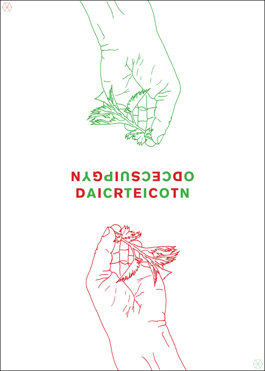
I submitted a (virtual) poster to the Occupy What’s Next web site, an action begun by a trio of San Francisco designers. Graphic designers were called upon “to participate in a global campaign to generate solutions for a constructive future.” Posters were submitted from around the world and will be part of a competition to select “99 strong and functional posters” and to additionally award 5 contestants some Adobe software swag that I don’t need.
The image on my poster is of a hand grasping a nettle and the type is what it says.
Étapes numéro deux cent

I am one of the 200 “voix pour le design graphique” included in the 200th issue of the French design magazine étapes. The special issue presents the comments of designers, collectors, curators, festival organizers, teachers, and critics on aspects of the state of contemporary graphic design. I was asked to respond to a brief questionnaire on critical writing. If, like me, you’ve forgotten most of your high school French, here’s the text in English:
Q. Is there a renewal of interest in graphic art criticism? In your country or worldwide speaking?
A. Discussion of graphic design criticism has arguably increased but I can’t discern an increased interest for an actual criticism. There has been a spike in calls for additional celebratory journalism from the profession that is termed (but isn’t) “graphic design criticism.”
Q. How has this developed?
A. The graphic design field has little institutional memory since reading of criticism or graphic design history that’s not an examination of storied practitioners isn’t encouraged academically or professionally.
Q. How can stepping back and taking stock of graphic design help its practice evolve? Does it bring about a creative revival?
A. I don’t see practical evolution as the purpose of graphic design criticism. If engaged, criticism might bring about a deeper cultural and social awareness amongst practitioners by expanding graphic design beyond a “profession” and into a “discipline.”
Q. Are there opponents or obstacles to the existence of critical thinking?
A. The graphic design profession. Professions do not value or support critical literature, disciplines do.
Q. Should criticism be part of a graphic designer’s training?
A. For vocational training in graphic design, probably not. If meant as a component of an art and/or liberal arts education, yes.