Humanities identity

Hlogo

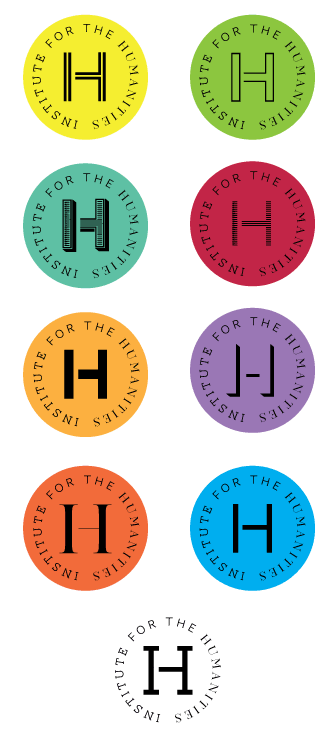
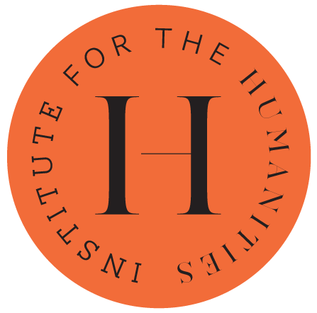
I’ve created an identity for the Old Dominion University Institute of the Humanities. This is a program that “promotes interdisciplinary studies with an emphasis on critical theory and cultural studies, allows students to pursue individualized programs of study that incorporate classes from across departments within the College.” Other institutions call these kind of programs Interdisciplinary Studies or some such. As shown, I settled on a typographic approach emphasizing the H of Humanities but segmenting the character to show the I. To represent that different disciplines were involved under a unified structure, I selected a typeface with related but distinct fonts to set the H in: AW Conqueror by Jean François Porchez. Finally, there’s a color scheme to make it all cheerful. As the system gets deployed, we’ll see if particular programs are paired with a font/color or we just rotate through the options. As I’ll be designing the materials, I can’t wait to see what I do.

humanitieslogos

To Arrive Where We Started

I designed the materials for To Arrive Where We Started, a curatorial project by Peter Eudenbach that recently opened at the Redwood Library & Athenaeum in Newport, Rhode Island. My work included a 24 x 36 poster, paper and metal signage, and a 10 x 30 hexa-fold 2-color brochure/map that guides visitors through and articulates the installation. The map idea and layout scheme was Peter’s concept that I elaborated upon and performed the typography (the face is Matthew Carter’s Miller.). Peter also supplied the imagery and did the requisite Photoshop work (except for the three-panel halftone image of him holding a triangular mirror up to the library pediment). Similarly, he devised the poster’s image juxtaposition that I executed. The map was printed by Liskey Printing in Norfolk. The exhibition runs until June 30, 2013, and a catalog is planned. (Sign photo by Peter Eudenbach, brochure photos by Leaf FitzGerald.)

Occupy What’s Next poster

I submitted a (virtual) poster to the Occupy What’s Next web site, an action begun by a trio of San Francisco designers. Graphic designers were called upon “to participate in a global campaign to generate solutions for a constructive future.” Posters were submitted from around the world and will be part of a competition to select “99 strong and functional posters” and to additionally award 5 contestants some Adobe software swag that I don’t need.

The image on my poster is of a hand grasping a nettle and the type is what it says.