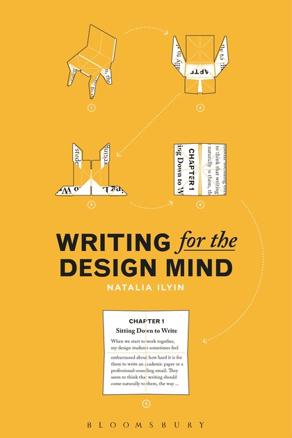
Scratching the Surface

I’m the interviewee of the latest edition of Jarrett Fuller’s Scratching the Surface. “Scratching the Surface is a design podcast about the intersection of criticism and practice hosted by Jarrett Fuller. Each week, Jarrett interviews designers, writers, critics, educators and those that operate between these fields about how writing, criticism, and theory informs individual practice and the graphic design profession at large. Previous guests have included Michael Beirut, Jessica Helfand, Michael Rock, Steven Heller, and Alexandra Lange.” Thanks to Jarrett for inviting me to participate and massaging my words into broadcast.

Quotes on Paula Scher

Two quotes from my essay “Match Prints: Barney Bubbles vs. Paula Scher” are included in the introduction to the new Paula Scher: Works monograph published by Unit Editions. Scher is a senior partner in the New York office of Pentagram, and was featured recently in the Netflix series Abstract: The Art of Design.

The Green Ambassadors in White and Black

As part of an annual faculty exchange program, I taught a one week class in late summer 2015 at the University of Kitakyushu in Japan. I was accompanied by my daughter Emma, who was 15 at the time. Kitakyushu is a city of nearly a million inhabitants on the northernmost tip of the southern island of Kyushu. A dark distinction of the area is that it was the initial target of the second atomic bomb during World War II. Smoke and overcast cloud sent the “Fat Man” south to Nagasaki.

We flew into Tokyo a week ahead of the class to travel through the country. From the start, I eagerly collected random print ephemera. Japan overall is a graphic wonderland, in density and detail. I scooped up a wide variety of free print materials. If I couldn’t collect it, I was photographing signage, logos, stickers, and such. Admittedly, much of it was mundane artifacts that I might pay less attention to if it was home-grown. But distance, language, and culture made it all fascinating.

Tables stacked with announcements at galleries and museums were target-rich environments for uncanny and novel artifacts. Arts-related material generally provided special thrills, especially when paired with nostalgia and personal obsessions.

Neither of us spoke or read any Japanese but the impediment was a boon. I could just indulge in everything as joyous form. A translation or explanation of the concept behind the In Our Time Shiny Grey Lozenge might drag this mini-poster down to hum-drum literality. I had to have two of this one. Sputniko!

I watched Ultraman as a child and hadn’t thought about him in quite a while. Put him on anything and I needed three at least. One for the office, one for home, one as a gift to a deserving person.

When this flier took its place of honor on my office door (where it still resides), I broke down and asked a Japanese-speaking colleague what the cat was saying. Something on the order of “Attention!” I was told. But it had me at cat.

My suitcases were already stocked with cards, fliers, brochures, maps, and miscellanea when we arrived in Kitakyushu. My pace of acquisition slowed considerably due to the plenitude we were hauling and spending the day teaching. Still, there was ample opportunity to walk the city streets and add to the trove.

As we wandered, we would run across these two bear-like figures in different situations on diverse paraphernalia. From the varied contexts we couldn’t tell what they were promoting or relaying. Sometime the white one appeared on its own.

To us, the nose/mouth seemed to form a Japanese character or word. They didn’t seem to be commercial mascots as they appeared across a range of businesses. We weren’t sure if they were meant to be bears at all.

Were they a couple? Siblings? Good and evil twins? The black one’s eyebrows added a mischievous or menacing element. What we did know is that they were adorable. More frustrating than not knowing their identity was my inability to secure a sample of the characters. They didn’t adorn anything freely available. Purloining a poster affixed to a window, or a shop display was out of the question. And we didn’t possess the language skills to ask what they were, never mind if we could have a spare specimen.

The mystery was solved with a question to our hosts in the University International Studies office. The creatures were bears and called Teitan and Burakku—the Japanese transliteration of the English word “black”—Teitan. They served as Kitakyushu’s “green ambassadors,” symbols of the city’s many eco-friendly initiatives.

At the time, we weren’t given more than this of their back story. But they did turn out to be opposing forces. Black Teitan represented the contrary impulse to ecological responsibility. Their mouths were the character for “eco.” Black Teitan occasionally sported a mark that resembled a closed quote that changed it to “ego”—symbolic of his selfishness. Their absence indicated Black Teitan had seen the light green.

Unfortunately, it didn’t take much to intuit Black Teitan as a negative character, especially when pared with a white version. In our brief time in Japan, we had stumbled across stray examples of racially insensitive imagery. But they were fewer in number than instances of Confederate flag display back home in Virginia.

Because of this, I immediately began referring to them as Teitan and White Teitan. This exasperated teenage Emma so, of course, I made a point of saying it often. She understood where I was coming from but it still qualified as dad-jokery.

Gratifying as it was to resolve the enigma of the cartoon bear creatures, it was only the prelude to the true revelation. The culmination of the office’s Director explanation was to gift us each a button with the Teitans.

Despite my misgivings about their nature, I accepted mine with delight. Today, it adorns the lapel of the white lab coat I wear in class: a treasured artifact of travel, a teaching moment.

ODUMUNC program

My redesign of the program for the annual Old Dominion University Model United Nations Conference (ODUMUNC) was published last month. The project began in summer of last year and was supervised by Dr. Aaron Karp of the ODU Political Science & Geography Department in his capacity as Director of the event. The 6.5 x 8.5, 32-page booklet (including cover) is used by participants to provide information on conference activities and guidelines, and serves as a souvenir of the event. The brief was not to diverge substantially from the existing layout but to sharpen and bring it into InDesign. Previous programs had been crafted in a text program and, considering the limitations, wasn’t that bad. I tightened by the overall layout, added page footers and bolder folios, created a running strip of flags across all pages, redrew the hotel map (or drew, as the original was a crude multi-generation CAD output) and moved it to the center spread, replaced thr default Times and Helvetica with Mr. and Mrs. Eaves, and drew a new masthead, keeping the spirit of the prior versions, which swayed from Helvetica to a Grotesque unpredictably with the year. It’s taken from an early UN security council vote. Most of the work was structuring the many lists in the book. I was particularly gratified that the cover image, which I created simply as a placeholder, stayed as the cover throughout.