Process Music: songs, stories, and studies of graphic culture is the second book collection of my writings. To be published by Onomatopee Projects, the new book will gather over 40 pieces primarily from the past decade, with reprinted works first appearing in forums like Emigre, Eye, Print, Idea, Modes of Criticism, Design Observer, Speak Up, and Voice: AIGA Journal of Graphic Design. Others are texts of lectures and presentations, have appeared on his blog or elsewhere online, or are original to this collection. Many are unavailable or hard (and expensive) to find. The book will also feature a prelude composed by AIGA Design Medalist and Design Matters host Debbie Millman.
Process Music refers to print media and the intentions behind design activity. It is interested in visual culture, providing deeper readings and close viewings of graphic design artifacts and activity, frequently examined through the lens of music. Employing a range of narrative voices, the works combine academic rigor with the accessibility of popular forms like music journalism. FitzGerald regards himself as a critical enthusiast: knowledgeable, appreciative and irreverent.
The book is organized in four sections and a coda: “Blues in CMYK” contains short essays that focus on concepts and topics in graphic design, such as the practice, limits, and potential of design criticism; different aspects of design education; the importance of metaphor and cross-disciplinary inspiration; inclusivity and responsibility in design; the proper context of digital technology; authenticity; the influence of religious faith on design activity, and more.
“Interlude with Designers” presents appreciations of famed and upstart individuals in the discipline, including Barney Bubbles, Paul Rand, William Addison Dwiggins, Jacqueline Casey, Paula Scher, Vaughan Oliver, Martin Venezky, illustrator Mark Andresen, and design activist Andrew Breitenberg.
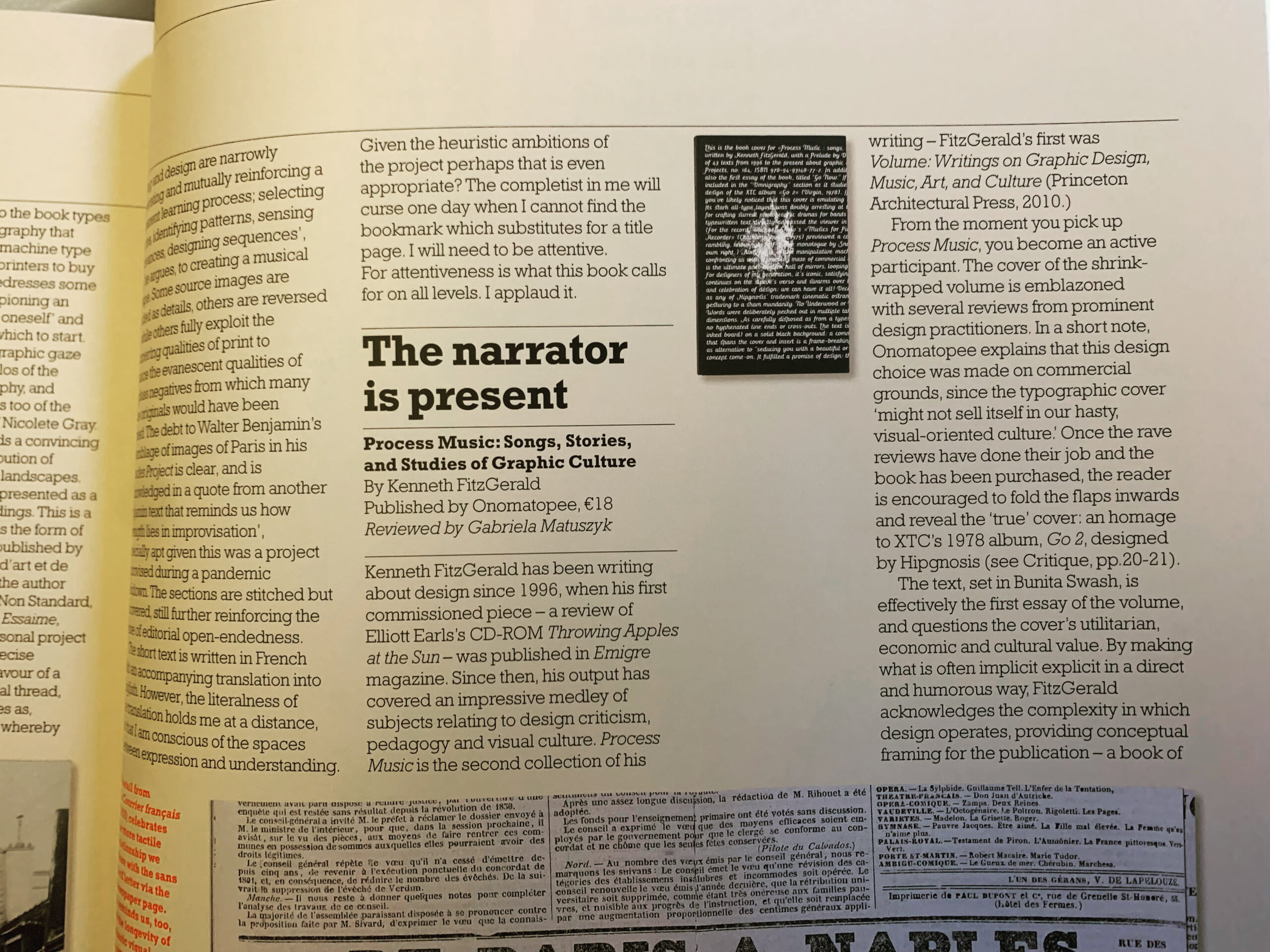
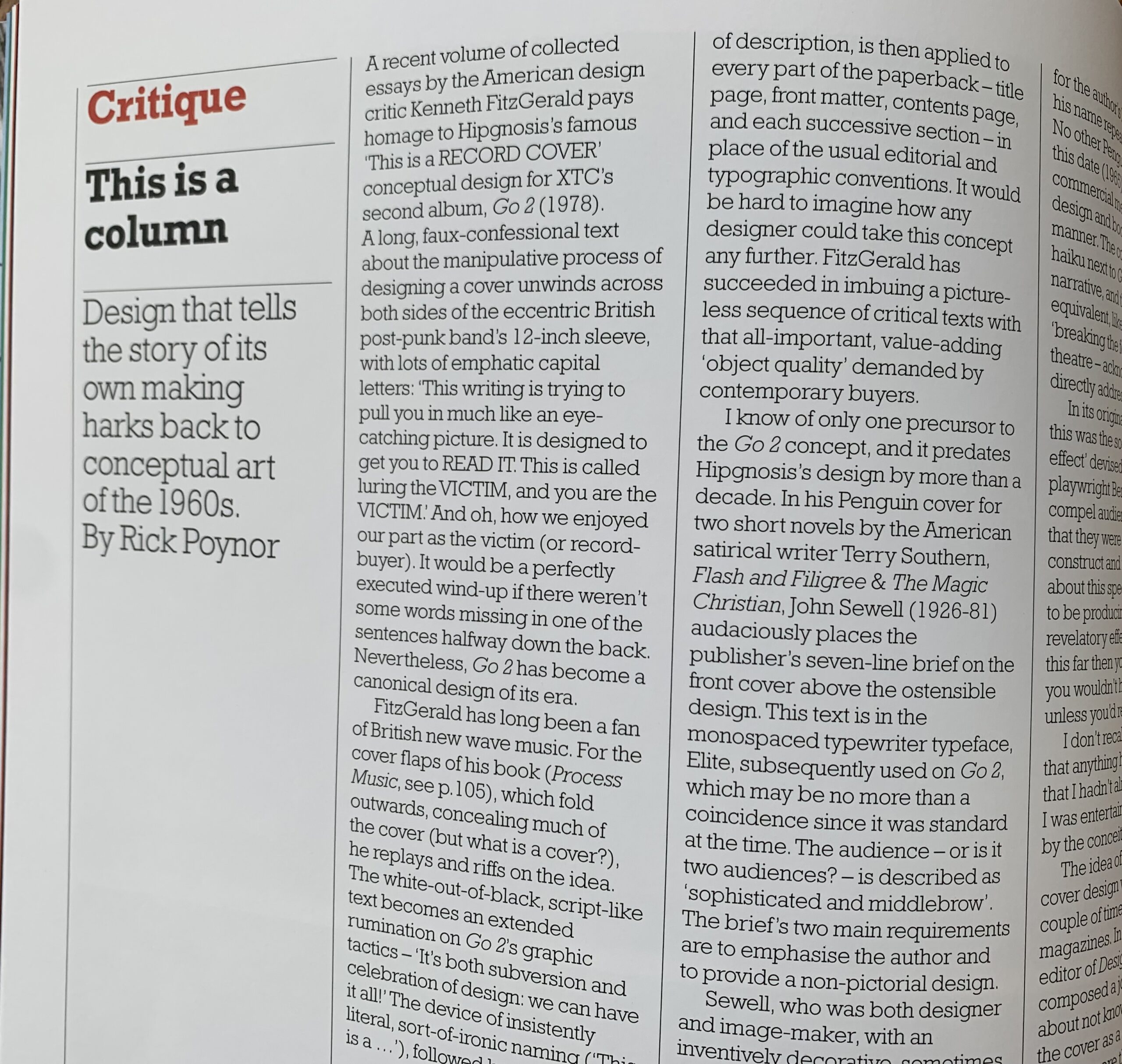
“Omnigraphy” has expanded reviews and studies on graphic design and music works, performers and practitioners. Figures covered include Josef-Müller Brockmann, Rudy VanderLans and Zuzana Licko/Emigre, Elliott Earls, Stefan Sagmeister, Hipgnosis, Fuel, and the musicians Van Dyke Parks, and British band Cornershop. Artifacts examined include books, interactive projects, typefaces, independent and mass market magazines, posters, and record albums.
“My Back Pages” offers short memoirs and stories that take a personal perspective on creativity, visual culture and communication. Lastly, “(extended play)” offers a short fiction.